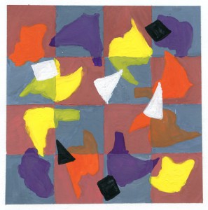
For the Transparency In Pattern project I used the muted colors of red and blue. Two colors that work well together, so it was a lot of fun to experiment and see how they both mix with black and white as well as add the variety of the splat shapes going around the surface. As I painted the squares first I would also think about which colors I would use for the shapes. Several came to mind but by the end I wanted three colors that would ultimately pop out to the viewer, especially if I wanted to catch there attention. Yellow, purple, and orange were chosen because they were a mix of bright and warm colors and knowing I had to mix them with the muted blue I knew it would come out just fine.
The tricky part was the placement of the three squares and three triangles that lied on top of the whole piece. Keeping them black and white was simple, but knowing where to assort them or how not to over size them to the point of no control took a lot of thought for me before even creating the outlines. Eventually I realized that I did not want them to become too small but enough that they weren’t to disappear to the viewer’s eye. Also painting the small shapes was a great challenge since I had to be calm and slow to now over paint them or accidentally make them larger then they should. Great project and defiantly see myself making a more diverse version for personal use and view.


