On April 9th, I was given a second cover assignment where we needed to prepare a data report for each of the three organizations. And this time the supervisor wanted a cover that was minimalistic, one with lots of color variations, and geometric shapes, and the cover will have three to four logos. Each logo has a different color and she wants the cover to have blue, green and yellow variations. Unlike my first cover assignment, this time there will be multiple logos on the cover. And the color choices are based on blue, green and yellow. But I think the challenge of the two cover tasks is comparable.
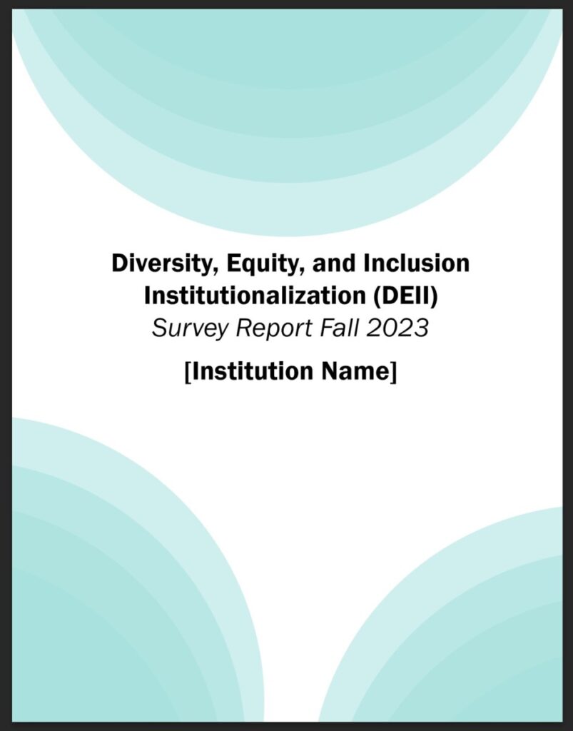
In this cover assignment, because there are no logos yet, I need to think about the background of the design first, using the right amount of graphics as the body of the cover. The first idea was a yellow background with a combination of circles and rectangles to create a before and after contrast based on the different visibility of the circles and rectangles. The title is then placed in the center of the rectangle with 100% visibility to draw attention to the title. The second is a blue background, using two white squares of different sizes as the body of the cover. Again placing the title in the large white square, we see the contrast in the size of the squares, and then giving the large white square a fuzzy blue backdrop to give the cover a sense of hierarchy. The third cover uses a light green gradient circle for graphic enrichment.


