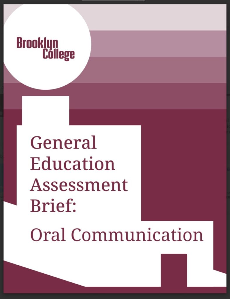
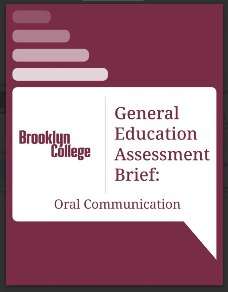
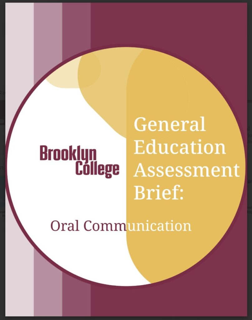
My first cover task is to create 2 or 3 covers which are for the General Education Assessment Brief. In the email, my supervisor gave some requirements and gave some examples to us. She let us use the colors and fonts from the Brooklyn College guide and let us generated 2 separate editable PDF cover options. The covers she sent us for reference all used maroon and the font was Serif, so I referred to those examples and made 3 covers using maroon color and Noto serif font. Cover is a challenge for me, this is also my first time to make a cover, I have almost no experience in designing cover. Cover is the most important part, it is the first page that readers see, it has the role of attracting readers. I also often collect picture books, and a good cover will be a plus. Based on the reference given by the supervisor, I also decided to use simple patterns and colors to highlight the text.
Through the referenced covers, I learned that I needed to have the Brooklyn College logo and title on the cover. The first idea(left to right) was to put the logo and title in a white building against a maroon colored background. The second idea(left to right) was to create a speech bubble based on “Oral Communication” in the title. For the third idea(left to right) I wanted to do something new and use two colors in the text and add a gradient in the background. Gradients add to the visual appeal of the cover and make the graphics look more interesting and compelling.


