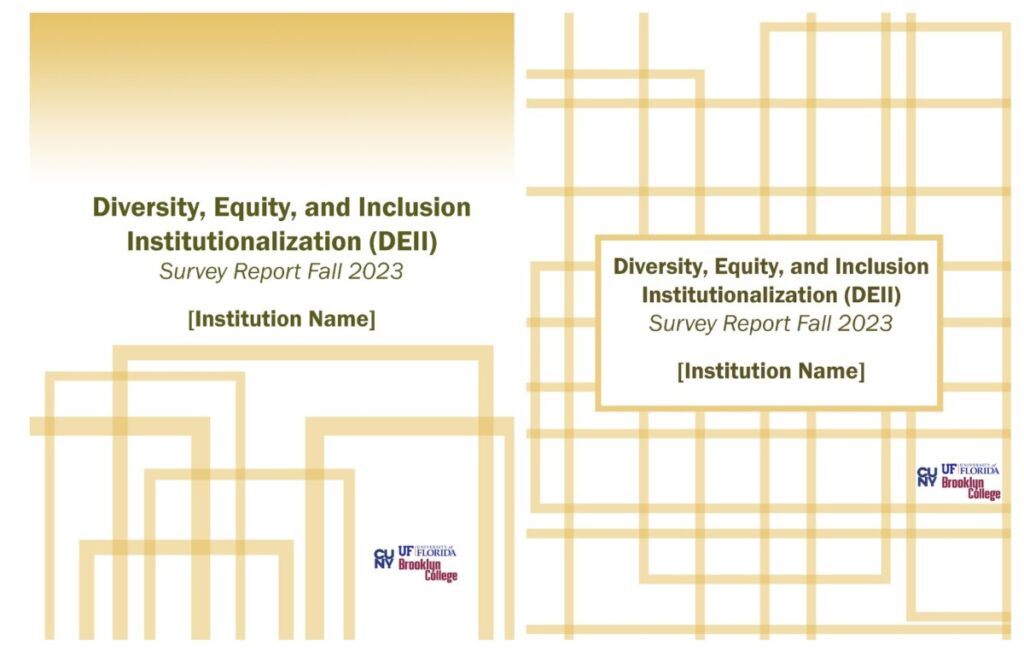
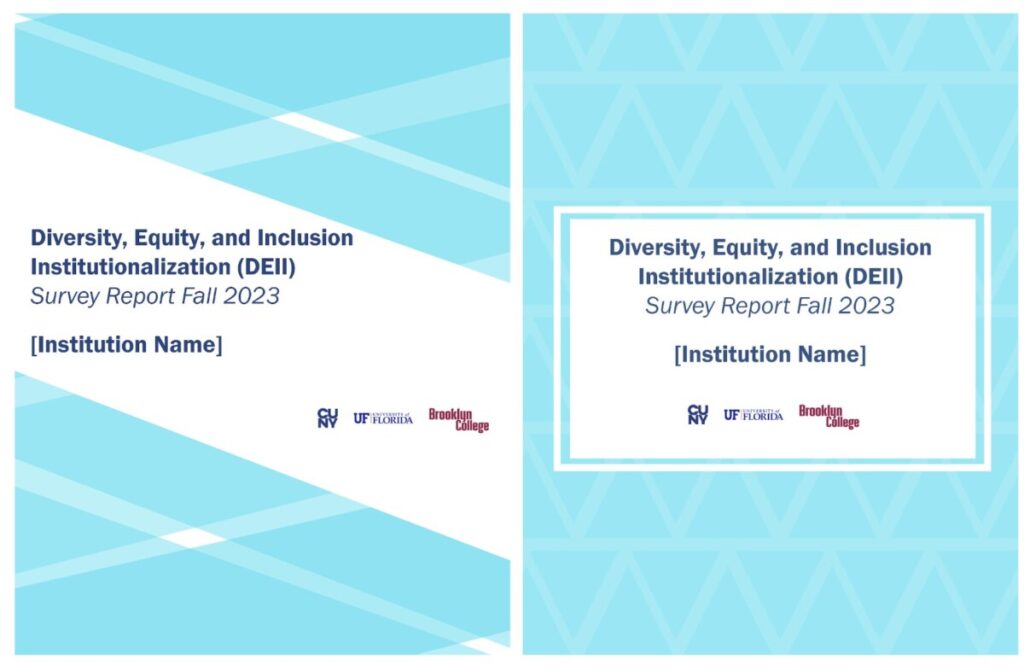
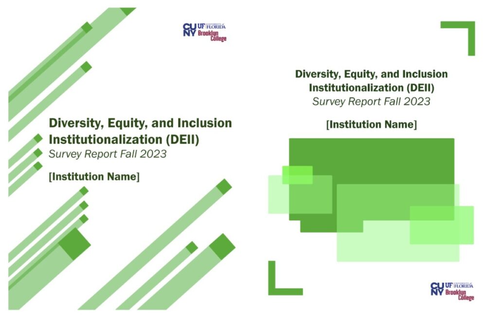
On the 22nd of April, supervisor notified us in a text message that we needed more covers for the second cover project, so I recreated some covers. still blue, green and yellow. This is my third time designing a cover, and I have some experience compared to the previous two. For example, the title should be highlighted to make it easy for readers to identify. And consider typography and layout to avoid overloading the cover with too many patterns in the background. As usual I opened up Adobe Photoshop and started making aspects of the background.
My first idea (left to right) was to use a gradient yellow, using some 50% yellow lines grouped together, and then put the title in the most visible center. The second idea (left to right) was to use a white background, then put a bunch of 50% yellow lines, and then finally put a white rectangle in the center for the title. The third and fourth ideas are similar, but use a number of blue shapes with varying degrees of visibility, plus a rectangle with 100% visibility as the title’s background to add to the title’s appeal. The fifth and sixth ideas use a light green pattern as a background and that surrounding the title, and in the center the title can be more attractive to the eye. (The work I put here has been improved according to the supervisor’s feedback.)


