 1. I found this example of visual hierarchy very interesting since the design of this image has the direction of what is wants you to look at first. Where it says, “Art. Collect. Yourself.” I had read the words second and paid attention to the person that was posing for the photo first. In my opinion those words are the first location of this poster (Art). Where the records are located and scattered on the floor is where the second word comes in play (Collect). Finally, after we have gave our full attention to the records we then look at the model. In the photo he is enjoying his music while dancing and feeling the groove.
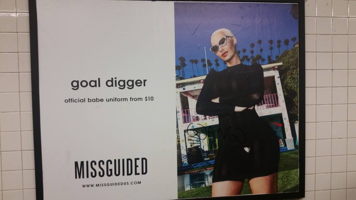 In this poster we have Amber Rose posing for the image. We can see and example of visual hierarchy here since she is facing the white ground that is beside her.
 In this poster I found this interesting since the model is not facing the white ground to her right side but is facing us instead. Her knee is bending and facing the the white ground instead of her upper body.
 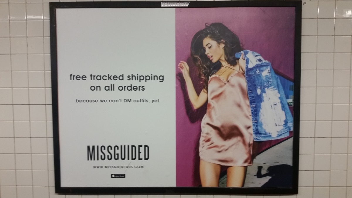 This poster is similar to Amber Rose’ pose since she is facing the words to her right side. If the two spaces were swapped then it would feel out of place.
 I like how this poster has the eagle lifting the pack of beer up towards the word “Drunk.” I like this example of visual hierarchy since the eagle is pointing the beer upward to the word that defines the purpose of the beverages.
The OpenLab at City Tech:A place to learn, work, and share
The OpenLab is an open-source, digital platform designed to support teaching and learning at City Tech (New York City College of Technology), and to promote student and faculty engagement in the intellectual and social life of the college community.


top