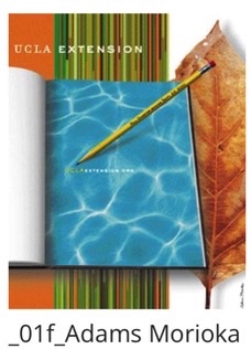
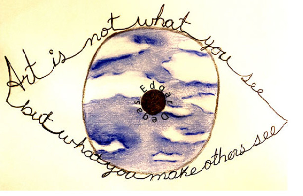
I like how well the designer managed the color selection to make them work in balance with the objects layout. This is a very interesting how the designer played with perspoective to display this text. The design is simple, but it’s effective.In this capture perspective is another interesting detail that brings my attention. The colors and lighting are well balanced as well.