
Maribel Royer – COMD1112 OL09
Tanya Goetz
Digital Media Foundations
October 6, 2021
History of Amazon Logo
The incredible growth and logo evolution of an online bookstore.
The protagonist of this story features Jeff Bezos. After graduating from Princeton University in computer science and electrical engineering, Bezos worked several jobs, including a telecommunications startup and a banking firm.
In 1994, Bezos landed at the hedge fund D.E. Shaw. He quickly climbed the ladder, becoming Vice President in just four years. Here, Bezos was responsible for researching new business opportunities on the budding internet at the time. But when Bezos proposed a list of 20 products they could sell online, they shut him down. This is when Bezos finally decided it was time to set out on his own.
Amazon was the perfect choice. What better way to name the (soon to be) world’s most prolific e-commerce marketplaces than after one of the world’s largest rivers? Bezos registered Amazon.com on November 1, 1994.
Though some people are still uncertain about Amazon.com’s Book of the Month Club benefit, Others have found it effective. The company’s growth as an online book store was powered by the growing global use of the internet. This has also helped the development of the networks and general e-commerce. Many consumers, who became loyal clients of Amazon.com feel committed to the club. Different from a traditional readers club, Amazon.com loyal clients have become more valued because others book of the month club readers are not as appreciated. Although more stores continued selling their products online during the pandemic period, Amazon became one of the most popular and visited online stores during this period. Its logo has proven its advertised effectiveness during this difficult time more than ever. Regardless of the recent obstacles it experienced due to the pandemic recession, especially during quarantine time; the company kept its status on its intended customer service goal.
https://www.aboutamazon.com/news/how-amazon-works/creating-a-trustworthy-reviews-experie
– PrimeAirVideo._CB509077587_.mp4
Films, DVDs and other tech goods can be found at Amazon.com, but anything is virtually found on Amazon. Not to mention the additional services, such as the streaming service through Amazon Prime, that offers high-quality movies, shows, and the Kindle, which allows consumers to read all the books with a gadget. The very important factor that makes Amazon.com logo’s purpose a reality is the company CEO, Jeff Bezos’ ideology and capacity to achieve his goal of creating a great online experience with the minimum agent-customer interaction, in order to provide excellent customer service, as he mentioned in Richard L. Brandt’s book, Jeff Bezos and the Rise of Amazon.com
Amazon It’s increasingly getting more and more popular among many people around the world. According to marketing studies, since its inception in 1994, Amazon has become more than just an online store. It represents an important part of innovation of the most effective technologies worldwide. Developments like the voice recognition system, a personal assistant like the Amazon Alexa, its groceries shopping through Amazon fresh, whole foods and others. Plus the use of drones to deliver packages to customers have made Amazon.com become an amazing contribution in the industry. As described in different marketing studies, the Amazon logo has certainly been an important part of the company’s success. When it comes to a large, global company, people automatically think of the company’s logo. It represents the company’s face and it creates an icon in customers’ minds for a long time as explained by Amazon.com’s CEO, Jeff Bezos’ in Jr Macgregor book, The Force Behind The Brand, where the writer highlights Jeff Bezos speech to the kids at Stanford during the commencement ceremony.
According to a logo analysis done by 1000 Logos in the company history, the logo was established under the name “Cadabra”, the company was renamed to “Amazon” in the same year, and the initial logo for the world’s most famous e-commerce platform was designed in 1995. During the company’s development, there were not so many redesigns and the color palette was set already in 1998, though the first two versions were made in black and white. The first logo of Amazon was quite different from the logo of today. The Amazon logo of 1995 was a big A letter with a river flowing through it. Beneath the logo were the words: Earth’s biggest bookstore. And it was only a bookstore back in 1994, but that was about to change quickly. The entire logo was covered with water effects that were meant to separate Amazon from the rest. The first Amazon logo was designed and created by Turner Duckworth, who was asked by Jeff Bezos to design it. The stylized black bold letter “A” was the main element of the logo, with a smooth vertical white line, repeating the contours of the Amazon river.
In 1997 the image was redesigned, gaining white horizontal lines coming out of the Amazon river. Due to these lines, the logo started resembling not only the river shape, but also a tree, plus it had something in common with the zebra pattern, which made it truly remarkable. The color palette of this logo was still monochrome. As for the wordmark, the style was slightly changed and the lettering became bolder, while the emblem was redrawn and made smaller and more elegant. The “amazon.com” wordmark in the lowercase was placed under the emblem and executed in a clean and simple sans-serif typeface, in black. 1997 — 1998
The logo changed significantly in 1998, and it was much more similar to the logo of Amazon that is in place today. The only difference between the two is that the line below the amazon word was longer and golden, and that there was a sign above the word amazon which read: books, music & more. This logo was more simplistic and it was more popular than the first one. Based on the article, Design your way, the Amazon logo has been modified since 1998. The logo contained the domain of the Amazon website (amazon.com), This added a meaning to the logo.
On the full logo version, the arrow part of the icon is stretched under the letters A and Z, symbolizing that customers can find any product in the online store. The arrow also signifies moving forward and achieving goals, which is in line with Amazon’s history.
On the full logo version, the arrow part of the icon is stretched under the letters A and Z, symbolizing that customers can find any product in the online store. The arrow also signifies moving forward and achieving goals, which is in line with Amazon’s history.
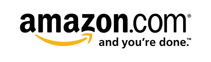
The logo from 2000 was looking very similar to the logo that is in place today, but there were some differences between the two. The 2002 logo saw the addition of the slogan “and you’re done”, which was added to the bottom left corner of the logo. This logo has remained in existence ever since and it is one of the most popular logos.
Based on the logo’s designer, Turner Duckworth, Jeff Bezos had a simple idea about how the logo should be. At the beginning he just had a bookstore, but he had a vision of continuing growth as he said: “everything under the sun” Bezos wanted to transmit that same idea. “He equally didn’t want the logo to look dramatically different..” So he asked designer Duckworth: “Change everything, but change nothing.” The designer thought it was a challenging job and said: “Easy, right?” Bezos loved the Smile idea so much that he didn’t feel the need to have the designer’s company do any further research as suggested by the VP. He said: “That’s great, that’s it!”, and “Anyone who doesn’t like this logo, doesn’t like puppies!..And he laughed his booming laugh and walked out.” As Designer Duckworth said: To this day, almost 20 years later, the logo hasn’t changed.

Coincidentally in an article by Campaign Live, where Amazon’s logo designer’s work are published and Taylor Smithfield in his book, In So Little Words: “Telling A Story With Your Logo, it is clearly agreed that The Amazon logo projects its message in a pretty simple, such effective way made out of two letters contained within the amazon’s world. Just by the connection the arrow makes between the “a” and the “z” transmit a great, effective message. This implies that the Amazon store contains everything from a to z, and the smile represents that customers are happy using Amazon. Turner Duckworth’s design smile idea is a playful and friendly sign that represents truthiness and satisfaction. The black and orange color palette only adds to these feelings, making the visual identity bright and perfectly balanced”. – Smithfield, Taylor. (24–25)
The lowercase Amazon logotype is executed in a bold and traditional Sans-serif typeface with smooth thick lines, slightly curved tails of both A’s, and straight cuts. The font used for the logo is Officina Sans Bold, which is pretty close to such fonts as Dynamic Grotesk Bold and Capital Gothic Bold. The colors of the logo are black and orange, which represent some values that Amazon intends to maintain. The black color is the representation of the dominance and elegance of Amazon, while the orange tries to convey happiness and pride. The design and the simplicity of this color is what makes this logo so special. It is memorable and the colors certainly help with that; a combination of black and orange.
Amazon logo gif image – Source: by logodix
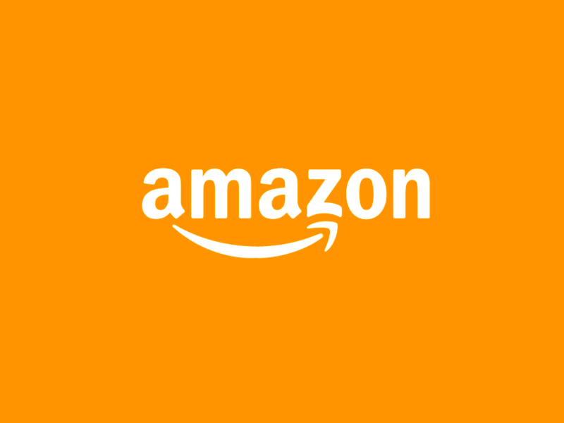
Amazon.com’s logo is definitely one of the most recognizable graphical icons in the world; the Amazon icon is built around two simple symbols — a lowercase letter “A” in bold black lines and an arched arrow resembling a smile under it. The curved orange line reminds people of a friendly smile, and the company managed to use this symbol to the maximum, making a legend out of simple lines. Amazon founder Jeff Bezos’ intention was to avoid additional expenses on branding elements, like package design. Then designer Turner Duckworth suggested using only a smile in the design, turning ordinary boxes into smiley ones. This decision turned the packages into a marketing tool and allowed the company to claim it was delivering smiles to the door. The impression is enhanced by the color orange, which is associated with friendliness, warmth, and joy. Amazon also has a charitable affiliate, Smile, which donates money to those in need.
It is important for companies to create their logo around their branding, how the company works, its targeted audience and its needs. This is exactly what Amazon has done with its logo. The addition of a good and meaningful slogan as stated:
“Work hard, have fun, make history”
—Amazon company slogan –
Through the times, the logo has been working because it is very simple and memorable at the same time. The logo became so effective that it makes people think of Amazon instantly and memorize the company just by looking at the logo itself. As discussed above, it also transmits a great understanding about what Amazon has to offer, which is everything from ‘a’ to ‘z’ and that the company will make sure its customers are happy with its service. Also the colors have really attributed an important value to the logo’s message. This ideology has been perfectly represented by Amazon’s well designed logo. This is also very important and it can be used as an interpretation of what to expect of the company itself. In Amazon’s case, the smile achieved a double meaning when the company started the smile program. This means that not only does the company work to keep its customers happy, but it also donates money to various charities. This is an excellent marketing strategy Amazon has. No one knows what the future holds for the Amazon logo, which has to be seen how. And if it will change as the company continues working to guarantee and improve its overall customer service excellence standard. At the same time continue to show Jeffrey Preston Bezos’ hard working, optimistic attitude to humanity by always believing in his technology-entrepreneurial extraordinary dream and make a big difference in the world’s history:
“If it is a sign of an e-world yet to come, a place in which technology allows all of us to shop, communicate and live closer together, then Jeff Bezos has done more than construct an online mall. He’s helped build the foundation of our future.“
“It’s still Day One for this country, and even in the face of today’s humbling challenges, I have never been more optimistic about our future.
Works Cited
The internet: Amazon.com reader of the month – ‘The Old, the New, and the Future View.” by Rosenfield, James R. Direct marketing 62.2 (1999): 44–. Print.)
“Manugistics Chosen By Amazon.com.” PR newswire 2000: 4719–4719. Print.
“Resources for designers and web developers” https://www.designyourway.net/blog/graphic-design/amazon-logo/
https://1000logos.net/amazon-logo/
Really good logos explained : Top design professionals critique 500 logos & explain what makes them work / by Margo Chase … [et al.].
“Jeff Bezos: The Force Behind the Brand” by JR MacGregor CAC Publishing LLC 2018: 264 – 265. Print
“One Click: Jeff Bezos and the Rise of Amazon.com” by Richard L. Brandt Portfolio/Pinguin (2011): 104 –. Print.).
Smithfield, Taylor. “In So Little Words: Telling A Story With Your Logo.” Shooting Industry 63.1 (2018): 24–25. Print.
– TIME Magazine. 12/27/1999, Vol. 154 Issue 26, p50. 6p.
–IT’S NOT A COINCIDENCE THAT AMAZON WAS BORN IN THIS COUNTRY. Periodical Vital Speeches of the Day. Sep2020, Vol. 86 Issue 9, p 223-227. 5p., Database: MAS Ultra – School Edition Subjects: WASHINGTON (D.C.); BEZOS, Jeffrey, 1964-
Other sources:
Logo life : Life histories of 100 famous logos
The Everything Store: Jeff Bezos and the Age of Amazon – Audible version
https://www.aboutamazon.com/news/how-amazon-works/creating-a-trustworthy-reviews-experience
https://www.aboutamazon.com/impact/community/amazonsmile
https://www.adforum.com/interviews/design-plus-how-turner-duckworth-creates-the-unmistakeable.


