Category Archives: Assignment submission Links
Hundred_Words_Description
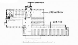
LIBRARY DIAGRAMMING
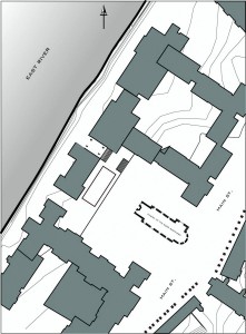
CIVIC SPACE ANALYSIS
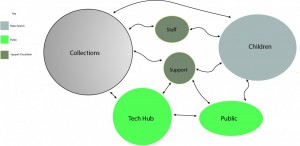
Bubble Diagram
Civic Space Analysis
Assignment J
I h
Here is the link: https://openlab.citytech.cuny.edu/jwilliams-eportfolio/academics/courses/design3/
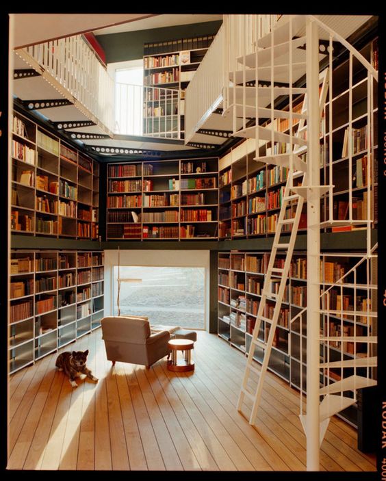
Image 1 : The exterior walls are used as book shelves. There is minimum openings for light. Its a double height ceiling but creates a second level like where the floor is around the edges of the room creating a opening in the middle to look down. Uses comforting material like wood floors and the walls a calm dark green but the flooring for the second level & stair is a white. Even though white usually gives a sense of purity, I think it brings in chaos. It actually is a kind of color block and is shocking to the eye. Where the openings are, since the room is at an angle it would make sense that the shelfs where along the interior walls because the light barely grazes the books not cause damage.
Image 2: A large amount of transparency, which would not be common for a library due to damaging of the book .It must be located on the northeastern or northwest side. Due to not have an issue of solar radiation or shading the shelves are placed in the floor plans instead of the exterior.
Image 3: The structure within the building is used as shelfs. Openings/slots were created to put the books. Its like a way of connecting the circulation with the program . Where it works simultaneously. In this picture it doesn’t look like its much of the whole building being a library. But incorporates it in a vertical stage between two levels. Makes it feel like a place to you relax. It also brings a feel of relaxation through the material of wood. It looks like a structure that was added into the building to kind of create a separation of maybe programing.

