https://acrobat.adobe.com/link/review?uri=urn:aaid:scds:US:cdf81cbc-d2a9-3360-97d7-b6bf8f4b12f2
Sixteenth Journal: Internship Review Final Week
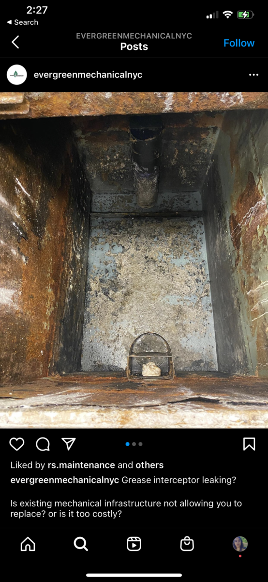
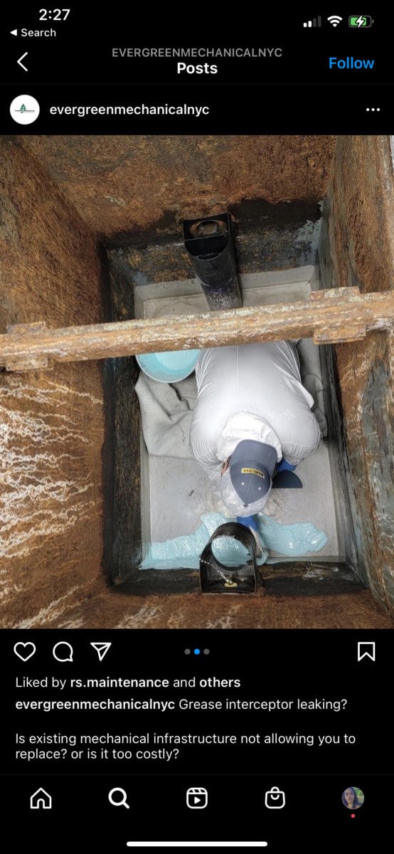
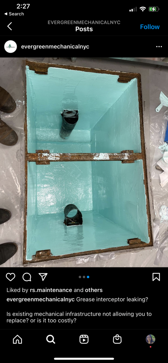
After finally coming to an end at the internship, I was a little disappoint that I didn’t get to do much design work. Coming up to the final days of, I was approached by Shianne Velez and asked to upload some photos onto their instagram page. They didn’t want anything fancy just to upload the photos and write a caption. I was given three photos so I decided to create a carousel so people could swipe through instead of individually. Even though I didn’t get to design much I did learn a lot on what it takes to run a small business. It really takes a great dedicated team that can keep a business from floating or sinking. At Evergreen you could really see the love and dedicated the employees have for the company which is why they continue to succeed. I was offered a position to work there officially but I politely declined because I really want to find a job in the design industry.
. 
Fifteenth Journal: Internship Review
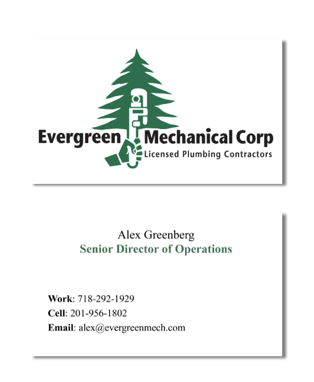
In the second to last week of my internship at Evergreen Mechanical Corp when Anthony asked if I could create a letterhead and business card design for the employees and company. They were currently using Microsoft word for the letters. Keeping in mind what the owner said, I decided to not do anything design crazy and go for a very minimal and simple design, that I felt like the owner would approve of. Using the logo, I removed the words and placed the logo mark on the back of the letterhead if they needed to print them out and a simple header centered at the top of the page. For the business cards I placed the logo large on the back and keep the important information on the front. They were very happy with the design and stated they will use it in the future which I was really excited about.

Fourteenth Journal: Internship review
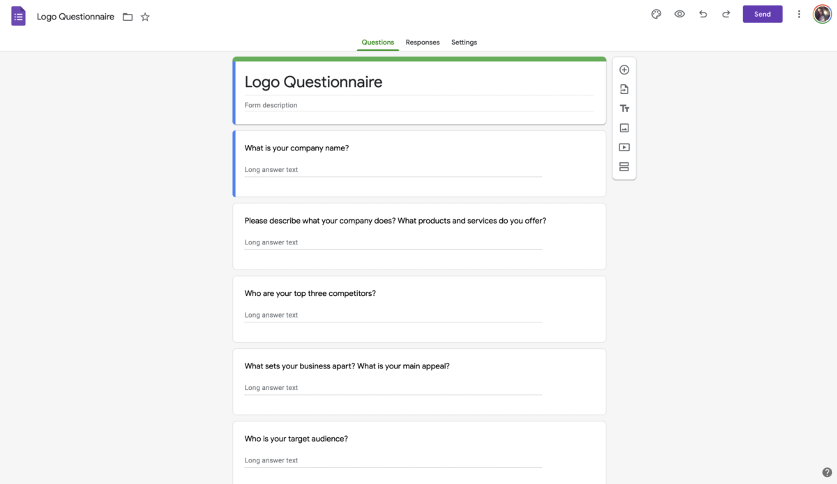
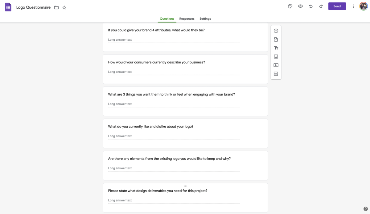
After the initial meeting with the office managers. I was really excited to start creating a rebrand to their company’s identity. I created a questionnaire to get a better understanding of what they wanted their company to showcase to the word. Unfortunately the following week, the owner of the company informed me that they didn’t want to go through with the rebrand and feel its better to stick with the original logo. I was a little upset and politely tried to disagree but the owner was not budging. I was asked for the majority of the internship to help around the office with filling paperwork like contracts and invoices. I also was asked to answer phones when the receptionist was on lunch.
This was the questionnaire I created for the company rebrand.
![]()
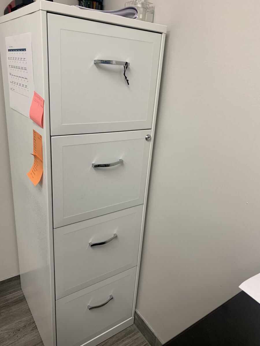
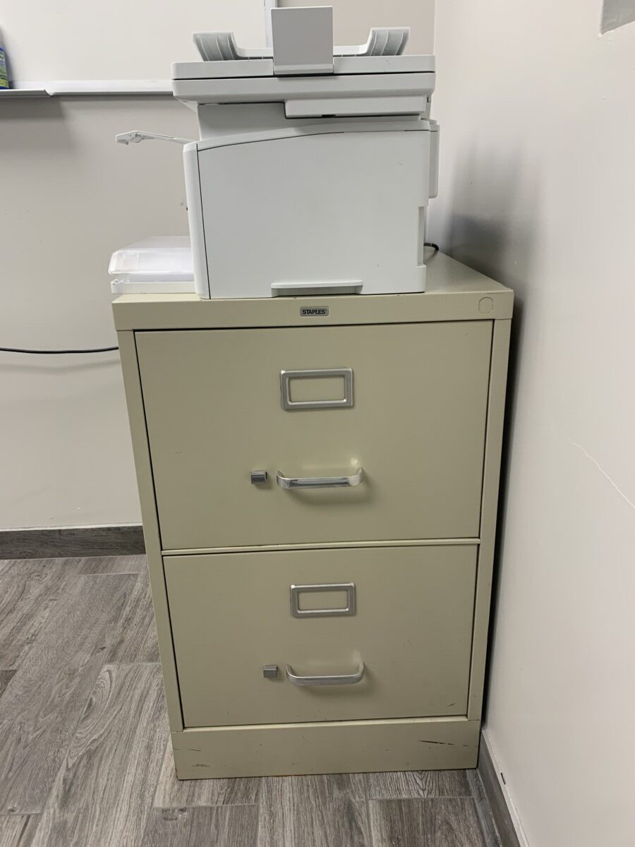
These are the filing cabinets that I would store invoices and contracts.
Thirteenth Journal: Museum Trip Part Two
After seeing the exhibit with the class we were able to branch off and see some other exhibits. I walked around a little bit and stumbled upon the Shell and Resin: Korean Mother-of-Pearl and Lacquer exhibit. It showcased the thirty works of Korean lacquerware and its long and rich tradition in Korean Art. The pieces are arranged by motif to illustrate the technical and aesthetic development of that particular art form. They also arrange to show the similarity in Chinese, Japanese lacquers. There were many cool pieces but I remember these sticking out to me the most.
.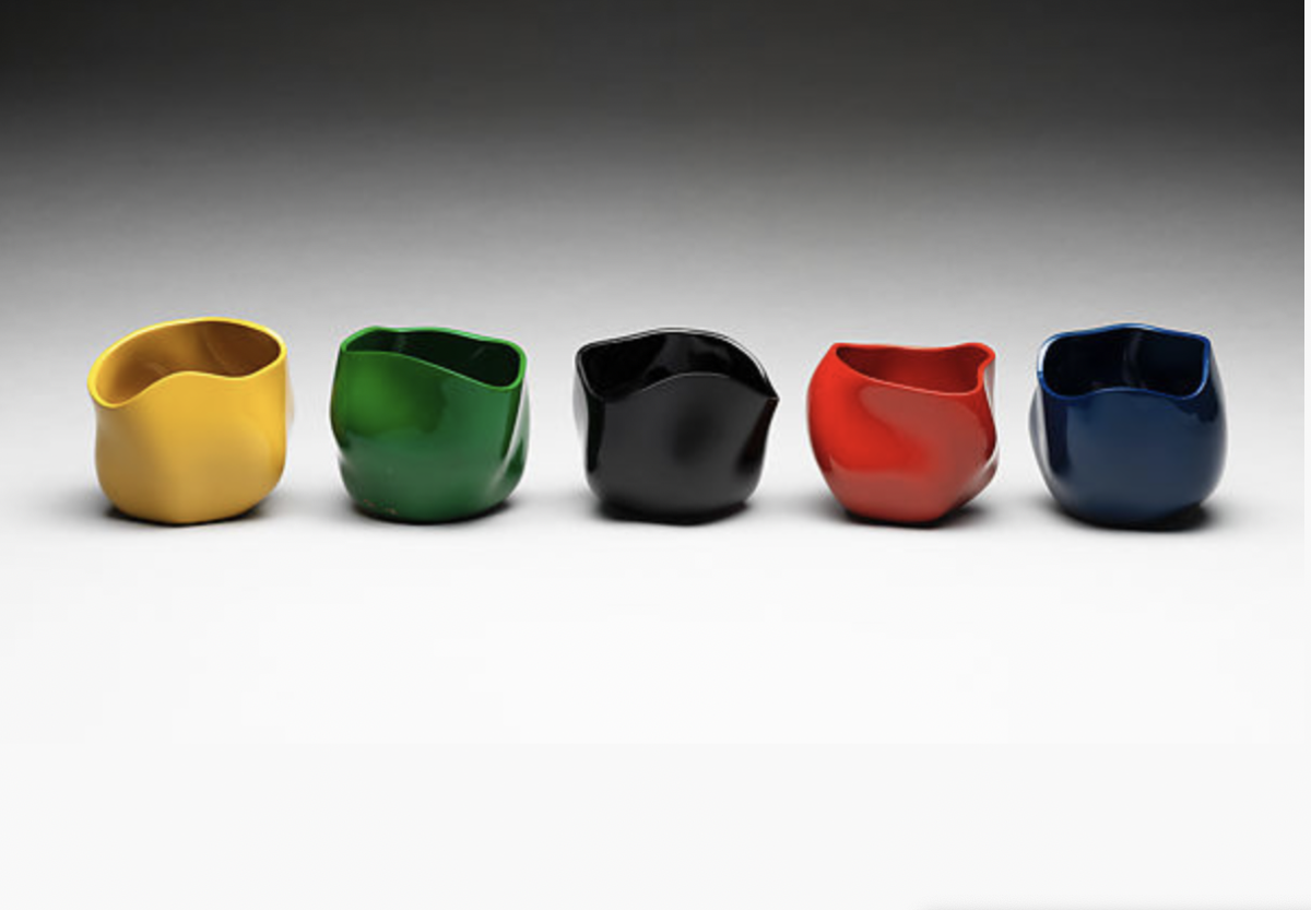
Korean. These five vessels relate to the traditional color spectrum obangsaek and connect to the cardinal directions and the five elements that are the basis of East Asian cosmology. The elements are white (west, metal), black (north, water), yellow (center, earth), red (south, fire), and blue (east, wood). Lacquer is naturally a deep reddish brown, it cannot be rendered white; so in this piece artist, Chung Haecho substituted white for green.
They had a video of Chung Haecho creating these pieces that I thought was so intriguing to see. I remember watching the video twice,.
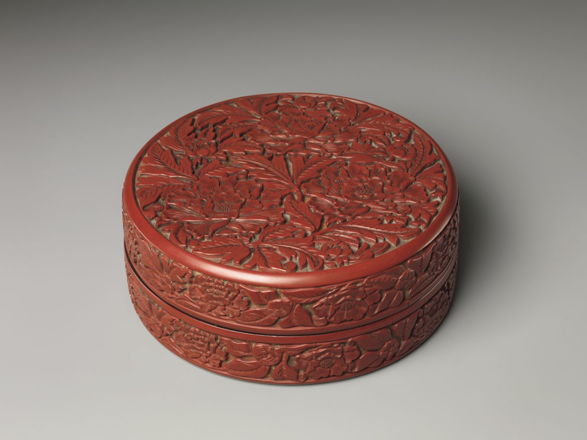
Chinese. This technique of carving lacquer was developed for Chinese lacquerware. This kind of carving is not found in Korean lacquer, for which inlay was the preferred decorative method.

Japanese. This piece is part of a set of thirty trays with matching basins that were sent from the Kingdom of Ryūkyū to the Qing court in Beijing at least three times during the eighteenth century. The dragons chasing a pearl at center have five-clawed feet, indicating that they are imperial symbols. It is made with thin pieces of mother-of-pearl chosen for its bright colors, the dragons feature heads disjointed from the rest of their bodies, a characteristic of Ryūkyū lacquer.
Twelfth Journal: Metropolitan Museum Trip
We had a class trip to the Metropolitan Museum to see the Before Yesterday We Could We Could Fly. It was an exhibit about Seneca Village, a thriving black community where the Met and Central Park now stand. I was previously aware of Seneca Village before this exhibit but it was really cool to see what a home looked like in that era. It was always something I’ve read about but to actually see it was quite surreal. It was such a beautiful designed room that made you feel like you were actually in the room. I also though it was really cool that the Met acknowledged that their building stands where Seneca Village was and taken away to create Central Park
. 
Eleventh Journal: Creative App Review Two
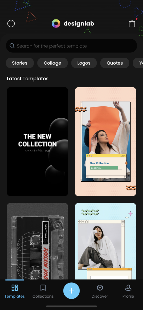
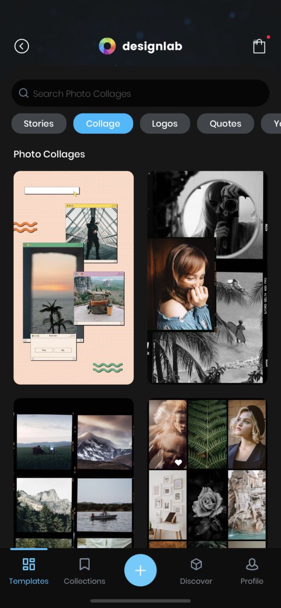
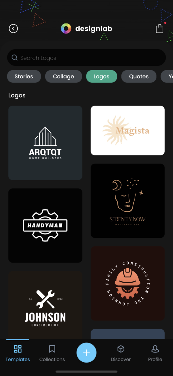
The second app I reviewed was called Design Lab, an app to use to create logos, collages, instagram stories and so much more. They have a free version and a paid one. The free one still offers a lot of option in case you don’t feel like paying for one. They have a ton of layout to choose from that you can manipulate to make your own. Your also able to add your own images and place graphics on them. It’s a easy app to understand and go through. I found an image on unsplash.com and added some cool simple graphics on top. I though it was a really cool app to make some super quick graphics in a hurry but also its a cool tool for someone who doesn’t know how to use the harder apps like adobe programs. It does reminisce the website Canva but I do like this layout and color palette a little more.
. 

Tenth Journal: Creative App Review One
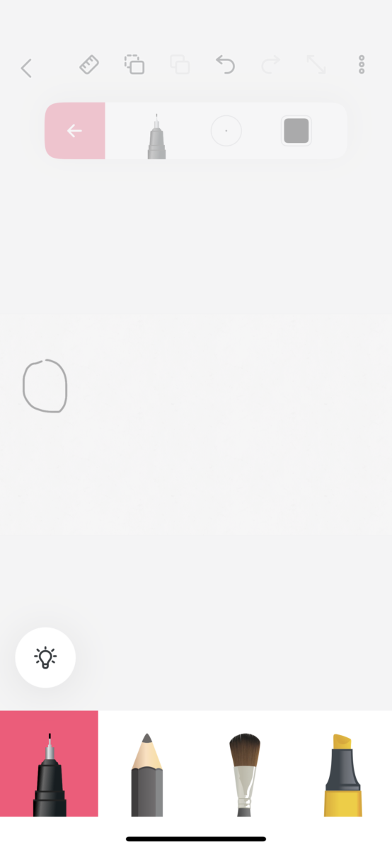
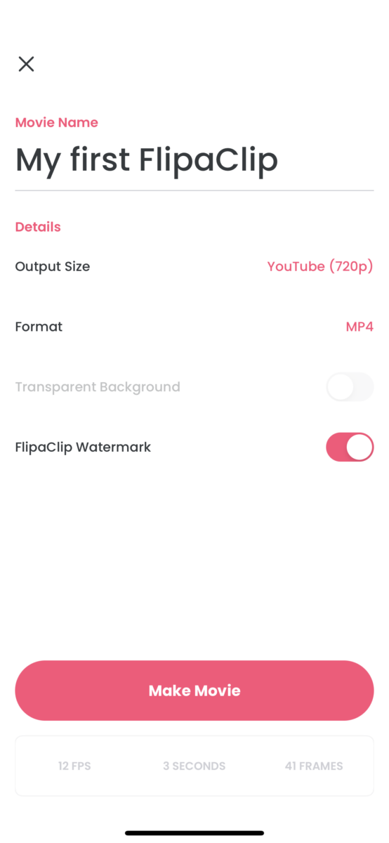
The first app I choose to review is called FlipaClip, which is an app where you can create 2d animation in a few minutes. I’ve always been terrified of animation because its not my strongest suit. The app opens with the option to watch a tutorial video or go straight into the app. I watched the tutorial that was only about one minute and pretty easy to follow. I made a super simple gif of a ball bouncing up and down which was fun to see come to life. Playing in the app some more, you’re able to add fun 2d graphics to videos already made. They have 4 different styles of pens and brushes and colors. You can add music and text to your animation or video. You have the ability to add a photo background and draw on it. It has the options for purchase in-app purchases for things like removing the watermark and to create a larger video. After you’re able to play in the app there is a section where you can add animations to videos that have background audio to follow. You can copy and paste the character into the scenario you created. Overall it was a very fun app to use especially for people who aren’t well versed in creating animations.


Ninth Journal: How to Build a Business Networking Event.
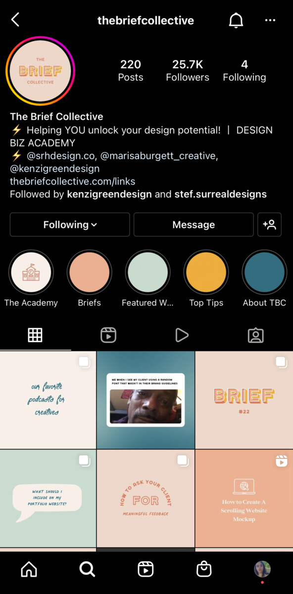
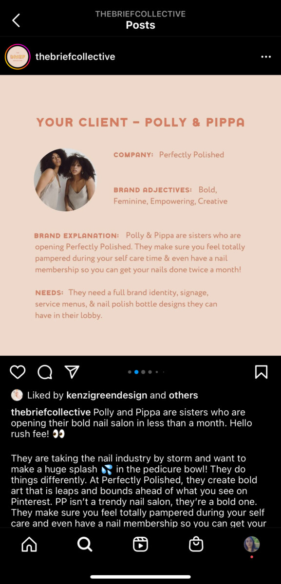
I follow a page on Instagram called The Brief Collective, where they create pretend briefs for designers to create brand identity’s in order to keep their creativity alive. It’s also a way to add more pieces to our portfolio’s. They were holding a webinar on steps to take to start your own design business. They started with a presentation and then followed with a q&a. It was very enlightening seminar about how the founding members started this page and how they started their joint business. They spoke about how they were able to go from charging $100 for logo’s to charging $10,000 for a complete brand identity. In the q&a portion people were able to ask specific questions about building a business. They were very informative which was nice because I feel sometimes with these webinars they always try to plug something. Even though they did speak about they’re academy that people can sign up for, it wasn’t forced down our throat. I continue to follow the page and finally have the time to participate in their briefs.
Eighth Journal: Office Environment
The office space for Evergreen Mechanical Corp is quite small. There are three people that sit right up front when you walk through the door. Then to your left there is the bathroom, which is just a unisex room. Next is the kitchen area. Towards the back there are 5 private offices but one doesn’t really get used because the plumbers are always out on the job. I worked mostly in the receptionist office which was the second biggest from the boss. The attire is business casual which is great because that’s what I enjoy wearing the most. We were allowed to wear sneakers and jeans as long as it had a business aesthetic to it. Lunchtime varied depending on how the day went. Sometimes it was 12pm and others it was 1pm maybe 2pm but people are allowed to eat snacks from the kitchen area if we wanted. Anytime they needed to communicate with me, they would just walk to my office area and speak with me or email me.

