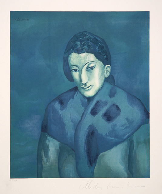
I saw the exhibition called “Blue” at Nassau Museum and it seemed very interesting to me how the artists have made their artworks based or the main element was the color blue. There are some of the artworks of the exhibition. The first artwork is “Buste de Femme” (1902) by Picasso.
In 1973, after Pablo Picasso’s death, his granddaughter Marina authorized the printing of these original lithographs. There are more than 500 printed on first quality arches paper of this artwork. I see in this artwork a humble woman could be a housewife or a model with an expression of sadness or suffering. Also, the blue color that it has in almost all the artwork it adds a touch of sadness. I find interesting and well dome work the different shades of blue in this artwork.
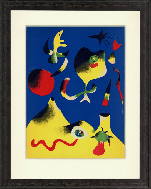
Another artwork is “L’Air” by Joan Miro 1937 Verve.
Joan Miro (1893-1983) born in Spain, artist and writers, moved to Paris in 1920. His first solo exhibit was 1925 in Paris and 1930 in the USA. This lithograph was printed in paper 14 x 10.5 inch. I see this artwork as a happy artwork because it has various colors. Also, I see like the bottom of a part of the sea with rocks in the form of volcanoes with fish, algae with colors or it may be other forms. This artwork has different forms that are not defined or does not have a specific meaning depending on the public or obserber.
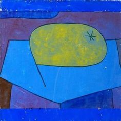
The third artwork that I choose is “Beulen Birn (Bulging Pear)”, Paul Klee, gouache, ex. Col. Ernest Hemingway.
Paul Klee (1879-1940) was a German and Swiss artist. He was a natural draftsman who experimented with and eventually deeply explored color theory. As the name says this artwork is a painting of a pear on a table or it can be on another surface. This artwork can represent loneliness or sadness because I see a lonely pear and it can be sad, also, the blue color gives it a touch of sadness.
Designer is a person who devises or executes designs, especially one who creates forms, structures and patterns, as for works of art or machines. Nowadays, we can see a lot of nice, cool, well done logos, posters, labels, and different products with a variety of typefaces, images and backgrounds around us. Each designer has their own methods, styles and they become more popular in our community. Some designers focus on a specific area like, cartoons, companies logos, covers and more. A famous typographer and lettering artist is Ephram Edward Benguiat and this research paper will be based on his life and his designs.
Ephram Edward Benguiat was born in Brooklyn, New York on October 27, 1927. He is an American typography and lettering artist and he has over 600 typefaces and designs, many created between 1970 and 1995. When he was nine years old, he was interested in the design of letters. His father was display director at Bloomingdale’s and he had all the drawing tools, when he was a little boy he saw those tools and he started to play with his father’s pens, brushes, drafting sets and learned about sign painting, showcard and speedball lettering. He received the usual education during World War II, he wasn’t old enough to join the Army service, but he was in the Air Corps and he learned to fly planes. He likes and enjoys flying his personal plane with his wife Elisa. Also, in 1961, he started teaching at the School of Visual Arts in New York and continues to work there. Some of his typaces and illustrations include Tiffany, Bookman, Panache, Souvenir, Edwardian Script and the eponymous Benguiat and Benguiat Gothic. Also, he designs or redesigns of the logotypes for Esquire, The New York Times, Playboy, McCall’s, Reader’s Digest, Photography, Look, Sports Illustrated, The Star-ledger, The San Diego Tribune, AT&T, A&E, Coke, Estee Lauder, Ford and the logotypes for the original Planet of the Apes film, Super fly, The Guns of Navarone and Stranger Things. Also, he became typographic director at Photo-Lettering and he was inducted into the Art Directors of Fame in 2000.
There are some of his popular typefaces and some of these typefaces some companies use as logos. ITC Avant Garde Gothic typeface is geometric sans serif design, basic shapes appear to be constructed form circles and straight lines. Herb Lubalin and Tom Carnase based their 1970 typeface on Lubalin’s logo for Avant Garde magazine.
In 1974 Ed Benguiat was drawn and in 1977 Andre Gurtler designed the obliques.
ITC Benguiat typeface, is long and finely extended line terminals that harmonise perfectly with the taperin serifs. The original had alts for ‘A’ and ‘M’ and various ligatures which are not available in today’s digital version, designed in 1977 and released in January 1978.
Benguiat Caslon is an Old Style Serif typeface designer to be set in biglarge and huge sizes in classic TNT (tight-not-touching) Style. Ed Benguiat drawn for photo-lettering in 1960s, high contrast between thicks and thins, sharply tapering serifs. This typeface had different fonts as bold and ultrabold, and has two digital interpretations were used in 1970 and an extended version released by House Industries in 2017.
ITC Benguiat Gothic is a decorative serif typeface, released in 1977, has an arched bar in uppercase “A”, shaped lowercase ‘g’ and the inward curving stems of the capital “U” and is available in Book, Medium, Bold and Heavy fonts.
Benguiat Buffalo is a sans serif typeface, has dark markings on limbs, horns shorter than other subspecies, curve upwards, large, prominent ears, wide mouth, bare, moist nose and tuft on tail. Ed Benguiat designed in the early 1960s and created the original film version of Buffalo for Photo-Lettering partners. This typeface was digitized in 2004 by Donald Roos.
In 1967, Edward Benguiat designed logo or screen design for the New York Times newspaper, and worked with Louis Silverstein who was the director of The Times. He made it small letters and in different or no common letterforms which the nameplace is based in blackletter of Gothic, traced in the late 700s. This typeface is referred to as Gothic or Old English, and is characterized by a dense black texture and highly decorated caps. The lowercase are angular forms with dramatic thick-to-thin strokes and serifs.
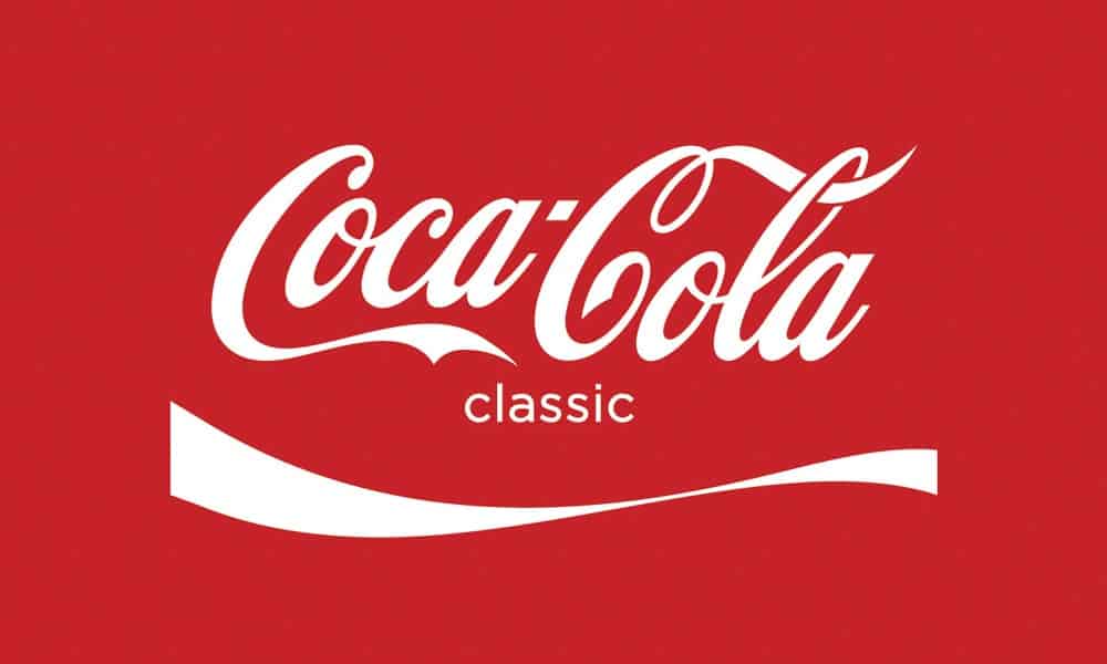
Coca Cola logo, the legendary typeface which name is “Elegy”,was designed by Ed Benguiat in the 70s and based on the original, hand letters of this Corporation In New York.This typeface is like a wedding dress, it looks like the purest of whites with flowing lace and long, lavish train, simply gorgeous.
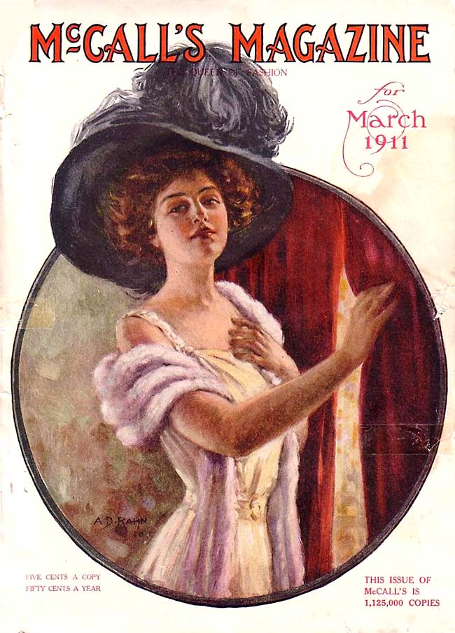
McCall’s was a monthly American Women’s magazine, published by the McCall corporation was popular in the 20th century. This magazine used on the front covers many of Benguiat’s typefaces because to the magazine designers liked those typefaces and thought that looked cool.
Benguiat Charisma Script typeface designed in the late 1960s by Ed Benguiat. Inspired in Candice, also, Gaston & Charade typefaces. It is his regular style of created typefaces, how he had some of his typefaces created was inspired by them or he got new ideas to create other typefaces with similar style.
Benguiat was a prominent jazz percussionist under the name Eddie Benart and played in bands such as Stan Kenton, Claude Thornhill and Woody Herman but he decided to choose a career as a designer or illustrator and created their interesting typefaces. Also, he was a member of the Alliance Graphique Internationale and a past president of the Type Directors Club. He received some recognitions like the gold medal for excellence in 1990, he won the prestigious Fredric W. Goudy Award and SVA honored him in 1995.
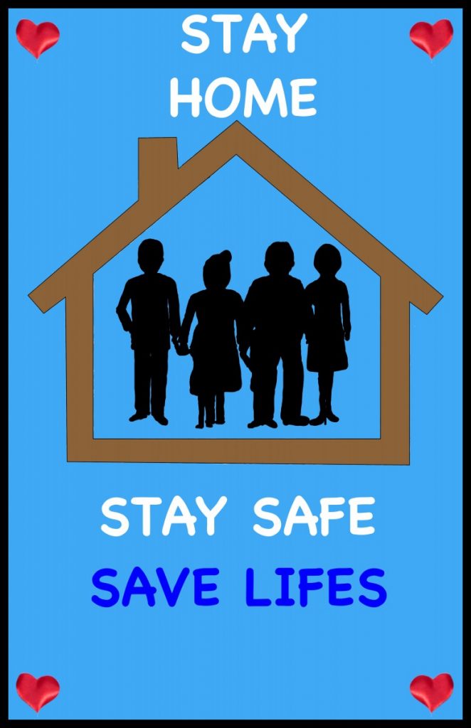
I made this poster in Adobe Illustrator. I decided to make this poster so that people gain awareness and know that it is very important to be at home to be safe and not be able to infect our family members who are significant in life. Nowadays, we are living with a worldwide pandemic called Coronavirus (COVID-19)
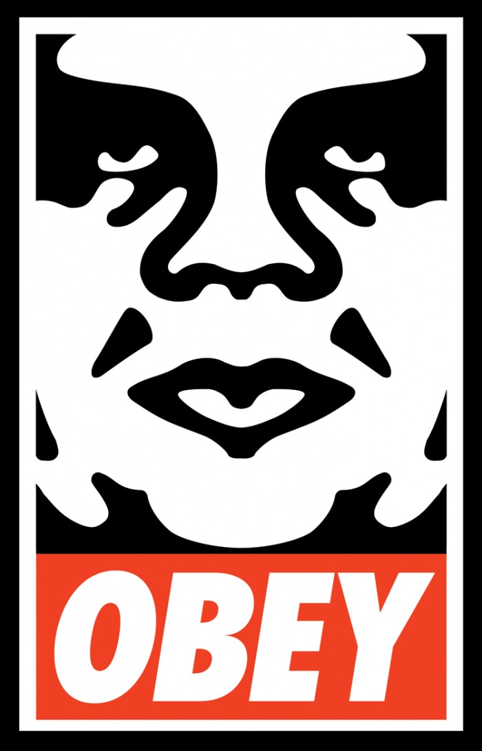
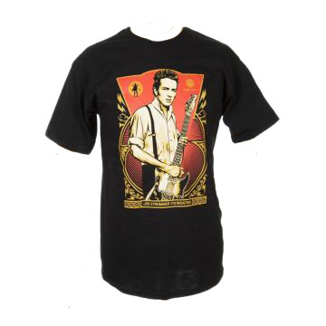
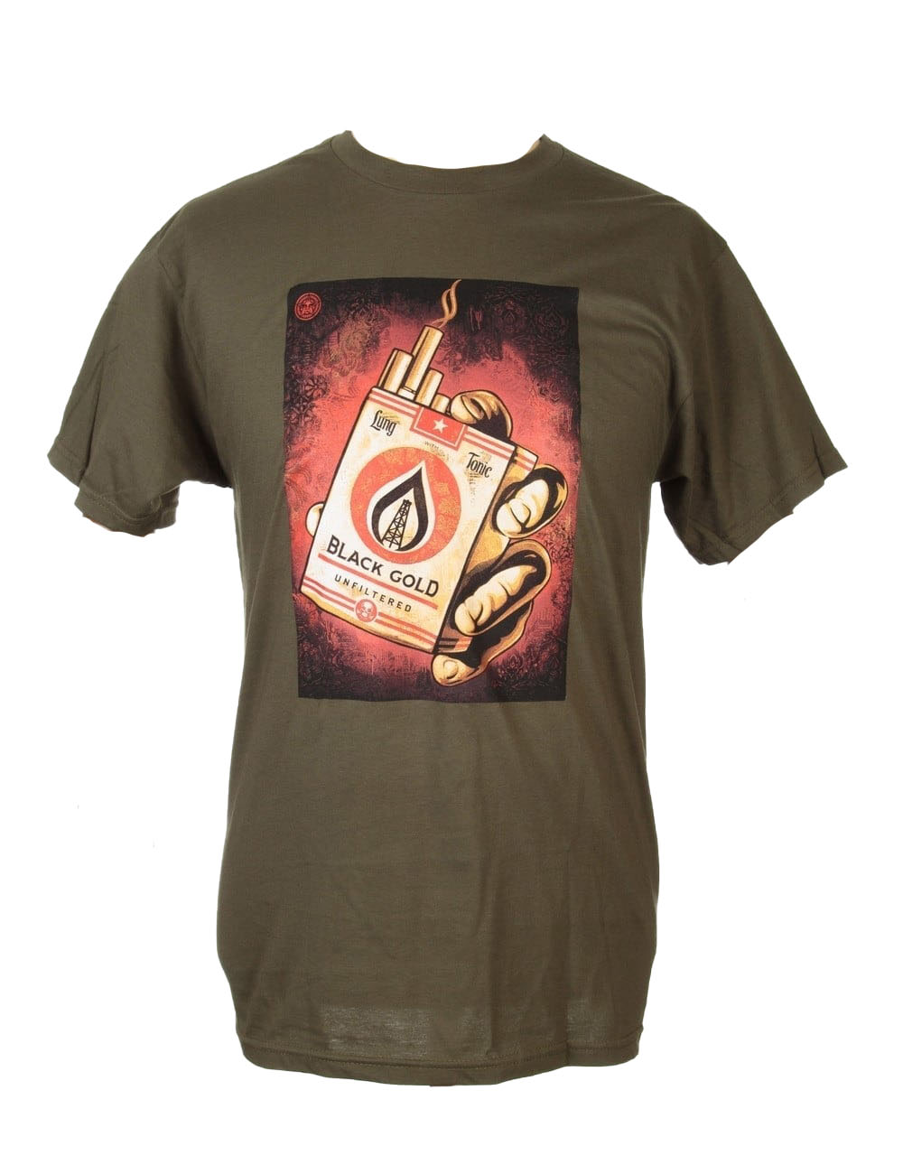
Clothing are the things that people wear to cover their bodies, typically made of fabrics or textiles or animal skins. Nowadays, clothing has different fresh, cool, nice logos and become more popular in our community. Each company creates and designs their own logos to identify their style in the market. A logo is the definition and presentation of a symbol or design for public recognition of a company or individual aid. We see many clothes from different companies and brands with their own logos such as Nike, Puma, Adidas, Obey and more. A famous mark of clothing is Obey and this research paper will be based on this prominent brand.
In the summer of 1989, Frank Shepard Fairey had a great idea that would innovate the future of clothing. He is an American contemporary street artist, graphic designer, activist and illustrator who emerged from the skateboarding scene. In some of his designs he included revolutionary and rebel figures such as Aung San Suu Kyi, Che Guevara, MAlcoln X, and Chinese soldiers, punk and rock music stars, Big Brother, Uncle Sam and the police. Also, he included peace, justice, equality, freedom, immigration reform, human rights, the Occupy movement and he designed the HOPE sticker for Barack Obama’s U.S. Presidential campaign in 2008. Shepard was born on February 15, 1970 and raised in Charleston, South Carolina. His father is a doctor named Strait Fairey and his mother is a realtor named Charlotte. He attended Wando High School in MT. Pleasant, South Carolina, and transferred to high school Idyllwild Arts Academy in Idyllwild, California, from which he graduated in 1988. After that he moved to Rhode island to attend the Rhode Island School of Design (RISD) and he earned a Bachelor of Fine Art degree, in 1992 from the same school of Design (RISD).
When Shepard Fairey was studying at the Rhode IslandSchool of Design (1989) he had a part-time job in a skateboarding shop and he was interested in the street art culture and graffiti movement. He created a silk-screened sticker in black and white color called “Andre the Giant Has a Posse,” which has over a million copies distributedaround the world. This sticker was inspired by an image found in a newspaper of the wrestler Andre Roussimoff, known as Andre The Giant and his height and weight, 7’4 and 520 pounds. Also, Fairey had an exhibit at New York’s holly Solomon Gallery about this sticker in a large size. After his exhibition that was organized by Paul Hitopoulos, who plans to bring more contemporary work, Fairey realised that he was very successful and that he caught people’s attention a lot, although that image had no meaning for them.
Some time later, in the same year Fairey made a campaign with this same image but he added the word “OBEY GIANT” or “OBEY” in red and white color. This campaign was successful and caused a lot of curiosity and questions about their relationship between the images and the word to the people who saw it because it was something innovative and not common in these times. People were not used to seeing advertisements with images and words togethers. In reality his work had no relationship or meaning but Shepard was related to the image of the wrestler as a symbol of courage, power and at the same time as frustration, anger and the word “OBEY” as obedience, expressing his idea as a sign of support to people who were abused. Although the word “OBEY” does not mean anything, it is just a word that he designed. This was a professional way to express his revolutionary ideas.
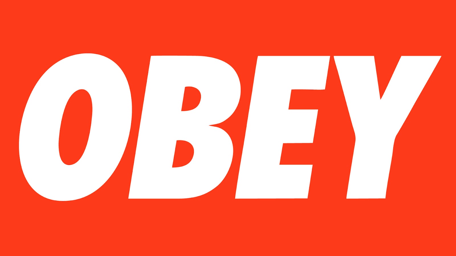
After a few years Fairey couldn’t use a permanent image on his campaign, artworks or designs as his logo. So, he decided to use only the word “OBEY” in white and red color as his logo or mark. Nowadays, we as customers can see this logo in different colors such as black and white, green and black, gray and black, green and white and more in different clothes like t-shirts, hoodies, caps, sweaters and more.
In 2001, after almost ten years since Fairey’s last museum show and independent street art, his line in skateboard-inspired clothing and international brand called OBEY was created.
Over time it became popular around the world and started to get stocked by some popular shops such as PacSun and Urban Outfitters. People of different ages liked this clothing style because it was a new and different style with nice, colorful and fun designs, especially the skaters were very happy because a clothing brand that is of their styles came out. From the beginning although this clothing line was not as popular as it is today, it has always hadinnovative seasonal trends and great collections such as pieces of leopard-print puffer jacket, laid-back graphic t-shirt in many colors, comfortable pants, cool caps and more. In this line clothing or company Fairey and his group of workers are only in charge of making the designs and logos of the clothes because Obey men’s is designed by Mike Ternosky which is a designer responsible for translating Shepard’s vision to Obey and Obey women’s is designed by Grace Lee which is the director of this area. Some Obey clothing is made in China and many of the items like jackets, jeans, hats and more are made in Asia because they are cheapest but the most of the clothes are made and printed in the U.S.
Nowadays, this clothing company has thousands and millions of really cool designs on their clothes around the world and continues to maintain the ideas of contemporary culture, rebellion, power and peace. Also, they use famous political activism, Hip Hop, Punk Rock and rebel figures to express a positive and peaceful concept or idea for the entire public or clients of different ages. As we already know as clients, in these times there are many competitions between companies that are innovating the market with very cool and fresh designs and Fairey with his clothing company keeps capturing the public’s attention with his new clothing collection every time he puts or takes out one on the market. Fairey has also made a name for himself in commercial branding designing different logos, advertising and propagandas for Mozill, Pepsi, Hasbro, Hennessy cognac, NASA and other companies.
My quote is “You are never too old to set another goal or to dream a new dream” by C. S. Lewis I chose this image because it seems true to me when we have a dream or target it is never too late to fulfill it. In my first visually enhanced quote I did this in Adobe Photoshop program first I looked for an image that has a nice afternoon with two people that is related with the quote, then I used Futura-Medium typeface to write the quote in brown color. I chose this image of a nice and bright afternoon with clouds and two happy older people and looking to their left side as if they are thinking of a goal or a dream and they will accomplish them together regardless of the time.
In my second visually enhanced quote I did this in Adobe Photoshop program first I looked for an image that has a forest at dusk, then I used Arial Rounded MT Bold-regular typeface to write the quote in light blue and white color. I chose this image of a dark forest as a symbol of life.
This image represents the ways of life, the obstacles and difficulties that we have to go through in life to realize our dreams. Also, represents the different days that we spend in our lives as good days, not so good days and bad days. Nothing is easy in this life but not impossible.
In my third visually enhanced quote I did this in Adobe Photoshop program first I looked for an image of the Northland mountains with a colorful sky, then I used Chalduster-regular typeface to write the quote in white color. I chose this image because it is a peaceful, calm and beautiful place. It would be a perfect place to have a calm life and to be able to realize all the dreams that we set ourselves but reality is different and we have to have belief, be strong and never give up to be able to fulfill what we want in our lives.
Nulla quis lorem ut libero malesuada feugiat. Curabitur non nulla sit amet nisl tempus convallis quis ac lectus. Quisque velit nisi, pretium ut lacinia in, elementum id enim. Nulla porttitor accumsan tincidunt.
Reflection
Donec rutrum congue leo eget malesuada. Curabitur non nulla sit amet nisl tempus convallis quis ac lectus. Curabitur aliquet quam id dui posuere blandit. Quisque velit nisi, pretium ut lacinia in, elementum id enim. Quisque velit nisi, pretium ut lacinia in, elementum id enim. Nulla porttitor accumsan tincidunt. Vivamus magna justo, lacinia eget consectetur sed, convallis at tellus. Vivamus suscipit tortor eget felis porttitor volutpat. Mauris blandit aliquet elit, eget tincidunt nibh pulvinar a. Vestibulum ac diam sit amet quam vehicula elementum sed sit amet dui.

 Benguiat Charisma Script typeface designed in the late 1960s by Ed Benguiat. Inspired in Candice, also, Gaston & Charade typefaces. It is his regular style of created typefaces, how he had some of his typefaces created was inspired by them or he got new ideas to create other typefaces with similar style.