
Target as a company has a very rich and extensive background when it comes to their bullseye logo. The company was founded in 1903 in Minneapolis Minnesota. The growth of the company was slow and steady. However, through years of marketing and developing their brand they eventually grew to this large corporation that became part of the Fortune 500. Of the main contributors to Target’s success were their marketing strategies and their iconic logo.

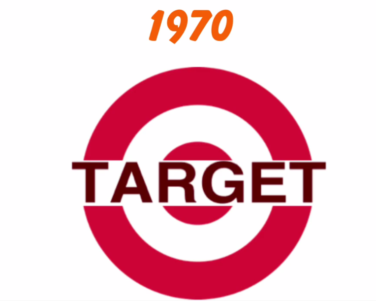
The first Target logo was developed in 1962 and it’s layout primarily consisted of a faded red ring around in a circle to signify the dart target board with the word “Target” in a serif font. The Target logo was a clever marketing strategy to have a simplistic easy to digest logo that is easily identifiable. Target wanted to have logo recognition with their marketing and having a simple design worked for the company as a whole. The target font felt like a more elegant yet bold stand out.
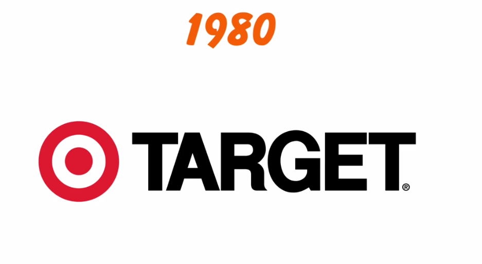
Target’s second logo came after 10 years and their goal was to update the font and change the hue and saturation of their original design to make it more appealing to the eye. The original had glaring issues in its design, for example the multiple circles were too disorienting for the consumers, also the Target font seemed to obstruct from the design of the target logo itself. So as a result the company decided to incorporate the font with the logo itself still keeping the target theme but changing the font type and size. The type of choice was a san serif font with smaller type to fit inside the target logo itself. This move helped to familiarize the consumer with the brand as a whole through the logo.
The final logo was chosen after another 10 years of the company solidifying itself with the general public .Target separated its logo icon on its own occasionally having the text next to it. The Target icon remained consistent while the font of the logo changed over the years to reflect the times in the company. The bulls-eye symbol represented achievement and destination and something to always aim for. The Target brand made sure it was able to keep the company’s core values while changing the look and feel of the brand to fit with times associated with it.

