Blog 1
I have been looking for internships using indeed and figuring out the process of creating my resume and portfolio. The first couple of design internships I did apply for were Calling all Graphics; which did decline me because I didn’t have motion graphic experience. My main goal for this week was updating my resume and working on my logo. I wanted to give a more detailed look at the design and what exactly worked and what didn’t. I also spent time in my portfolio class working on my logo and making sure that it represented the idea of comfortability that I wanted to exemplify in my overall aesthetics.
Later into the semester I do intern for the PDC or the Public Development Center. The PDC is in New York City College of Technology on Jay St . The PDC is a public company. An educational institution that helps students develop their professional profile. A high-quality college education for students. The university has customers of students and Stakeholders, Primary clients, first-generation students, adult learners. They have resources for students in continuing to develop their professional profile. The PDC was created in 2015. I work as a graphic designer for the company.
Blog 2
This week is all about getting to know my strengths and weaknesses. I spoke with Tanika who is my employer about expectations and understanding my schedule. Monday, Wednesday, Thursday are finalized however Tuesday and Friday still need to be discussed. We spoke about Andrea’s Ideas and also the Intro to Handshake explanation pdf. I did some rough sketches for the work. I worked on three out of the four concepts to better simplify the PDF. I research Pinterest and on google for design ideas. We also spoke about the design guide. I spoke to a previous design intern from 2019 who work with IHeartRadio.
Blog 3
Today I had a meeting with both Tanika and Andrea about the future of the class. I spoke to them about my process and they spoke to me about their expectations. The keywords of importance we spoke about in the interview were Build Confidence in my Value, Critical thinking and Complex Problem Solving. I worked on a detour project about Career Week that is due Thursday. I worked on a rough concept design of what I thought could work. Learn to defend thoughts on my work respectfully and honestly. I spent time progressing my portfolio. The names of the speakers are important. I have to learn how to hook and grab audience with my designs
Blog 4 (Networking Event 1)
My networking event was going to a PDC event discussing resumes’s. During the event there was a discussion about what makes a good resume. When discussing the qualities of what makes a good resume we spoke about catering your resume to the job you are going for. Also making sure your skill set matches the job requirements. I asked questions about having more than one resume and also explaining what the are key search terms? During the explanation they stated that when job scouts are looking over applications they would search up key terms that you may have on your application that they would be looking for. For example if you are a graphic designer you would want your experience and skill set to reflect what your are proficient in. You would also want your abilities and experience to match the job requirements.
Blog 5 (Networking Event 2)
My second networking event was going to one of the career events during my internship and learning what the 8 Competencies are when going forward in my professional career which were critical thinking, oral and written communication, teamwork, technical application, leaders, career management, professionalism and work ethic. I started to apply what they were speaking on to my own situations and figuring out which of the 8 competencies do I excel at and which I need work on and improve. After looking it over and really analyzing my skills, I realized that i excelled in critical thinking and technical application and professionalism but needed work on everything else, especially Communications
Blog 6 ( Ethics Response)
When looking at Shepard Fairey Copyright Case and comparing the two photos of Obama it was hard for me the judge the differences of the photo vs the design. On one hand it is an exact shot for shot recreation of Barack Obama’s face and facial expression. In terms of the subject that the design was made from there was no discernible changes to the way the layout was set up. However, although the posture and facial expression didn’t change the design of positive and negative space help to amplify the design to something more than just the photo. It captured a level of longing and progress with the hope tagline that was needed for the time during Obama’s election.

Blog 7
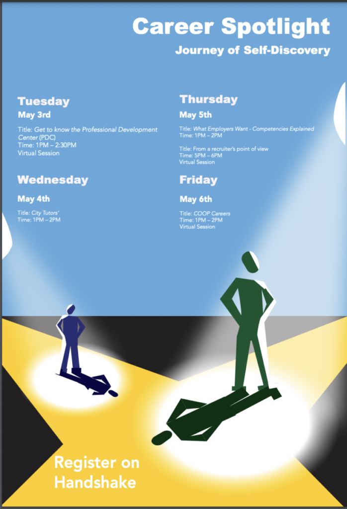
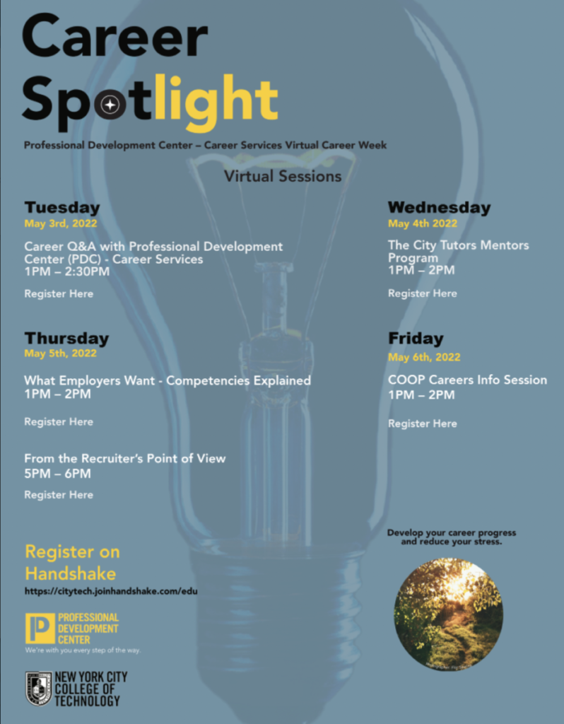
I sent my email to professor for Friday asking about schedule shift for internship. I edited the handshake logo and added the body copy from the handshake pdf. I got feed back for the career spotlight and the handshake. Simplify text more. Give a call to action for Career Spotlight. Feels flat make it feel more alive and make the characters more ambiguous. Ideas Back of the head in foreground but background gives to spotlights that hide in shadow. Grab audience and it feel more inviting for the audience A little bit of the Grammy style event more exciting.

Blog 8
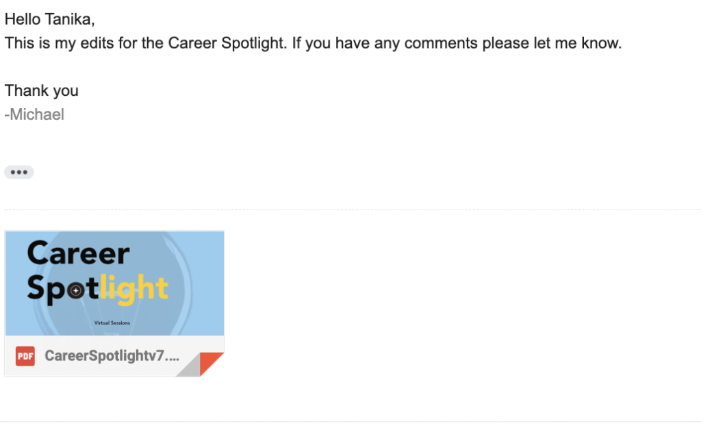
I worked on the Career Spotlight assignment. I worked on cleaning the Graphics for handshake. I made a totally new graphic based on peoples feelings on a new career path with Career Spotlight. I spoke to my mom about my future. I spoke to Tanika about future options. I sent an email talking about my future for internship.

Blog 9
I sent an email regarding trying to work out my hours for the rest of the semester. I also worked on both the handshake guide and the career spotlight as well. I made sure to make the changes that was told of me and make it clear there are two paths to take for the design I needed to make more changes for the weekend.
Blog 10
I worked on my career spotlight hopefully finally for tomorrow going to give my links to embedded them and then I will be finished. I now need to come up with a new project I can do in a feasible amount of time. I have to consider the option of an incomplete. I have to understand that it’s not just about completing the time requirement but also make sure I am taking something away from the experience as well.
I was finished done more motion graphic design. I spoke about how to reach students more with Andrea. She stressed the idea that most students have the mindset to just survive college when that shouldn’t be the mindset at all. Do more than just survive and thrive. I was given notes about the design Signing into your future. Gradual change to grow from college. Experience more than just the bare minimum. Blossoming to something greater.
Blog 11
I am working on motion graphic design. I made some sketches for the work. I also spoke with my professor about prioritizing my work schedule. I continued to work on the sketches and put the sketches into Adobe After Effects. Andrea could not open the file so I must make a different file. I also helped Andrea with a quick photoshop work for the PDC website. I spoke to Tanika about possibly taking the incomplete because I am bad about communicating. I got satisfactory for my midway evaluations. I need to speak up about questions and things I need clarification on. They did not like the handshake work. I worked on some more of the Motion graphics and made sure I asked specific questions about the piece to get the best work possible.
I got some notes on things to change for the motion graphics. The clarity of the work is poor because of the reduced file size coming up with a solution. I made sure I made the changes that she told you to make. I need to make sure the first couple of changes were attention-grabbing. I did work for the animation. I made sure to work on the timing and the music and clean any graphic movement that was a part of the design. I also seperated the work into 2 parts.
Here is the Beta Version
Here is the final piece
Blog 12 (Review of App)
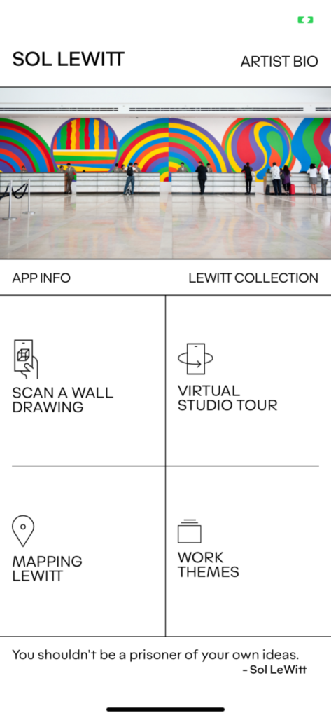
The two apps that I wanted to focus on was the Sol LeWitt app as well as the app called Procreate. First I wanted to talk about the Sol LeWitt app which consisted of an in depth look at the artist Sol LeWitt and his art collection that kept in mind the pandemic and found a way to do a virtual tor of his art. I personally wasn’t a fan of the the way the app decided to the art gallery. As a whole the app was clean and the visual presentation was stellar but the user interface and some of the features did not feel clean in my opinion.
The second app I chose to focus on was Procreate I feel like it most versatile for anyone who wants to get start with digital design. The interface and clean and clear finding things to play around with is wonderful. I use the app a lot for my art work and it really helps with stabilizing shaking hands and figuring out shortcuts to make sure you making exactly what you want to make.
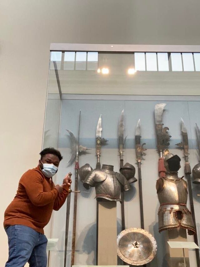
Blog 13 (The Met Field Trip)
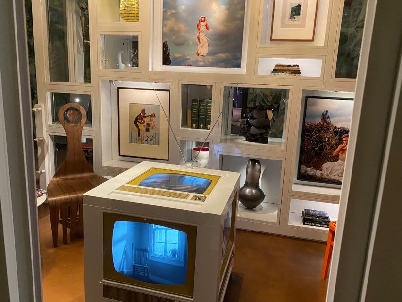
When I went to The MET there were only two art pieces that stood out to me was the surreal video that was playing and this medieval glaives that looked amazing. The video was called OUT / SIDE OF TIME which was in the living room the four videos one every side of the television depicting a a black Nigerian family in a very western societal American family way. It felt like the theme of juxtaposition of the Harriet Tubman in a pristine vase that a rich European Acolyte may have on their person is almost uniform in this video. This otherworldly and cosmic element made it feel rich in lore and scope.
Now the second thing that caught my was these assortments of glaives which I had to stand next to for scale. The reason why I was so interested in this piece is because I play a game called Dungeons and Dragons where I play this big goliath man who carries a glaive similar to the ones on display. It really put into the perspective the size and sheer power the weapons I imagined in my head were in actual tangible space. Never in my wildest dream did i believe any normal can wield this weapon effectively without having superpowers. It was truly awe inspiring.

Blog 14 ( Podcast)
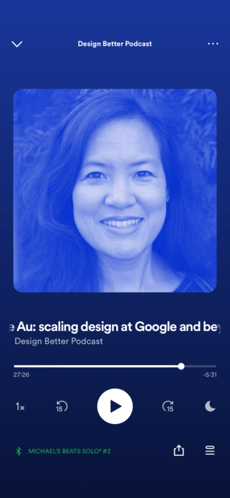
The podcast that I listened to was a podcast called Design Better Podcast and this episode was about scaling design at google. The person who spoke on this podcast was Irene Au she is a Design Partner at Khosla Ventures; Adjunct Lecturer at Stanford; top UX/design executive for Google, Yahoo, and Udacity. She spoke about google optimization and focusing not just on efficiency but beauty as well. They spoke about product values and mental models and how it effected design. Irene stated “Google focuses on early adopters so if the world is going in this direction eventually everyone else will come along….. Yahoo wanted to target as much people as possible but hindered innovation in my opinion.” She talked about the new wave of dynamic interface and how it might scare away the consumer, however google wanted to push the envelope and force people to make the adjustment.
I found it interesting the two different approaches to design from massively different cooperations with drastically different levels of success. I understood the bare basics of UX/UI design to be clean and clear for the consumer but I found it interesting during the earlier stages of google that the mindset wasn’t to make easy but to make it distinct. I’m not sure if I agree with the idea but I can’t argue that the results it gives.