
I took a further step and named my banner, “Beauty Blood” my ligature has a lot of meaning to it, from interests to hobbies and from personal lifestyle to name initials. I decided to choose these ligatures because of specific type faces, colors and style. Now sit back and enjoy this beautiful view starting with image one:
Image 1 – “Angled to Vertical”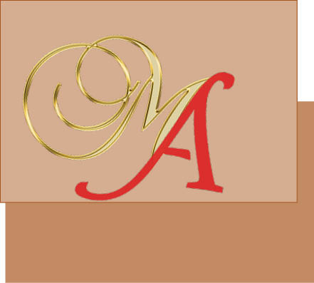 The image above was my first ligature idea, I wanted to go for a mixture of two different kinds of scriptures and I wanted to go for a more old time fancy look for a ligature. I chose the ligature because of the colors at first, but playing with the two fonts I chose it because of the style and how the two go hand and hand. Every project comes with a form of struggle and frustration – when I started I was confused as far as what colors I was going to use and what form of type face i wanted to be in my work. I decided to go with two different forms of scriptures and stuck with Christmas colors. Another challenge was shifting the letters to make them overlap each other, I decided to use a layer of the same color and make it work. I believe that the reason why my design art did work for me was because of the letter A, it was about using it in a different form and style.
Image 2 – “Remove A Stroke”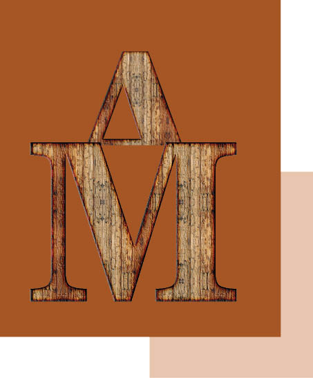
The new image above shows my secondary design idea which was a hat on the letter M. I wanted to make the letter M a more dominant thing because it is based off of my first name, the most important thing to me. I chose this form of design and image because of the background itself, its a wooden background and it seemed to interest me. The wooden background reminded me of home, my space, my life so I think that was another reason why I had chose this form of lettering. Challenges we all face when dealing art designs was cropping out the capital A so it could sit on the letter M perfectly. I felt like this wasn’t the strongest design because of the way the letters sit and overlapped each other. But overall, my challenges helped me decide my final ligature – which you’ll see towards the end! This ligature didn’t quite help shape my final design because of shape, background and style.
Image 3 – “Upper Lowercase” 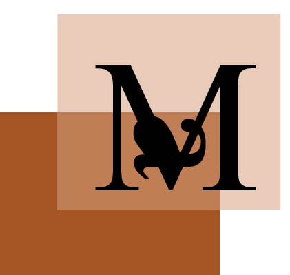 I absolutely love this design ligature because of the color and the design. The way the color contrasted each other also, how the letters sit on each other so well just makes me proud of myself. I specifically chose this form of ligature because they wee two different sizes, and shapes. As much as I love this ligature, i came across a few difficulties when it came with the lowercase A, I wasn’t sure how I could’ve rotated the letter so it can fit in the M. Another thing was shading the letter A so it’s not too transparent and odd looking. Towards the ending point I ended up loving it and taking a few parts from it to add in my final design, which made it so dominant.
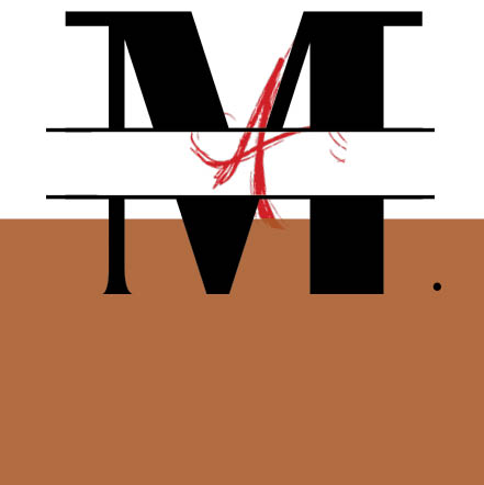
Image 4 – “Interlocking”
 The last but not least, my final design – “Beauty Blood” came out the way I wanted it to come out and I love it! This ligature piece works so well with my design and how its suppose to come out because it defines everything in my life, whether its the smallest thing like a mark on my face or the color of my skin. This design just defines everything about me. As a designer a way this ligature shows a unique side of me is by looking at the design itself. It also allows me to be free with my designs and be able to show a sense of style, character and personality in the designs. But overall, I believe that this form of design is very dominant in my opinion. Thank you for viewing my page !

