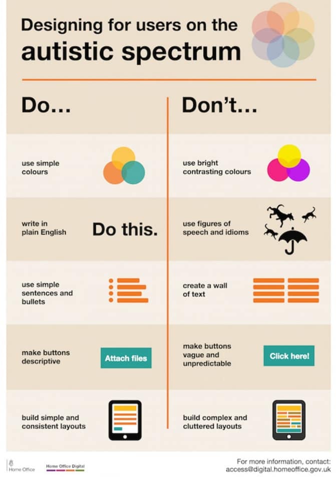
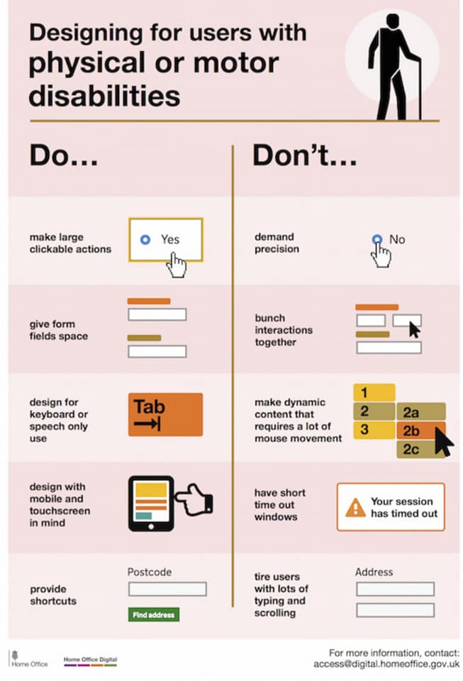
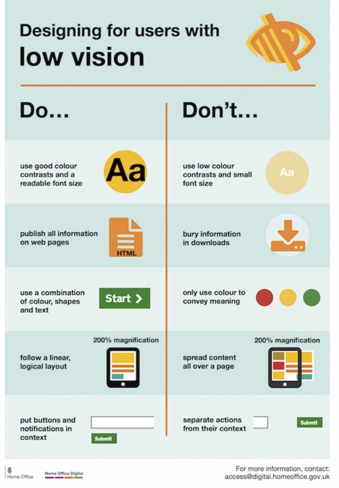
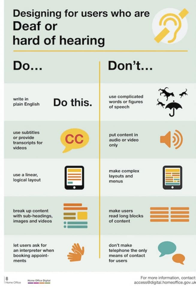
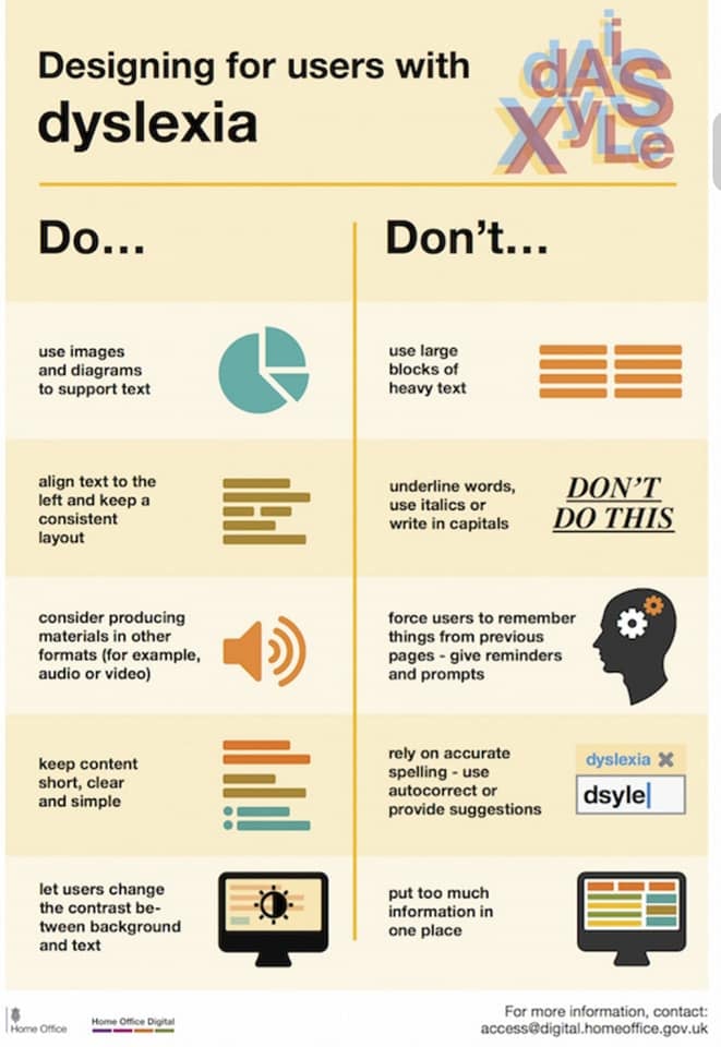
Hi everyone! I found some interesting cheat sheets for designing accessible websites. The information in the images below would have been useful to have a few weeks ago before everyone had already made up their lessons, but better late than never??? If we continue to update and maintain the course hubs, we can keep these tips in mind. I like that they go beyond the bare minimum of having a site be “accessible” according to some narrow or bureaucratic definition and instead offer tips for making sites actually *accessible* to different types of users. (A bit ironic: I doubt posting text in jpgs like this passes any accessibility tests…)



This is great Kate! Thanks for sharing.