Printed Matter

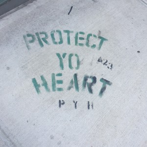
Graphic design can be seen at every corner. Not only is graphic design apart of the the advertisement industry, but it is also apart of the architecture industry. The High Line located at Chelsea is a great example of design at its best.

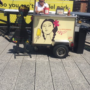
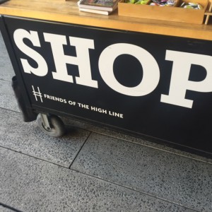
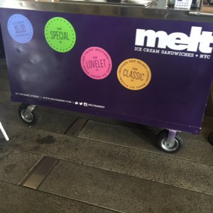
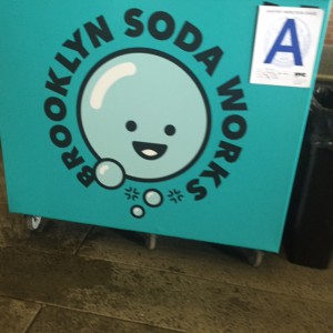
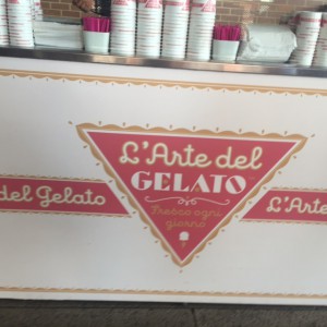
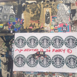
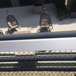
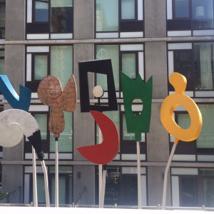
The High Line was created in order to take place of the New York Central Railroad spur called the West Side Line. The makers of this architecture design created a garden that pedestrians can use to walk around and enjoy the view. There is a section in the high line that gives a great view of the buildings and billboards overhead. Not only was this inspiring for young artist, but they also had street venders with great advertisement logos in front.

IMG_9343IMG_9335IMG_9331IMG_9332IMG_9330IMG_9333

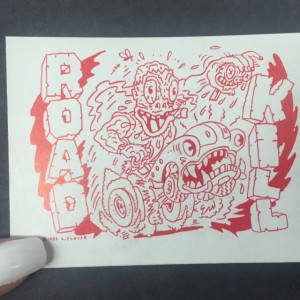
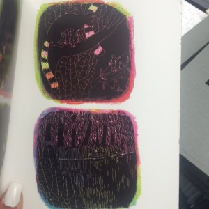
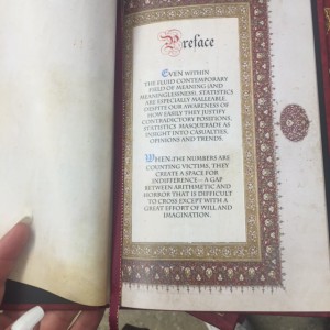
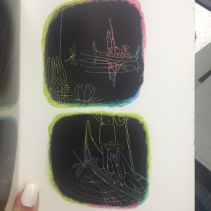
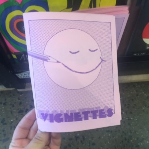
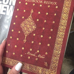
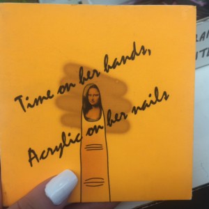
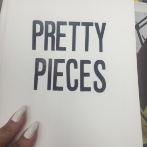
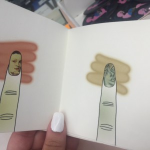
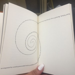
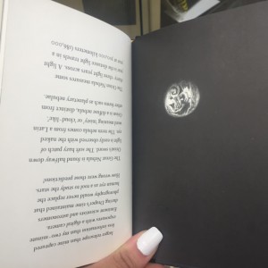
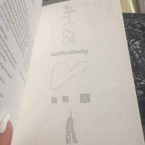
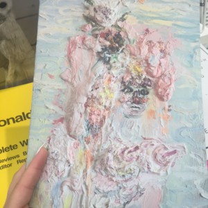
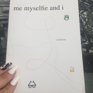
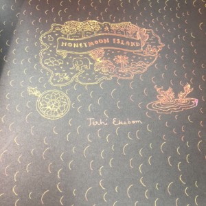
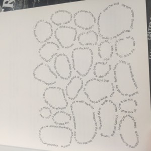
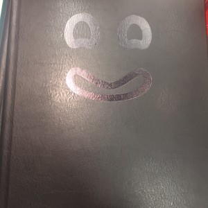
After visiting the High Line, I also had the chance to visit the Printed Matter. This small shop showed many books printed by a variety of people. They also had books that were made a variety of ways such as hardcover or with plastic cover on the front, either way, all the books looked amazing. These books helped to inspire me when having to create my own. It helped give me the idea to make my book using printed paper. It also helped me to design to sew the pages together.

IMG_9402 IMG_9398 IMG_9395-2 IMG_9397 IMG_9401 IMG_9396 IMG_9395 IMG_9394 IMG_9379 IMG_9393 IMG_9383 IMG_9382 IMG_9384 IMG_9372 IMG_9381 IMG_9369 IMG_9367 IMG_9371 IMG_9366

In conclusion, this trip was amazing and gave me a lot of inspiration when it came to making my own book. It was great to travel and see art in the city. Looking outside of museums is also a great way to view art and other graphic designs in different forms which was an amazing experience for me.  

More Images From My Trip

IMG_9363IMG_9362IMG_9350IMG_9348IMG_9346

Helvetica Documentary

     Helvetica 

     Helvetica is a typeface that originates from Switzerland. Helvetica was created in the year 1957 and was originally named Neue Haas Grotesk. This typeface can be seen all over the world. Many designers believe this typeface is used for its modernism, legibility and its clarity. Good typographers were and are still sensitive and aware when it comes to the distance between letters. Wim Crouwel is one of many graphic designers who believes that a typeface should be clear, readable, and straightforward, such as Helvetica.

     Massimo Vignelli is the graphic designer who created the American Airlines logo in 1966. This logo consist of both words containing no spaces, only to be separated by the difference of color. Vignelli used the colors red and blue to separate these words due to both of the colors representing americanism. Since this logo was created, it has remained even til today, unlike other logos that has changed its design numerous times since its creation. Helvetica classifies as a Neo-grotesque sans-serif. It is known for its clarity and neutral meaning in its form.

     During the 1960’s, Helvetica effected advertising and corporate identity. Corporates used Helvetica because it helped them seem neutral and efficient as well as the smoothness of the letters which made them seem human. They also use it to look more accessible, transparent, and accountable. Helvetica invites open interpretation. Examples of company branding that use Helvetica are Staples, The North Face, JCPenney, Fendi, and Oral-B.

     The relationship between Helvetica and Swiss International design is that they both are used to represent cleanliness, readability, and objectivity. They also have modernism in common. Swiss International design contains more color and design unlike the Helvetica typeface but they both help to represent legibility. There were many designers that appeared in the Helvetica documentary. Just to name a few, the documentary included Matthew Carter, Mike Parker, Alfred Hoffmann, Hermann Zapf, Leslie Savan, David Carson, and Massimo Vignelli. These designers were very detailed in their explanation of Helvetica and the impact it had on them as well as the rest of the world.

     Helvetica not only was able to affect the way of branding and graphic design, but it was also able to establish expressionism. Helvetica allows one to interpret it as one pleases. It is a very clean typeface that was created during 1957 and has continued to develop through 2016, present day. Originating from Switzerland, Helvetica can now be seen around the world helping express clarity and modernism.

Homework 1

Image

       Graphic design is something I’ve always been interested in. When attending high school, I chose Illustration as my major. During this time I was learning different computer programs such as Adobe Photoshop, Illustrator, InDesign, and Kaledo. When learning how to use these programs, I fell in love with Photoshop and Illustrator. I enjoyed uploading my work and creating something totally different using these programs. During this time, I was also a part of an after-school program in which we had real clients and helped our clients to create logos for their company. This was a great experience and was the reason I decided to take this class.
       If I could describe myself in three words they would be, dedicated. hardworking, and understanding. I chose the word dedicated because when it comes to school and my passion, which is art, I try my hardest to make sure I accomplish my goals and settle for nothing less. I also work hard at any and everything I do no matter how long it takes me which is why I chose the word hardworking. Lastly, I chose the word understanding because when attending art classes, my work gets critiqued constantly and when hearing negative comments I do not get offended; I take others opinions into consideration and fix my work.