
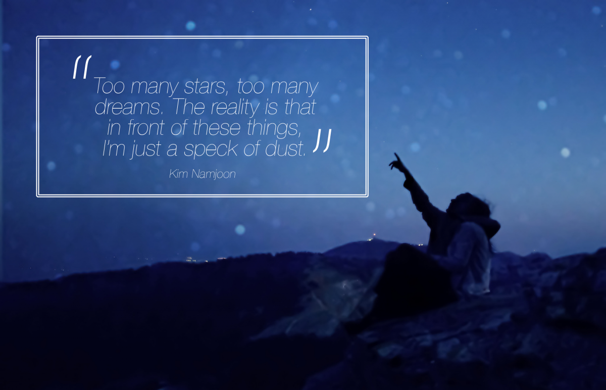
 This is my first visual enhanced quote. I chose this quote because I relate to it and not just me, but others who also feel the same way. I chose the background to be a person thats either reaching for the sky or pointing at it like how she is pointing in this one. It shows how this one person is under the night sky brimming of stars, they may seem small to us but unfortunately they are bigger and brighter than they look making us the small ones. For this first visually enhanced quote I used Helvetica neue ultralight to make it go with how the stars and the night sky look together from our own eyes, small and bright
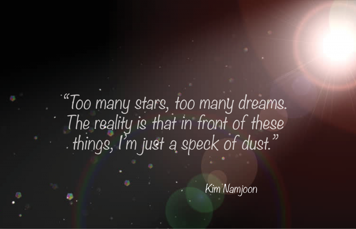 This is my second visual enhanced quote. It is still the same quote I have used for my first design . I chose the background to be a spotlight directed at an angle which shows dust specks due to the bright light. I wanted this background to really be a little accurate by using the speck of dusts as an example of how we really feel like. For this first visually enhanced quote I used Noteworthy Light, I did not want to have a lot of contrast in the font and not too edgy as it does not go with the background image.
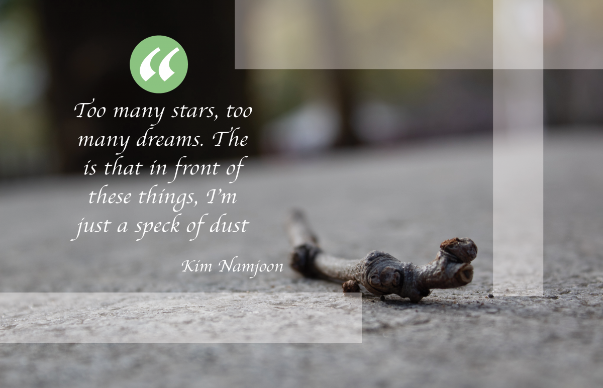 For this third Visually enhanced quote I wanted it to be slightly different from the others. The background image is a photo I personally took of a tiny twig laying on the park ground. It may not be a a speck of dust but it kind of relates to the quote in way of how small the twig looked when being looked at from any human’s point of view, that it is just a small small twig in front of us. The font I used for this is called Apple Chancery and I thought that I went really well with the photograph.

