We visited the AIGA National Design Center here in New York and were able to view their current exhibit:
365 Design Effectiveness 2011
AIGA’s (American Institute of Graphic Art) 365 Design Effectiveness was a competition in which entrants were asked to exemplify how their designs worked effectively to not only communicate the idea, but also how the design moved beyond their client’s expectations, how it changed the practice, how it can inspire someone to want to know more either about the product or history, how it could raise awareness to social issues, or how it translates across different platforms/mediums, etc. AIGA received 1,200 entries but only selected 134 designs to represent the year 2010.
AIGA designed the exhibit to be interactive and very bold with it’s reddish-orange wall on the left and charcoal wall on the right and large white typefaces. When I first walked in, I found the tables with the winners’ designs of this year’s competition were organized in such an awkward way until I walked up to the second floor and viewed it from above did I get a sense of that the tables spelled out AIGA. Very clever indeed.
See the photo below taken from the AIGA’s website:

One of my favorite designs in the exhibit was done by Foreign Policy Design (www.foreignpolicydesign.com) for Wanderlust Hotel in Singapore. Yah-Leng Yu was the art director as well as the designer for the project.
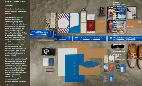
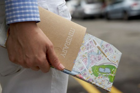
Wanderlust Hotel commissioned Foreign Policy Design to brand them and open up their market to people who love design and keepsake memories. I, myself, being an avid traveler couldn’t help but gravitate towards this design. They had luggage tags, postcards, luggage stickers and stationary paper/envelopes with the Wanderlust Hotel logo and typeface that evoked that classic traveling experience that doesn’t exist anymore in which you are not only mailing or sending letters, but sending actual keepsakes from the hotel/country you stayed at. They also created a little booklet called the Itinerary which has basic information about the hotel and the city, such as bus and train routes, good places to eat, it has your room number, room rates, and places where you can jot down notes, etc. This same little booklet could be taken home as a sort of travel journal.
The colors they used were blues, browns and whites. All of which can be interpreted with the feeling of flying and traveling. The brown is the color of recycled brown bags and has a very Earthy feel to it while the blues and whites remind me of the sky and clouds.
When designing the customized typeface for Wanderlust, Yah-Leng Yu decided to go with a lined type to give the feeling of having to connect the lines or having someone go from one point to another like in traveling. Although it wasn’t mentioned as part of the creative process, it also gives me the feeling of when I was a child learning how to write. We had to connect the lines to form the letter and given that one of the objectives was to exude a sort of playful innocence, I think this type works perfectly for the branding of Wanderlust Hotel.
![]()
If you’d like to read more information and see more photos of the creative process, go to: www.processedidentity.com/study/creative-process-study-18-foreign-policy-design-group/
Another design I loved was for Washingtonian Bride & Groom Magazine. The editorial spread done by Design Army in Washington, DC (www.designarmy.com). Jake and Pum Lefebure are the creative directors and for this project, Pum Lefebure was the art director while Lucas Badger was the designer with photographer Cade Martin.

When I first glanced at this editorial, I stopped dead in my tracks and had to see each page of this spread. I was very entranced not only by the design layout, but by the photography. I just thought, “gosh, why didn’t I think of this!” The ability of the spread to seem simple in its concept and execution is the goal of most designers and photographers. The fact that it was a bridal magazine doesn’t deter someone from appreciating the beauty of the editorial.

 Design Army was asked to create this spread for “Fair Queen” wedding gowns and they decided to do a cheeky editorial where a bride was at a fair. Hence the title of the piece, “My Fair Lady.” They were asked to design a spread where they can use contemporary and classic gowns in a not so formal, but very memorable manner. I definitely think they achieved that. This spread is one of two that Design Army has done for the Washingtonian, the other editorial was “I Do’s and I Don’ts” which also won a place in AIGA’s 365 Effectiveness Competition 2011. Coupled together, Design Army helped the local Washingtonian Bride & Groom magazine sell 15,000 units which is 4,000 more than the national Martha Stewart Magazine. Quite an amazing feat!
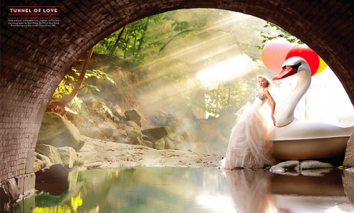
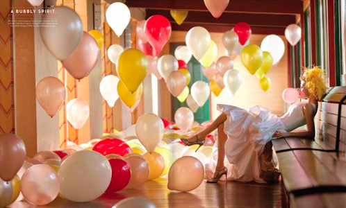
Though I can’t quite pinpoint the typeface they used I do realize that it’s technically a modern type with its sans serif, however with a twist of the old. It reminds me of old carnival signs and has a very art deco feel to it with the low crossbar and red colored stroke around the text. It’s a great typeface to use for this editorial because it is a bit of the new and old, like the dresses. Also the color theme of the editorial was red, white and blue which could be interpreted for being patriotic considering it’s the Washingtonian Magazine based out of our nation’s capital or the red could mean love, the white could mean purity and/or the bride’s dress and the blue could be that something borrowed. Either way, it was a well executed editorial spread.

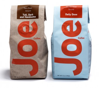
Another favorite, was done by Square One Design (www.squareonedesign.com) from Grand Rapids, Michigan for Paramount Coffee. Square One branded Joe Coffee and designed the packaging. Mike Gorman was both creative director and designer with Karin Lannon as the writer.
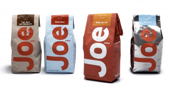
Paramount Coffee approached Square One Design hoping to increase their sales, with new packaging and branding, outside their region. So Square One decided to look at the shelves in the local supermarket stacked with other coffee brands and noticed that most of looked the same. Nothing really stood out and they figured if they could make Joe Coffee stand out, they can grab consumers based on design and then if they loved the coffee, they would be returning customers.
JOE COFFEE
VS

Photo by JoeBehrPalmSprings/Flickr CC
ALL THE OTHER COFFEE BRANDS
When devising the brand for Joe Coffee, One Square Design thought to compare the coffee to the “average Joe” and how anyone can basically like this coffee. That it feels like home. They also used humor with the names of the coffee to connect with consumers. Names like “Wake up Call” or “Tall, Dark and Handsome.” They also used bold and vertically aligned typeface to attract consumers as well as a variation of red to call attention to Joe Coffee unlike most of the coffee brands whose type is set horizontally and generally in white. So far, it has effectively boosted sales and Paramount now sells, not only outside their region, but from coast to coast.
So these are the three designs I loved most at the 365 Exhibit this year. I honestly can’t wait to see what next year brings and hopefully in the future, I can be one of those winners, perhaps for an editorial design or packaging or book design.
We’ll see. Stay tuned.

