The visual quote I chose to use for a class assignment in Graphic Communications was “Nobody puts Baby in the corner,” from the movie Dirty Dancing and for the quote, I decided to draw a pseudo corner from line and stretch the word baby to lean against the line, very much the way Baby (Jennifer Grey) leaned against the wall in the movie. I was inspired by Pentagram’s conundrums and their use of taking a famous quote and communicating it in a clever, simple manner.
In choosing to do this design, I sampled the purple from the Dirty Dancing movie poster and used it for the background color. I chose Futura as the primary typeface because I wanted to keep with the clean lines of the corner as well as the simplicity, similar to that of Pentagram’s conundrum. I chose to use bold for the word, “nobody” because I wanted to emphasize the stern voice of Johnny (Patrick Swayze) and italics because I wanted to show that it was personal, like handwriting.

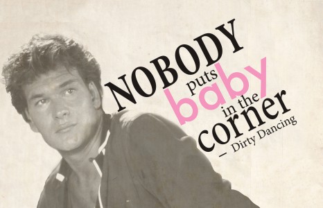
For this second design, I decided to incorporate a photo of Patrick Swayze from the movie “Dirty Dancing” along with my quote. The slant of his body suited the diagonals of my design and together they form a sort of x-shape.
For the quote, I decided to emphasize the word “Nobody” and “Corner” by heightening their weights and size. I chose the typeface Minion Pro for the main text because it has a traditional feel with its serifs even though it’s a fairly new typeface. In the movie, Baby is placed in the corner by her very traditional parents and so I thought an “older looking” typeface would be appropriate. It also contrasts against the Futura typeface I used for the word “baby” which is sans-serif and more contemporary looking. I also decided to use baby pink as the typeface color for “baby” because in the movie, Baby is naive, young and a female.
Photo by Adger Cowans ©1987
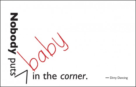
For this third design, I wanted to again to emphasize the words “Nobody” and “corner” so I set Nobody in Bold and corner in italics. I also placed the quote so that the word “baby” could strategically fit in the corner of the page, however I decided to “insert” the word baby, sort of like a correction note, and set it in red. I used the typeface Gills Sans in the most of the text to contrast the word “baby” which was set in Sweetie Pie.