Midterm Project

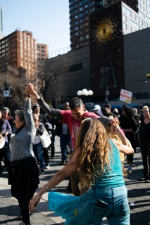
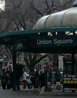
I shot my midterm project on Union Square, this location is very close to my job, and I always pass by just trying to absorb all the information and look at all the people around. Union square is full of diversity, with different cultures, mindsets and thoughts. I found really fun to do this shoot because I got to meet people and see different events on this location.

High Resolution: https://flic.kr/s/aHBqjzGRi8

Visual Quote final

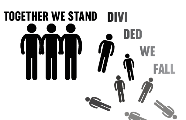
“TOGETHER WE STAND, DIVIDED WE FALL”

This is a very popular quote that is often used as a motto to motivate and inspire collaboration on certain social movements and protests. This phrase encapsulates the fact that things usually come out better when we work together for a same objective.

There is not a clear origin for this quote, but its main idea has been rephrased and rewritten several times by the ancient greeks, the Bible, Founding fathers, politics, activists and lately, Pink Floyd.

I chose this quote because hearing on the song “Hey You” by Pink Floyd, it’s what made me aware of it, the whole song has a despair, helplessness and sadness feeling, but ending in this phrase the song lyrics takes on a whole different meaning.

Concept 1

In my first visual quote assignment I decided to go for a simple and basic shapes that can easily represent a collective standing together and other falling apart and blending into the background, as a way to represent the quote’s meaning. I also played around with the type making it have the same gradient effect that the silhouettes have.

Concept 2

My second visual quote is a variation of the same concept, I designed the type in a way that the first part of the quote looks like a stable ground, and the second part looks fractured and unsteady floor. In addition to the the typography I added graphics that represent people close together standing on the safe ground, and people falling from the unsteady ground.

Concept 3

On my third concept I tried my best to highlight the “visual” part on the visual quote assignment, by using less words to explain my quote, hoping that is understandable and easy to read with the mixture of graphics and type treatments. I believe this is my strongest design of this assignment, but it also might need to go together with the first two so it can be understood.

Project 2: Barbie Timeline

Resources :

Barbie Media

“Barbie Through the Ages” History.com, Brynn Holland (2019)

Barbie’s Youtube Channel

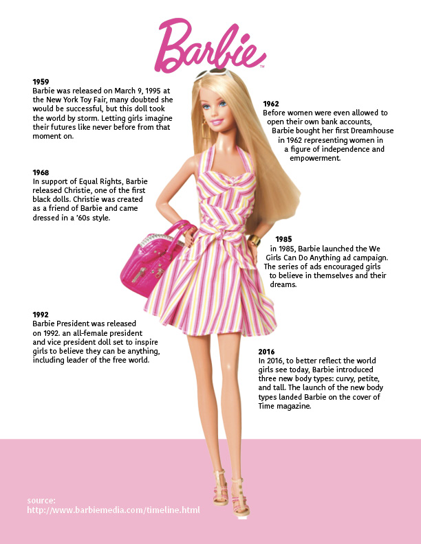
Barbie has been very meaningful in the life of so many of us, being the best companion for little girls all over the world, and produced great impact on the way that women think of themselves throughout generations and social changes.

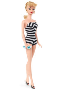
Barbie was created on the 60’s, when girls where taught to grow to be good in the kitchen and take care of babies, this doll was a revolutionary idea created by Ruth Handler and Mattel Inc. a doll that could be whatever she wanted to be in this world!. This mindset influenced all those little girls to become powerful empowered woman on the future. The first Barbie debuted at the New York Toy Fair on March 9, 1959 in a black and white striped swimsuit and became the top on the market for decades.The logo of this product appealed to the children’s attention by its bright colors and fun typography (almost childlike) used in the year it was dropped. The color used to portray the brand is related to the gender norms of the time, being pink a color that was often used by girls.

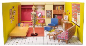
In 1962 the first Barbie dream house, before women were even allowed to get their own bank accounts, the doll was self-sufficient in her own fashion and colorful house, giving little girls the dream and aspiration to see themselves like this in the future.

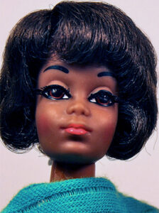
In 1968 This brand decided to show their support on social movements yet again when they releases the first black doll in the Barbie collection Named Christie, her facial features were redesign to match African-american features. 

In 1975 the logo was redesigned based on the style of the epoch, being a little bit more funky, and using the shadow to make it pop out, as well as the letters with a more circular shape, which was a really common typography style during the 80’s and 90’s

“Girls can do anything” was a campaign released on 1985 to encourage little girls to dream big and aim high, and to show them how perfectly capable they are to achieve what they intend. On the 80’s many of the women’s movement attempts for equality were showing results, but women were still undermined by man in many professions. 

In 1991 they decided to go back to the original concept on their logo image, they went from “trendy” to the childish appeal from their first logo, keeping some of the letters the same and removing the shadow for a more simple look. As well as they changed the shade of pink they had been using since the creation of the brand.

Breaking the social schemes Barbie President got all the ballots on 1992 with an all female president cabinet, allowing girls to aspire to be leaders of a free world. 


For a more diverse catalog and to portray how the world looks today, Barbie introduced different body types, skin tones, ethnicities, hair and eye colors in their Barbie Fashionista line. 

And since 2009, Barbie went back in time, they are currently using the same logo that they used when the brand was created, the same childish-fashion purpose, and Barbie remind and inmortal iconic figure thanks to all of this image process they went through, and the impact that the dolls had in our society.


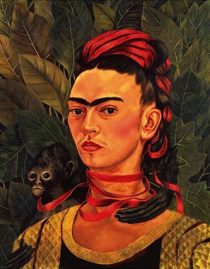
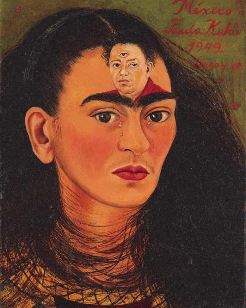
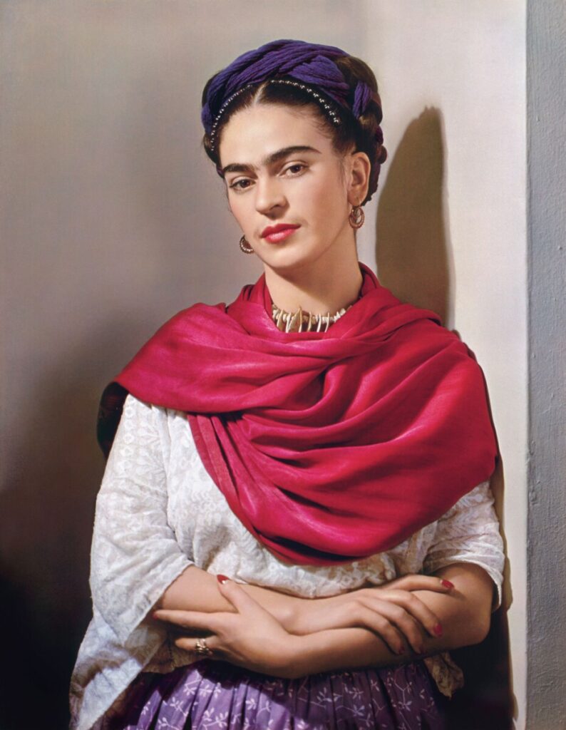
~Frida Kahlo~

As artists there is always a need to find a compare artwork from other creators to our own. Inspiration is key when developing in the artistic world. Creating is not easy without this element, there are many ways of finding inspiration for an artist, experiences, muses, art styles people, landscapes, songs. Every artist has another artist that has inspired their creations, and styles and mine is Frida Kahlo. 
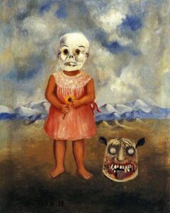
Born on 1907 in Coyoacan, Mexico, Magdalena Carmen Frida Kahlo, one of the biggest female painter and artist in history. Kahlo struggled all her life to achieve stuff, thanks to all the obstacles and problems she went through in her life, At age 6 Frida contracted polio, leaving on of her legs skinnier than the other while she suffered spina bifida, a disease that affected the legs and spinal cord development. 

During her school age she was involved in a tragic bus accident that left her injured for months in a cast that held her spine and pelvic in place. It was then during her recovery and that she decided to paint to kill time and alleviate the pain. Frida’s family encouraged the art she was producing and eventually led her to look for art revision from Diego Rivera, who later turned into her husband. Frida explored many art styles like surrealism, symbolism, and magical realism, most of her paintings are self-portraits or family portraits, Frida once said I paint myself because I am often alone, and I am the subject I know best”.
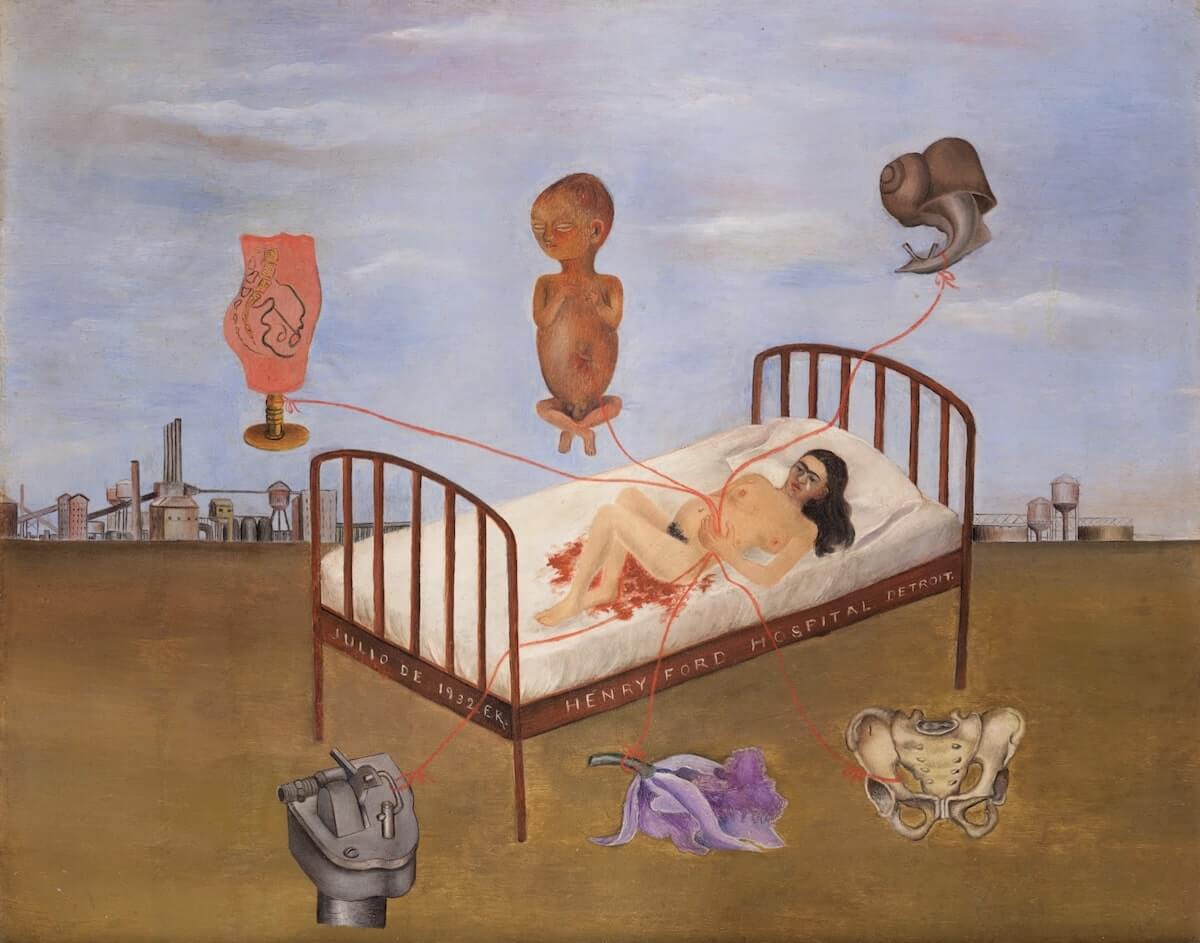
One of her most popular surrealism pieces is “Henry Ford Hospital” a painting that reflects Frida pain and suffering when she went through her second miscarriage after trying repeatedly to get pregnant.  This painting has several elements that represent her illness and failure as well as fragility and sadness.

There is something about all of Frida Kahlo’s paintings that transmit so many feelings and have many things to say, her self-portraits are often full of color with eyes that say more than any words. 
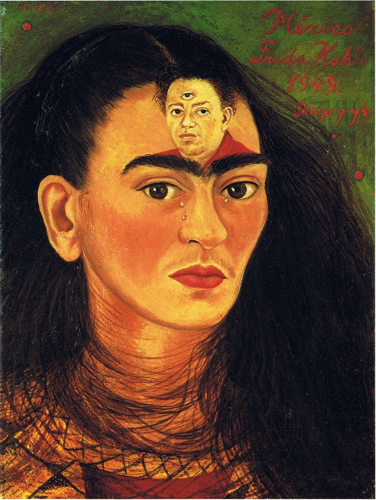
                         

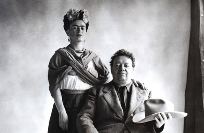
Diego and Frida did not have a relationship like any other, it was full of adultery and toxicity that only made them love and hate each other more every time, and the pieces created by her during this rough patch are the proof of how this amazing artist used her pain and experiences to create beautiful and sentimental pieces that led her to become a legend in the art world. 
 

Project 3: Artists.

Frida Kahlo (1907-1954)

 Frida Kahlo’s artwork has always inspired me so much, based on the way that she was able to portray herself and her personality in each of her paintings.
Frida lived a complicated life and was able  to go through it and express it through her art, gaining the recognition that she deserved as an artist.


Ryan Murphy (1965-Present)

Murphy is a producer, director, writer and creator for television originally from Indiana, that founded the iconic show “American Horror History”.

His productions have a specific style, photography and aesthetic that has inspired my own style in many ways. The shots and color schemes that they use are always on point and it all thanks to this gentleman and his team

Andy Warhol (1928-1987)

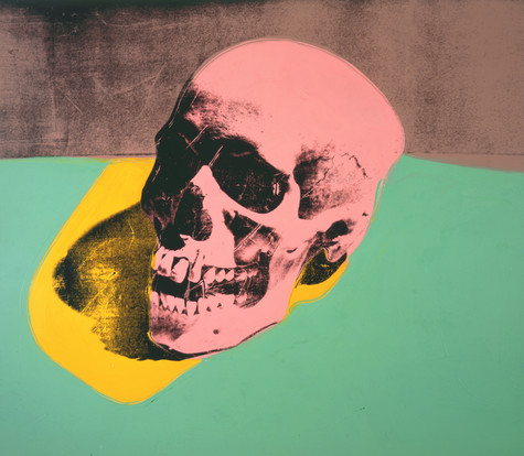
Warhol’s use of color in hist art pieces, completely changed the definition of color combinations for this society, his artwork is minimalistic but at the same time so full of life, and that’s something I always try my best to include in my works

Banksy

One of the legends of the art world and a constant social activist that says through art what many people don’t dare to think. Banksy’s boldness and mysteriousness have been the characteristics that have brought his art to popularity, becoming one of the pioneers on the popularization of modern street art, thanks to all the polemic that their artworks causes, the acceptance and encouragement towards street art has grown increasingly in the last decade. 

Their mystery identity has played an important role on the way Banksy’s art spread all over the world, as well as it has allowed him to do art that would be considered illegal  as a way to protest on some different social issues.

Michael Wiehart

I find very interesting the way the Michael Wiehart combines filming animation with graphic design and typography. Is impressive how he started in this industry when there was no computers but as time went by he was able to figure out and advance his knowledge on the software that have allowed him to create  digital projects just the way he wants it. 

I like how he refers to this industry as a group since it is very beneficial for a creative process to have artists that specialize in different fields in order to produce better and more versatile designs.