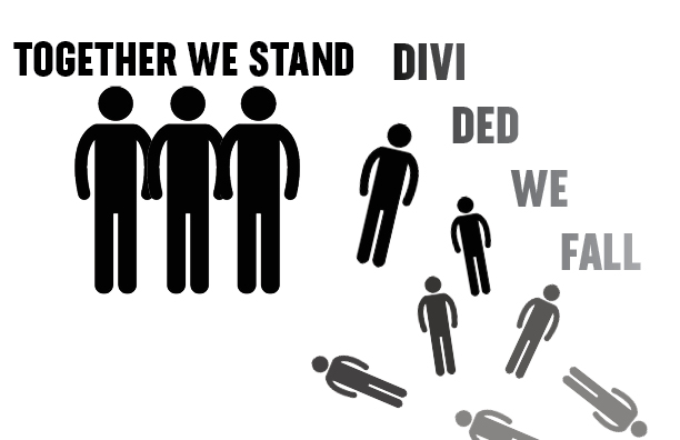
“TOGETHER WE STAND, DIVIDED WE FALL”
This is a very popular quote that is often used as a motto to motivate and inspire collaboration on certain social movements and protests. This phrase encapsulates the fact that things usually come out better when we work together for a same objective.
There is not a clear origin for this quote, but its main idea has been rephrased and rewritten several times by the ancient greeks, the Bible, Founding fathers, politics, activists and lately, Pink Floyd.
I chose this quote because hearing on the song “Hey You” by Pink Floyd, it’s what made me aware of it, the whole song has a despair, helplessness and sadness feeling, but ending in this phrase the song lyrics takes on a whole different meaning.
Concept 1
In my first visual quote assignment I decided to go for a simple and basic shapes that can easily represent a collective standing together and other falling apart and blending into the background, as a way to represent the quote’s meaning. I also played around with the type making it have the same gradient effect that the silhouettes have.
Concept 2
My second visual quote is a variation of the same concept, I designed the type in a way that the first part of the quote looks like a stable ground, and the second part looks fractured and unsteady floor. In addition to the the typography I added graphics that represent people close together standing on the safe ground, and people falling from the unsteady ground.
Concept 3
On my third concept I tried my best to highlight the “visual” part on the visual quote assignment, by using less words to explain my quote, hoping that is understandable and easy to read with the mixture of graphics and type treatments. I believe this is my strongest design of this assignment, but it also might need to go together with the first two so it can be understood.


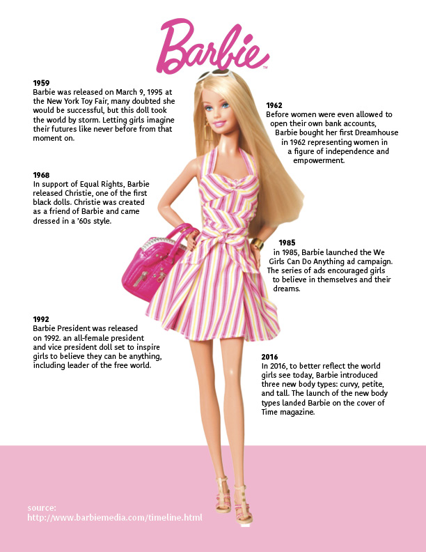
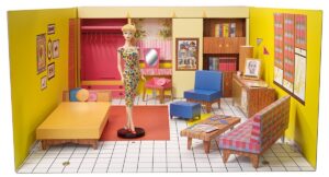 In 1962 the first Barbie dream house, before women were even allowed to get their own bank accounts, the doll was self-sufficient in her own fashion and colorful house, giving little girls the dream and aspiration to see themselves like this in the future.
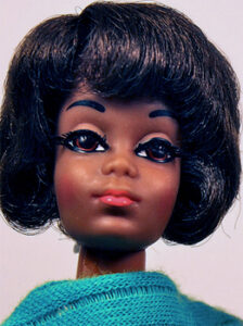 In 1968 This brand decided to show their support on social movements yet again when they releases the first black doll in the Barbie collection Named Christie, her facial features were redesign to match African-american features.
 Breaking the social schemes Barbie President got all the ballots on 1992 with an all female president cabinet, allowing girls to aspire to be leaders of a free world.
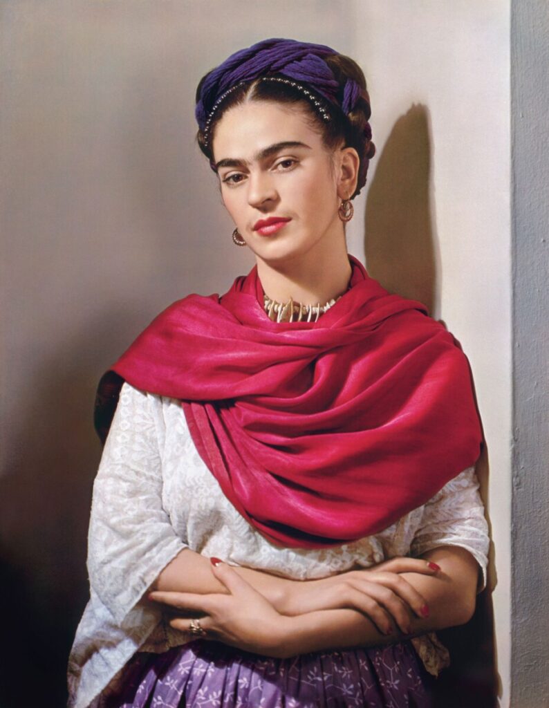
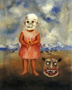

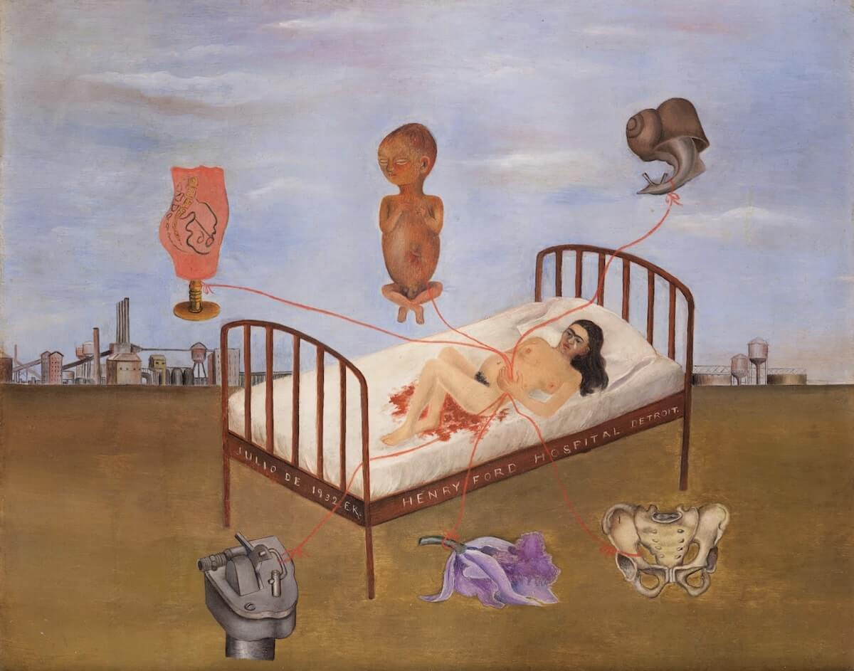
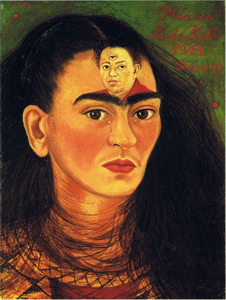

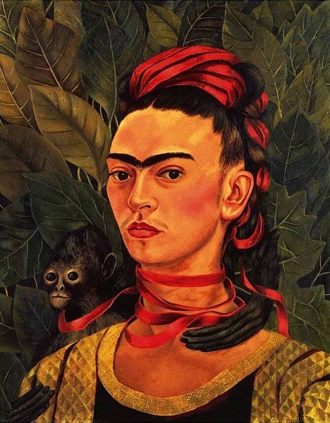
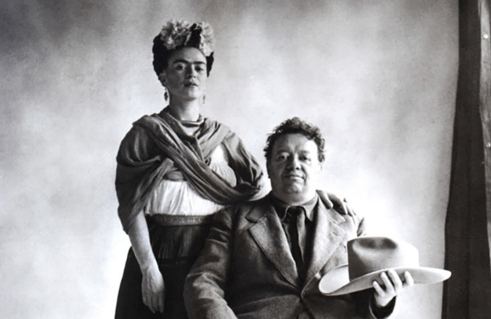


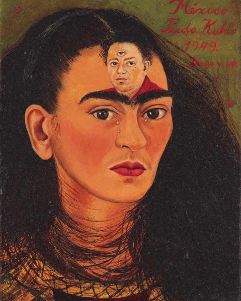 Frida Kahlo’s artwork has always inspired me so much, based on the way that she was able to portray herself and her personality in each of her paintings.
