COMD3504 - Section OL06 - Fall 2020

Author: Giovanna Qu (Page 1 of 2)

Giovanna Qu – Assignment 11 for November 18

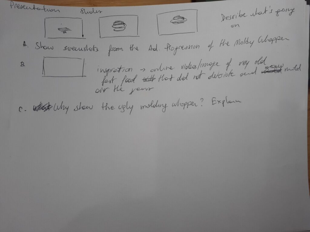
According to Steven Heller underground often times becomes mainstreams, or you could say that mainstream takes what was originally underground and turns it into mainstream due to commercialization. The “Moldy Whopper” by Burger King mainstreamed the underground, showing the ugliness of real food. Most, if not all, food commercials show beautiful, tasty, appetizing ingredients and dishes to attract viewers into buying their product. We are in a digital visual consumerism age where people don’t read anymore, so capturing the interest of the viewer with as little text as possible and interesting imagery is vital to the success of an advertising. The Moldy Whopper creates the same effect with the opposite. By showing a molding burger, Burger King attracts attention, creates reaction and disgust, in order to spark interest in the viewers. And it worked. Burger King saw a 14% increase in sales, and 88% positive neutral.

Adobe UK. “Adobe Presents: D&AD – Behind the Work: Moldy Whopper”, Adobe UK YouTube, 1 July 2020. https://www.youtube.com/watch?v=hAOI_kW5dGs&t=1524s

Swant, Marty. “Burger King CMO Fernando Machado Says Moldy Whopper Ads Show The ‘Beauty Of Real Food’ Without Preservatives.” Forbes.com, 20 February 2020, https://www.forbes.com/sites/martyswant/2020/02/20/moldy-whopper-ads-show-the-beauty-of-real-food-says-burger-king-cmo-fernando-machado/?sh=44611a734789.

Sullivan, Luke and Edward Boches. Hey Whipple, Squeeze This: The Classic Guide to Creating Great Ads 5th Ed. Wiley & Sons, 2016.­­­

Guilbeault, Douglas. “DIGITAL MARKETING IN THE DISINFORMATION AGE.” Journal of International Affairs, vol. 71, no. 1.5, 2018, pp. 33–42. JSTORwww.jstor.org/stable/26508116.  Accessed 2 Dec. 2020.
Giovanna Qu -Assignment 7 for October 21

Media and technology are the fruition of human evolution. They give us tools to accomplish tasks related to our survival. From survival, technology has evolved to give us leisure and relax, such as with television. Behind the scenes there are people and companies working hard to sell products to the public, in order to make a profit. However, it is far too easy to overshoot for profit and create technologies that are hazardous to people. It could be something as simple as Aunt Jemima’s portrayal of racial stereotypes that hurt the Black community, so something far worse such as nuclear weapons. Before publishing a work, designers should stop and think about the consequences and effects their design could generate. A same idea could be perceived differently depending on the media of distribution. Unforcedly, I think that because of racism, religion, politics, and cultural differences, not all designers can and will think or care about the consequences of their work.

Giovanna Qu – Assignment 12 for December 2

Bibliography

Adobe UK. “Adobe Presents: D&AD – Behind the Work: Moldy Whopper”, Adobe UK YouTube, 1 July 2020. https://www.forbes.com/sites/martyswant/2020/02/20/moldy-whopper-ads-show-the-beauty-of-real-food-says-burger-king-cmo-fernando-machado/?sh=44611a734789

Aten, Jason. “Burger King’s New AD Features a Moldy Whopper. Here’s Why That’s Acutally Genius Marketing.” Inc.com, 20 February 2020. https://www.inc.com/jason-aten/burger-kings-new-ad-features-a-moldy-whopper-heres-why-thats-actually-genius-marketing.html.  

Burger King. “The Moldy Whopper”, Burger King YouTube, 19 February 2020. https://www.youtube.com/watch?v=oSDC4C3_16Y

Beatrice Warde, The Crystal Goblet, or Why Printing Should be Invisible (1930): Warde_CrystalGoblet

Bruno Munari, selected chapters from Design as Art (1966): Munari_DesignAsArt

Chou, Shin‐Yi, et al. “Fast‐Food Restaurant Advertising on Television and Its Influence on Childhood Obesity.” The Journal of Law & Economics, vol. 51, no. 4, 2008, pp. 599–618. JSTORwww.jstor.org/stable/10.1086/590132.  Accessed 2 Dec. 2020.

Guilbeault, Douglas. “DIGITAL MARKETING IN THE DISINFORMATION AGE.” Journal of International Affairs, vol. 71, no. 1.5, 2018, pp. 33–42. JSTORwww.jstor.org/stable/26508116.  Accessed 2 Dec. 2020.

Kettemann, Bernhard. “Semiotics of Advertising and the Discourse of Consumption.” AAA: Arbeiten Aus Anglistik Und Amerikanistik, vol. 38, no. 1, 2013, pp. 53–67. JSTORwww.jstor.org/stable/43025841. Accessed 1 Dec. 2020.

Paul Rand, Good Design is Goodwill (1987): Rand_Goodwill

Sullivan, Luke and Edward Boches. Hey Whipple, Squeeze This: The Classic Guide to Creating Great Ads 5th Ed. Wiley & Sons, 2016.­­­

Swant, Marty. “Burger King CMO Fernando Machado Says Moldy Whopper Ads Show The ‘Beauty Of Real Food’ Without Preservatives.” Forbes.com, 20 February 2020, https://www.forbes.com/sites/martyswant/2020/02/20/moldy-whopper-ads-show-the-beauty-of-real-food-says-burger-king-cmo-fernando-machado/?sh=44611a734789. Accessed 25 November 2020.

Giovanna Qu – Assignment 9 for November 4

…the intelligible is reputed antipathetic to lived experience.

Process of signification

Quasi-tautological

…true sign systems and a statement of quasi-identity.

Non-/coded iconic message 

Hence, knowing that a system which takes over the signs of another system in order to make them its signifiers is a system of connotation,6 we may say immediately that the literal image is denoted and the symbolic image connoted. Successively, then, we shall look at the linguistic message, the denoted image, and the connoted image.

When it comes to the “symbolic message,” the linguistic message no longer guides identification but interpretation, constituting a kind of vise which holds the connoted meanings from proliferating, whether towards exces­sively individual regions (it limits, that is to say, the projective power of the image) or towards dysphoric values.

The text is indeed the creator’s (and hence society’s) right of inspec­tion over the image; anchorage is a control, bearing a responsibility-in the face of the projective power of pictures – for the use of the message. With respect to the liberty of the signifieds of the image, the text has thus a repres­sive value10 and we can see that it is at this level that the morality and ideol­ogy of a society are above all invested.

Then again (and there is no contradiction with what has just been said), it is a sufficient message, since it has at least one meaning at the level of the identification of the scene represented; the letter of the image corresponds in short to the first degree of intelligibility (below which the reader would perceive only lines, forms, and colors), but this intelligibility remains virtual by reason of its very poverty, for everyone from a real society always dispos­es of a knowledge superior to the merely anthropological and perceives more than just the letter.

Does the coding of the denoted message have consequences for the connoted message?

Spatial immediacy and temporal anteriority

The denoted image naturalizes the symbolic message, it innocents the semantic artifice of connotation. 

The more technology develops the diffusion of information (and notably of images), the more it provides the means of masking the constructed meaning under the appearance of the given meaning.

The language of the image is not merely the totality of utterances emitted (for example at the level of the combiner of the signs or creator of the message), it is also the totality of utterances received:the language must include the “surprises” of meaning.

It can thus be seen that in the total system of the image the structural functions are polarized: on the one hand there is a sort of paradigmatic con­densation at the level of the connotators (that is, broadly speaking, of the symbols), which are strong signs, scattered, “reified”; on the other a syntag­matic ‘flow’ at the level of the denotation-it will not be forgotten that the syntagm is always very close to speech, and it is indeed the iconic “discourse” which naturalizes its symbols.

Giovanna Qu – Assignment 8 for October 28

Fenty Beauty by Rihanna is a makeup company that has been a role model of inclusivity since day one. Their make up line offers foundation shades in many different skin shades. https://www.instagram.com/p/BY9PocNlkFm/?utm_source=ig_web_copy_link
Nike’s Your Can’t Stop Us promotional ad is a masterpiece of inclusivity. It shows people of all genders, races, backgrounds, abilities. https://www.youtube.com/watch?v=WA4dDs0T7sM

Giovanna Qu – Assignment 6 for October 7

Jan Tschichold’s book The New Typography teaches how typography should be about clarity and not beauty. Type should be about clearly deliverying a message. Ornaments, decorative elements are unneccessary because they dristract from the message. Text should not be centered because it doen’t make sense and it is hard to read for cultures who read from left to right. Centered text also creates uneven white space from line to line. Since text should not be centered, text appears asymmetric. Asymmetry is logical and functional because is natural order. Asymmetry gives unlimited variation and flexibility, which allows for a clear delivery of the message of the design. 

Karl Gerstner approach to design is to have a system when laying out design elements. Design elements need to be picked out for their purpose and not for the feeling the designer has towards them. Gerstner takes Fritz Zwicky’ scientific system and applies it to design. Elements are grouped in parameters and relative components. He considers a grid a system that can be used to proportionally laying out design components. He also talks about programmes, which I didn’t really understand from the paper. 

 Josef Müller-Brockmann popularized the use of a grid system as a design structure. A grid creates order when there would otherwise be chaos. A grid should be used to layout the elements of the design to deliver an orderly, functional, aesthetic, understandable work. Creative work is not just for delivering a message, but it also represents the designer’s creativity, knowledge, and ability. 

Giovanna Qu – Assignment 4 for September 23

With the establishment of the Bauhaus, a new idea of being artists comes to surface. The artist of the past is not good enough because they are tought theory and to follow specific rules, but they were never given the freedom to practice and explore their own creativity. With the founding of the Bauhaus school, Walter Gropius intends to change that. The artist of the future needs to learn theory and foundations yes, but they also need to incouraged to explore the world outside of the classroom, explore creativity outside of rules set by their instructors. Only this way they can bring the best out of themselves and design unique products.  Artists also need to learn the new language of graphic design, only this way they can communicate their ideas appropriately. T

When Laszlo Moholy-Nagy joined the Bauhaus, he introduced new technologies in the practice of graphic design. With technology, a revolution in the world of typography started to happen. Herbert Bayer designed the Universal alphabet, which started a revolution in Typography. Because of the introduction of new technologies, typography needed to evolve to the same level. Typography because it’s a tool of visual communication. Different typefaces convey different meanings and feelings. These ideas are still true to this day. 

« Older posts