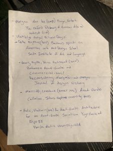
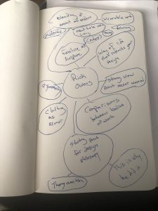
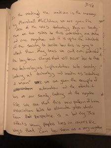
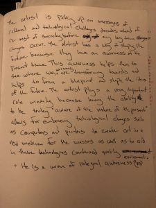
 This is my final poster for the designer I chose put together in an asymmetrical design style to reference the aesthetic mentioned in my presentation. The major themes were the Avant-Garde , Bauhaus design principles, Constructivist ideals as well as Lissitzky’s ideas a of total work of art. Linked below are two of the most current interviews.
Author: Angel Ortiz
Angel O Dec 9 Bibliography
Angel O Dec 2 HW
Angel O Nov 25 HW
Angel O Nov. 4 HW
Angel O HW Oct.28
Angel O HW Oct. 21
In this design I tried to use the grid to create an organized creative use of type with some key terms from the reading. I found the grid to be an interesting way to work out text design by hand. There is a level of difficulty to this way of designing but it also gives you a feeling of organized freedom. With more time and practice this way of designing can be a strong and beneficial way to create layouts of typographic design.
Angel O. Oct 7 HW
Angel O Sept. 23
Angel O Sept. 16
When looking at signs and how we use them in everyday life we have to take a moment to look at the context. We take for granted the way we use signs sometimes because of how common place they have become in our lives.
Semiology which is the backbone of understanding the language of signs and linguistics plays a major role into the understanding of our modern society’s communication. Looking at linguistics which is a part of semiology we see it play a role by bringing the social and cultural influences of what makes language. This shapes our understanding of the development of language in a whole. Semiology is different because it can be broken into parts categorized as signifiers, signified, and sign which together create a general communication basis. The signifier which is the sound associated with or the image of something example (tree). The signified which is the idea or concept of something (example tree). finally the sign which is the combination of both the signifier and signified which together form a meaningful unit.
By putting these ideas together modern society/graphic communication is able to achieve a language that most people can decipher for everyday negotiation. Looking at language graphic communication and visual arts we are able to see some similarities through the execution. Language having a distinct recognizable way to communicate concepts is important. Graphic communication comes into play by making sure these forms are easily understood by a large demographic of society. Visual arts comes Into this by actively discovering ways to convey these messages in a way that is easily interpreted by the people come into contact with these symbols regularly.

