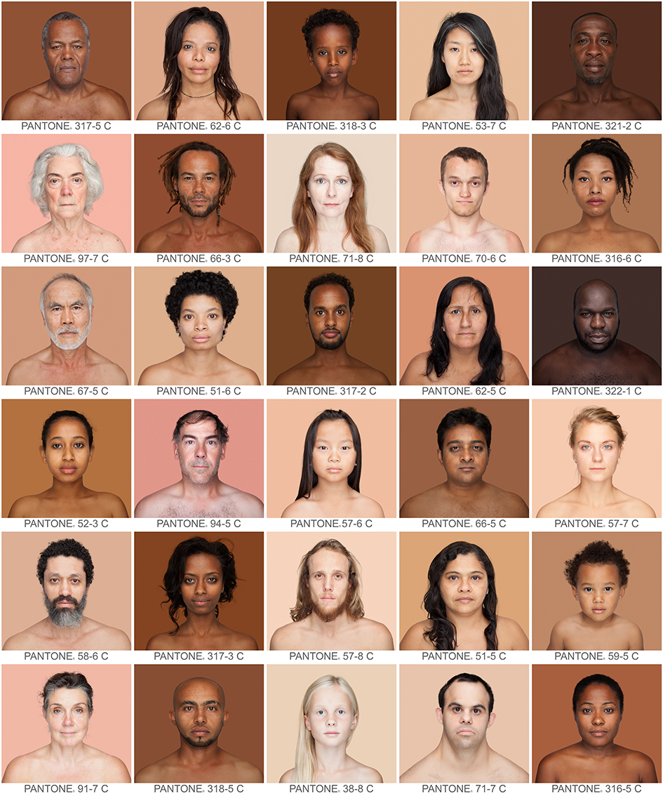
 Humanæ by Angelica Dass is a project and ad campaign that focuses on the idea of race as a social construct, rather than a biological one. I think this is a good representation of diversity because it represents every one of all ranges of complexions. She has already taken about 4,000 photos. https://news.artnet.com/art-world/4000-skin-colors-in-pantone-squares-1254683
 Zuri is a makeup brand from the sixties catered to Black women. I think this is a positive ad because at the time makeup lines were very limited for Black women. There is also the upliftment of Black beauty in this ad. (Pinterest – ADs from the 60s)
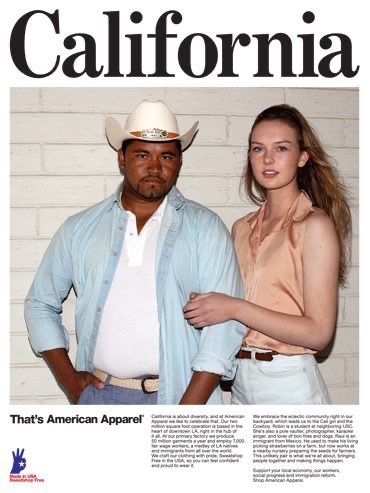
 Although the brand is dead American Apparel was known their controversial ads. I think this is a negative ad because of how tone-deaf they were especially with the usage of the real Mexican farmer being used as a prop. There are currents of exploitation in this ad. To a lot of people, it seemed odd given how much the company has done for the Latino community. https://gawker.com/5911787/american-apparels-hottest-new-accessory-farmers
 I wanted to incorporate university brochures because I remember during my college application process I used to see a lot of this. There were many examples where they would only add one Black person into their application brochures to make the school seem “diverse or inclusive”. https://www.rug.nl/about-us/how-to-find-us/huisstijl/toepassingen/informatiedrukwerk/poster?lang=en
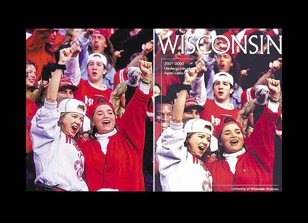
 This brochure is from the University of Wisconsin. They photoshopped a Black person into their application brochure to make their school seem more diverse of students but failing terribly. The school received a lot of backlash for this back in 2003. https://www.snopes.com/fact-check/photo-finish-2/


