COMD3504 - Section OL02 - Fall 2021

Author: joseph asimeng (Page 1 of 2)

Joseph Asimeng-comd theory-final presentation sketches

1 part of my sketch for my final presentation
another part of my sketch for my final presentation

By the way my topic will break down some info about rap album and mixtape covers. I know it doesn’t have any words and pictures for these sketches, based on it. That’s because it’s going to be a surprise before tomorrow(tuesday). I hope you don’t lower my grade for this. Since for one thing, almost everyone loves surprises.

Joseph Asimeng-Assignment 11

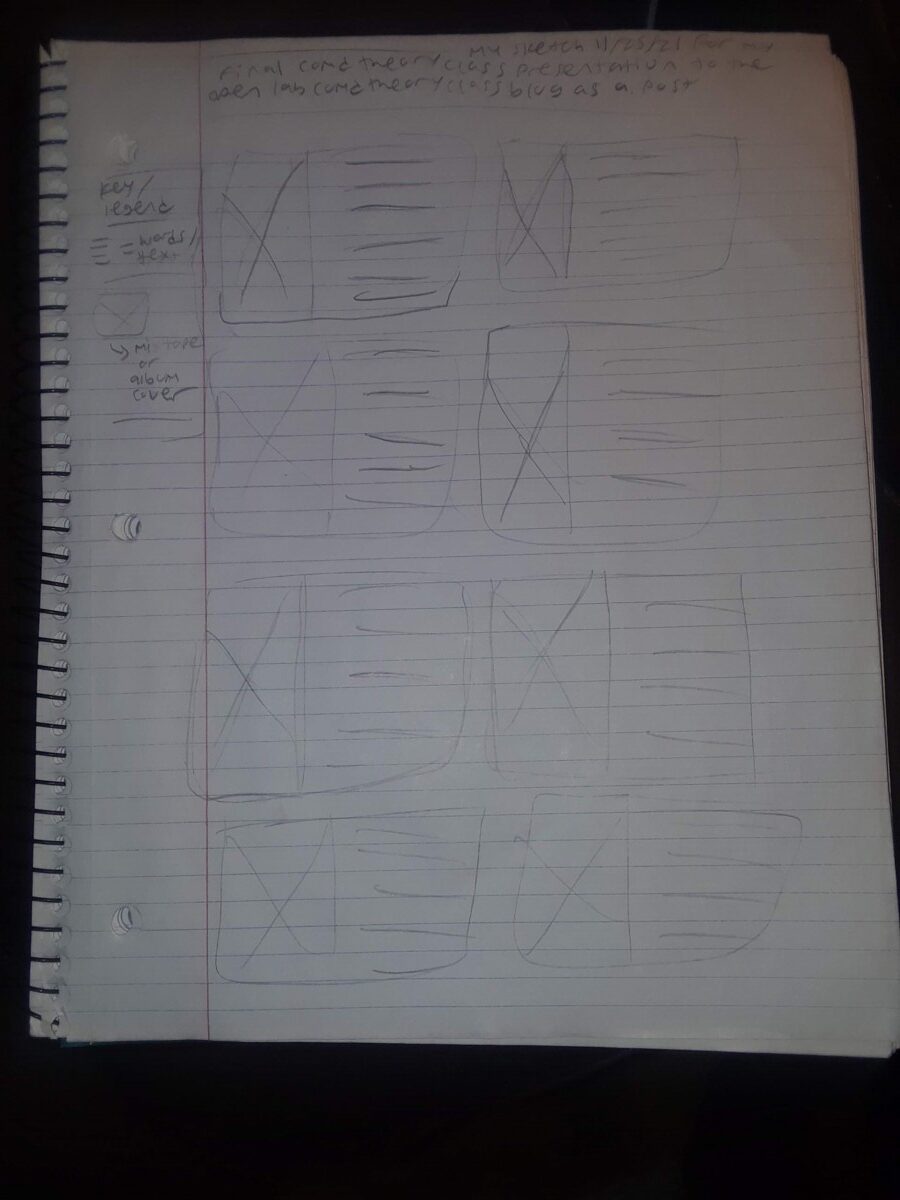
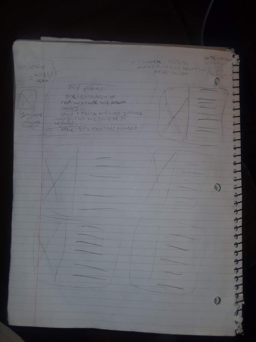
According to Heller, for the concept to be or not to be of mainstream vs. underground relevant in contemporary design because for the mainstream side: “All it takes is the followers of followers to cut a clear path to the mainstream. Indeed the mainstream embraces almost anything “edgy,” although once the label is applied it is no longer on the edge.” “Very little emerging from the underground fails to turn up in the mainstream.” On the underground side: “the underground satirically appropriated from the mainstream.” “Underground denizens attack the mainstream for two reasons: To alter or to join, sometimes both.” The designs or the designer that i’ll be addressing for my final presentation will fit into this dichotomy because i can talk about that in the form of hip hop mixtape covers. The reason is because to me, that’s what the words mainstream and underground remind me of, for seeing those words, in this question. Also another reason is that i would do general posters and flyers for mainstream and underground. However, i feel like i can’t do that because i can’t think of any examples of mainstream and underground posters. I searched it up online but i don’t think i got any accurate results, in my opinion. I COULD still present some hip hop album cover art examples, to my final presentation.

The sort of underground designs that influenced the work could be from the fact that “Ballyhoo took original quotidian ads for the things they made from cars, , detergent and foods, and wittily altered the brand-names to kinda sorta eventually make stuff like: “Look Ma, no cavities, and No Teeth Either,” a send-up of Crest Toothpaste’s false promise of cavity-free teeth, and “Happy But Wiser,” a slam at Budweiser beer through a parody ad that showed a besotted, forlorn alcoholic whose wife had just dumped him.” That explanation is one example. To back up my claim: “Ballyhoo in the first half of the twentieth century, and MAD magazine and wacky packs in the second. The Simpsons offers “gesture[s] of culture jamming in a context where we generally wouldn’t expect [them],” Fink observes.”[1]

One of the ways that his work shaped the mainstream is because he said that: “Take the sixties psychedelic movement, for example: It was born in a small
community that shared proclivities for sex, drugs, and anarchic behavior—
all threatening to the mainstream”. Maybe he didn’t want his work to resemble that or look that way.

Maybe it will probably do so in the future because he said that: “By focusing concurrently on popular design ephemera and groundbreaking new works, both editor and publisher were ahead of their time in forgoing any distinction between the products of high and low culture.[2]” (that i guess). A large amount of graphic design is straightforward or neutral—“The facts and nothing but the facts.”[3] So from those facts, and if he focuses on them, then that’s how he can continue to make good artwork, in any form or medium.

My 3-4 sources below:

Culture Jamming : Activism and the Art of Cultural Resistance, edited by Marilyn DeLaure, and Moritz Fink, New York University Press, 2017. ProQuest Ebook Central, http://ebookcentral.proquest.com/lib/citytech-ebooks/detail.action?docID=4500691.
Created from citytech-ebooks on 2021-11-20 19:49:06. [1]

Heller, Steven. Writing and Research for Graphic Designers : A Designer’s Manual to Strategic Communication and Presentation, Quarto Publishing Group USA, 2013. ProQuest Ebook Central, http://ebookcentral.proquest.com/lib/citytech-ebooks/detail.action?docID=3399604.
Created from citytech-ebooks on 2021-11-20 20:58:20. [2]

Heller, Steven, and Mirko Ilic. Stop, Think, Go, Do : How Typography and Graphic Design Influence Behavior, Quarto Publishing Group USA, 2012. ProQuest Ebook Central, http://ebookcentral.proquest.com/lib/citytech-ebooks/detail.action?docID=3399581.
Created from citytech-ebooks on 2021-11-20 21:03:35.[3]

Joseph a- assignment 9 annotation notes hw-based on the passage

From the passage itself, it was all kinda interesting to know about. The word signifieds sounds pretty weird even in modern times. he breaks down advertisements down in such a complex way, that i might not be able to compete with. I can try and come close to interpreting ads in a deeper way so my audience can be like “oh wow, that’s so interesting I never thought of it that way.” But i just don’t don’t think i would be a better ad “analyst” i’m in no way, shape or form giving myself shame but i’m just saying facts considering how i can only give small details whenever i think it’s necessary. I don’t think i can beat him in a type of debate where you would figure out any advertisements’ meaning, with that being said. You could also say he was mad wordy. I pretty much thought so too.

What in the world does he mean by lexia in this case?

Joseph Asimeng-Assignment 8

The first ad i chose pictured above.

The first ad i chose above shows a picture of a but being punched. Right in the car drawn in his cheek. By another guy with a car drawn on the palm on his hand. I chose this ad because all it’s telling me, or probably anyone else of that matter, is that if you text and drive you could crash into another car with your vehicle. Which can get ugly or violent. Most likely causing a scene to anyone that could pass by. Its not just obvious. It’s also true to the core.

Sourvce: BoredPanda.com. https://www.boredpanda.com/creative-print-ads/?utm_source=google&utm_medium=organic&utm_campaign=organic

The second ad i chose pictured above

This second ad i chose shows an arabic woman with her veil covering her face. Her left eye looks fine. But her right eye looks bad, battered and bruised a little bit. Only from the way i’m looking at it. The directions of her eyes may be different. Compared to the one that is beaten up, and the other one looking okay and normal. I also chose this ad because their message is simple to me or anyone else of that matter. Most likely. The message being shown is that they wanna speak up to fight (or end) women’s abuse. It could be mainly for arabic women in this case. In which it brings culture into the mix.

Source: Bored Panda, https://www.boredpanda.com/creative-print-ads/?utm_source=google&utm_medium=organic&utm_campaign=organic

the third ad pictured here.

This third ad shown above, pictures a teenage boy being pregnant. The reason i chose this ad is because the message is clear for me, or anyone else of that matter. the guy is pregnant. So to avoid that, it’s telling people to take condoms to not get bizarre pregnancies. Even for teens. I personally think its a weird ad but at least it deals with gender in some way. Making it look like boys can be pregnant. Which is still pretty insane to me but whatever.

Source: Trend Hunter, https://www.trendhunter.com/trends/pregnancy-ads

Joseph Asimeng-Assignment 7

McLuhan addresses technology and media as “extensions of man.” Usually I wouldn’t even think of it that way. It’s because to me, it sounds pretty weird. But No matter how bizarre it sounds, to myself, its a very complex way to think of it. This assignment response will break down some of the stuff that he said in his passage. My answers will try to dive deeper into how he really thought of, what he thought of. My responses within some of his quotes will analyze why he intentionally mentioned the stuff he wrote in his book.

Media extends human beings, or humanity in general because “the mediums, or process, of our time-electric technology-is reshaping and restructuring patterns of social interdependence and every aspect of our personal” lives. “All media are extensions of some human faculty-psychic or physical.” The hazards that technological progress might bring for individuals and society can come this statement: “Unhappily, we confront this new situation with an enormous backlog of outdated mental and psychological responses.” Which could mean that it’s very unpleasant that we have to challenge this new condition with a gigantic pile up of previous answers to all of our brains. In general, some tech that’s too perfect can have some malfunctions and glitches. Even in those times, back in the old days, when you think about it. If i’m not mistaken.  

If “the medium is the message,” then some roles that artists and designers play in creating new messages by actually accept goals and get their roles too. That’s because: “The young today reject goals. They want roles- r-o-l-e-s. That is, total involvement. They do not want fragmented, specialized goals or jobs.” So, all of that can still happen if they also don’t reject goals as well. Designing anything has to be successful if you do your job right.

There needs more way less dropouts and way more teach-ins. Dropouts get nowhere in life. Teach-ins are technically pretty excellent in their careers. That’s because: “The dropout represents a rejection of nineteenth-century technology as manifested in our educational establishments. The teach-in represents a creative effort, switching the educational process from package to discovery.” That’s in my opinion. the work of a designer subordinate to the media they use to create or distribute information could be because i guess they’re only doing it for whoever clients and companies individually. That’s how once again McLuhan addresses technology and media as “extensions of man.”

Assignment 4 from me-Joseph Asimeng

Disclaimer: I’ll try to answer these questions as best as I can. They might be from the passages and in my opinion as well. The authors are very hard to understand from what i think, but i’m like whatever to it. I hope you enjoy it.

Now from these authors, the stuff they thought were missing with past art and education was basically like this. For Bayer(Not like the pharmaceutical brand) he was saying that :”taking a closer look at present-day typographic customs, i make the following suggestions, believing that they offer immediate possibilities for
both improvement and change.” For Gropius, regarding the bauhaus, he said that:” With the development of the academies genuine folk art died away. What remained was a drawing-room art detached from life.” For Moholy-Nagy, he said:” Every period has its own optical focus. Our age: that of the film; the electric sign, simultaneity of sensorially perceptible events.”

The roles that typography and photography should play in shaping a new art are from what Moholy-Nagy said about typophotos. Which is Typography communication composed in type. That’s one thing he said about it. Then he also said “Photography is the visual presentation of what can be optically apprehended. Typophotos are the visually most exact rendering of communication.” Gropius said that: “The type is the elementary principle in the figurative sphere.” Bayer said that: “and new ideas must logically be deduced
from the function of typography and its carriers.”

The roles that other media should serve are from what Bayer said. Which he stated: “correctly foreseeing the widespread reshaping of typography imposed by new media.” Followed by how it should continue to be on stuff like on movies, tv show, tv ads, billboards etc. It should basically, continue to expand it’s territories, around the world, in every form possible, is what i’m saying.

The roles that language or communication play in art and design come from the fact that they inform us about what to buy, where to go, how to use anything and other stuff we need to know in a way. Thus, expanding our reading comprehension in a sense. Followed by what Bayer said, which is: “it seems appropriate at this point to recall the essence of statements made by progressive typographers of the 1920s: previously used largely as a medium for making language visible.” “the type designer is not usually a language reformer, but a systematic approach will inevitably carry him to a point where he will ask for nothing less than a complete overhaul of communication with visual sound.” “an important extension was introduced with the recognition of supranational pictorial communication.” Maholy-Nagy declared that(once again): “What is a typophoto? Typography is communication composed in type.” “Typophotos the visually most exact rendering of communication.”

Artists should approach the creation of future art forms by doing what Moholy-Nagy was referring to. Which is: “impartial approach” of photography, showing us
even now how to experience reality anew.” For one thing. Then another way is to do what Bayer was mentioned. Which is from the following: “the type designer is not usually a language reformer, but a systematic approach will inevitably carry him to a point where he will ask for nothing less than a complete overhaul of communication with visual sound.”

Education or “the academy” should teach artists about their field, not to be shut off from the world of industry and handicraft. As artists were shut off from themselves and the career they’re supposed to be good at, according to what Gropius has also talked about. I think “the academy” should teach them how not to be misled by the fatal and arrogant fallacy.

The Bauhaus ideas should be updated to remain relevant in the 21st century by how they shouldn’t think that anyone should not stay enslaved. They should not also think that society should continue to be in chaos and in shambles in a way. More importantly, to me they should update every sentence in the passage. The reason is because in my opinion, it was pretty hard to understand. They should adjust that to make it more understandable. So that everyone is on the same page.

« Older posts