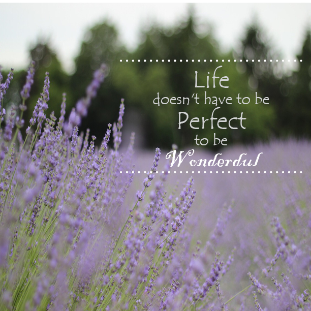

First Image
In my First image of the quote concept, I used two different typeface on it. It was Tempus Sans ITC 48 point and 30 point, the other font was Blackadder ITC 48 point. I created the spot line at top and bottom of the letter. Because this is the first one of my 3 images, will more simple and cleaner. The background I took at the Lavender By the Bay in Long Island.
Two Image
In the Two image of my quote concept, I also used two different typeface on my image, (Showcard Gothic / Bernard MT Condensed) and 48 point size. Since I got some ideas on the book cover, I tried to create one bigger circle behind the type. Then I added some effect on my circle, 44% of the transparency. This circle will made my letter more pop in the front, also do not destroy my background. In addition, I created the spot line on the left top and the right bottom corner. On the my background, I took in the sidewalk of the LA Universal.
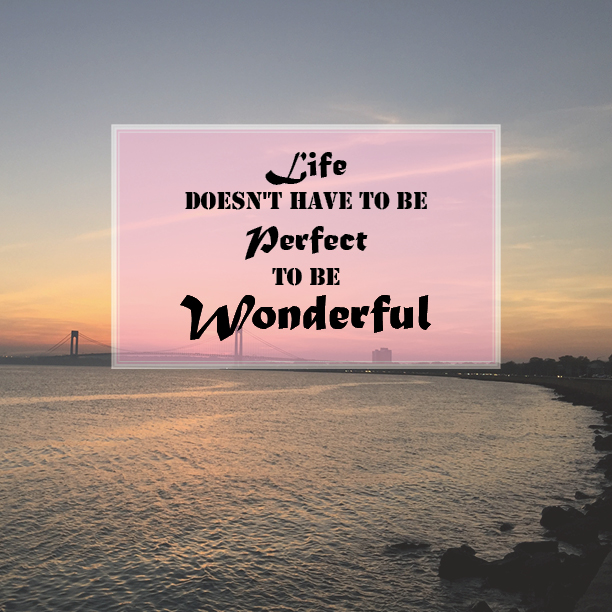
Three Image
In the third image, I used two different typeface (Stencil/ Matura MT Script Capitals) and 25 point / 38 point size to make the quote more attractive. Then created the rectangle behind the letter, and made some effect on it like 75% of the transparency. In addition, I made the other smaller rectangle in front the first rectangle, the easier to see a little bit red color. At the end, I used the seaside photo on my background , that’s I took at the Belt Pway.

