
EB drawings
Reply

This illustration is made by John cuneo called “The swamp”. This illustration caught my attention due to the colors and the main person being illustrated Donald Trump. There where a few illustrations of Donald Trump that were in the gallery, but this one caught my attention because it was the most different and meaningful in my opinion.
The illustration shows Donald Trump playing golf in a swamp. It is very interesting because he is around many animals that are in the swamp that look like they want to attack Donald Trump, but he is playing golf and ignoring them. This goes back to Donald trump’s campaign where he said he was going to drain the swamp. As in get rid of the people that are bad in the government. Instead he is playing golf and not doing what he said. I think the idea of him playing in the swamp and the animal’s around him shows how he doesn’t care about the swamp and luckily John cuneo didn’t care to illustrate this.
John cuneo has done many pieces for The New Yorker. When doing this piece he was trying to block the noise of people in the media. He also know when to actually illustrate something controversial and make sure no one is doing something similar or else he won’t do it. He also makes the illustration very profane and inappropriate for the magazine that they won’t be able to publish it. Just so sometimes he can stay away from the political topic. Overall the artist and the illustration was very well done and just one of the great political illistration with a story to tell.
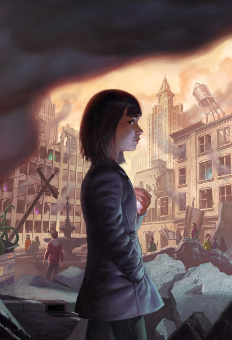
Little Apocalypse is a book by Katherine Sparrow and published by HarperCollins on March 12th, 2019 -today- and is about a girl who, though she’s never encountered anything really strange in her life, finds herself at the helm of a fight against monsters who recently caused a large earthquake in her city. The cover art was done by Eric Deschamps, who is described on the “About” section of his website as “both a sci-fi/fantasy illustrator and a video game concept artist”. Along with HarperCollins he has also worked with Blizzard Entertainment, Bloomsbury Children’s Books, and Paizo Publishing.
What drew me to this piece were the many colors being used, they were bright and eye-catching yet soft and there were often blends as one went into the other, the artstyle mirrored the imaginative world that was being presented in the book very well judging by the summary. This no doubt is telling of his “process” or how he actually goes about making the art, though he doesn’t have a piece detailing how specifically the art for Little Apocalypse was made, he does tell about his many card illustrations and of most recent, an illustration for Magic The Gathering which I will be using as an example.
He was given an “action” which detailed the image they wanted commissioned, a sizeable paragraph detailed enough that the artist would draw a specific scene but not so much detailing specific ways to draw it, it reads in one area “Gideon is sweaty and gritting his teeth in determination.” So we can see that the “action” is giving the narrative and tone but leaving the artistic expression of this up to the artist, Dechamps then sends back a sketch, in the blog post it seems to only be one, and the critique was that it was too far away -they wanted to see more of a certain character- so he sent back another sketch a little more cropped out which was approved. Already shaded, the final was made and colorized.
This differs however, from some other work he’s done. In some book illustrations we can very clearly see that the artist Deschamps is working not only on art, but also lettering. For Simon Thorn and the Wolf’s Den we can see sketches sent which clearly have word art already positioned and incorporated into the art itself, this differs greatly from Little Apocalypse where he only sent the art with negative space for Graphic Designers to work in, and this probably has to do with the specific contracts and word he’s hired, Simon Thorn was written by Aimee Carter and published by Bloomsbury USA Children’s, which might very well pay the artist more for more work, whereas HarperCollins the publisher of Little Apocalypse, might leave more to the hands of their internal departments.
What this then reveals is that given the games, cardgames, and books he’s worked on as well as the differences in his work, Deschamps being freelance, keeps him on his toes work wise, some work is more intense then others, and different publishers are more lenient then others, Magic: The Gathering, sent an Action script because they knew exactly what they wanted, Bloomsbury did not and Deschamps had to send multiple different sketches to him, not only is this much more intensive but this also stretches his mind not only in illustration but also in Graphic Design, and if he did not have these skills he’d lose out on money and connections.
What we can also see from his sketches is that they are pieces of art on their own, not messy lines and ill-shapen circles, they’re their own pieces of art, fully shaded with everything clear and fully presentable. As a designer my sketches can be very messy, going from idea to idea to figure out where text might go, or how a document will be oriented, but this is a much different kind of sketch, it is dedicated and precise because it’s not for ideation purposes rather it is for presentation purposes. This leaves no doubt in my mind that there is much more work not being shown, this art has to be strong and cannot be accompanied by much explanation, since as a job from a larger company this has to be presented by someone with none of these skills, to people who judge at face value whether they like it or not.
Each one for Bloomsbury was very different as well, one is a side profile of a boy’s head which is pretty surgical and kind of creepy, another shows the same boy just before a doorway, and the final, the accepted one, showed him at the gates of a large mansion with ghostly figures far off. This shows that in his process they are linked by subject matter but the entire composition is thrown out for the next piece, which again, takes mental focus and time.
Throughout the rest of the blog you see similar themes which continually impress me, sketches so different and yet so complete, action scripts and his interpretation and so on. It reveals to me the heavy mental side of illustration and the amount that a publisher can lean on the illustrator, as well as the differences between clients and the importance of a varied yet focused set of skills to accomplish different things for different people and for different industries.
As a book illustration, I’m willing to bet that he had to send in many different kinds of covers for HarperCollins and perhaps there was a Nondisclosure agreement explaining it’s absence from his blog, or maybe that has to do with it being a museum piece, I’m not sure, either way it seems like the publishing industry tends to have a lot more ideation then the more focused game companies, he probably had to send them in then get one approved and then move onto the coloring which would then get sent to their internal team. This is strengthened by the fact that his work on Fablehaven: Grip of the Shadow Plague by Brandon Mull, a book published by Shadow Mountain, also lacks an Action and contains multiple sketches.
All in all this leads to a greater appreciation of the art and the industries that illustrators work in, knowing that there is a lot that goes and does not go on behind the scenes, and especially adds weight to the importance and skill needed to be a freelancer working with different clients, tones, and people, for the best result.
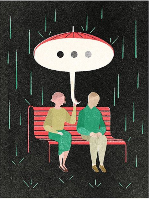
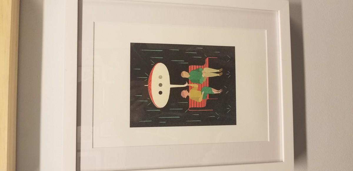
Gracia Lam is an award-winning illustrator. She was born in Hong Kong and raised in Toronto. She became an illustrator because she found how you can communicate and bring stories into the light to the audience. Her goal is to visually communicate with the audience and to uncover hidden treasures every day. Gracia Lam designed what I found interesting at the museum. She designed art for Real Simple Magazine and it’s a scene where you can either think it’s a couple, friends, family, etc, sitting on a bench in the rain and the woman seems to be holding an umbrella but the umbrella represents as a waiting text bubble. This icon usually means either someone is waiting or the person is texting or complete silence.
This design stood out to me because I thought to myself how I relate to this design. What I got from this was waiting for a text from your loved one and not getting a response. However, the meaning can go in many different ways. I research an article relating to the art on realsimple.com and the article talks about disagreement with others. The article basically summarizes how if two people disagree, we shut them down and don’t connect with people who don’t see the world as you do.
Overall, I think the art shows a clear statement to the audience. She used great colors and textures to express darkness and the mood in the art. The two people show clear body language and the idea to have the umbrella act as bubble icon is really creative.
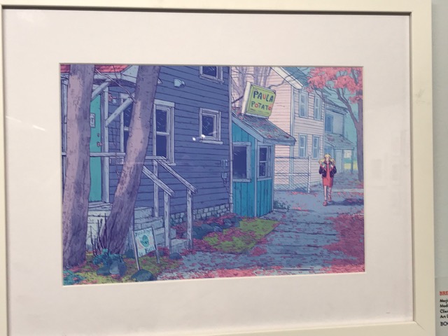
This artwork by Marjorie Alone I really enjoyed because of how the colors brought my attention. The way the colors are being used which are the pastel colors that bring this artwork more depth. It is from a story/comic called Sheets in this piece the character name Marjorie feels alone or in this case a ghost; she takes care of her parents laundry business. Another character name Wendell, a young ghost is trying to navigate his afterlife and figure out if his place is there or back to living among the life of the living.
The steps or tools being used was using graphite and then transferring it digitally. She started using pencil then using the strokes to create a back shadow as purple being the main color then adding the pastels being seen. Her illustrations of the character’s faces had so many emotions and was understanding to know what they are feeling or thinking. The detail is accurate because of how it is scattered around which makes it unique. The color palettes that were used in the graphic novel were blue and purple tones which fitted the story well.
Overall, this piece was unique and had a good storyline that explained her struggles through a story and how it was overcame. For expressing her work by using the colors to bring it to life made it more interesting to bring the readers in.
Coyote ugly is one of my favorite movies and its about a shy girl who find her voice by singing along with a jukebox in the bar she started working in which is called coyote ugly. Coyote ugly is a term created for a deunken one night stand you wake up to that is so ugly you rather chew your arm off then wake them up. It is also the name of this bar.
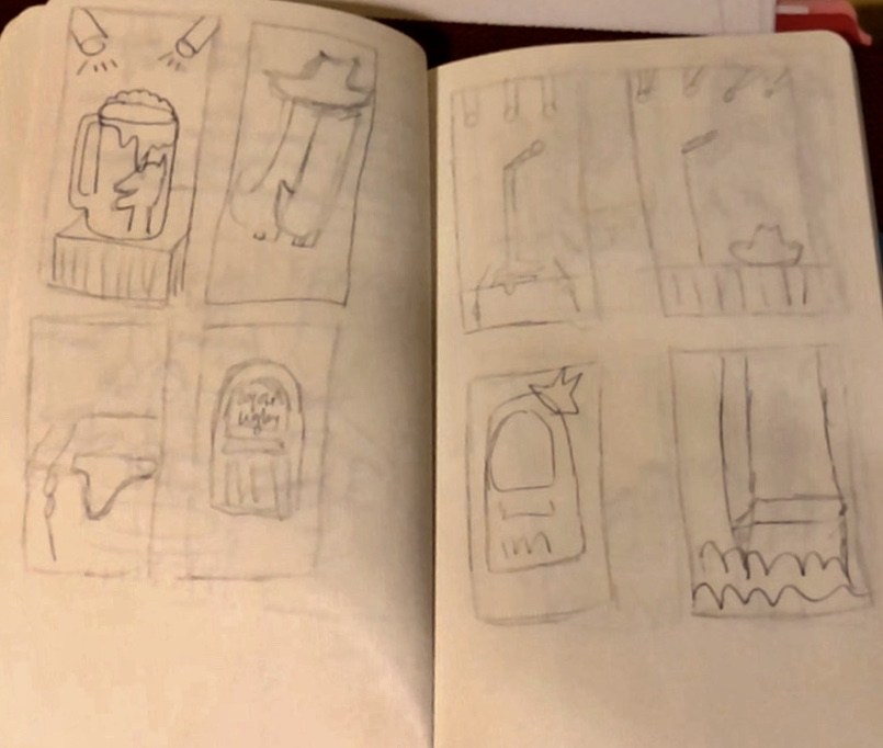
These thumbnails include stage presence, coyote hats , beer jugs, juke box symbolic to the movie and solo microphones

The musical basically breaks down themes of the movie -and significant scene and symbols
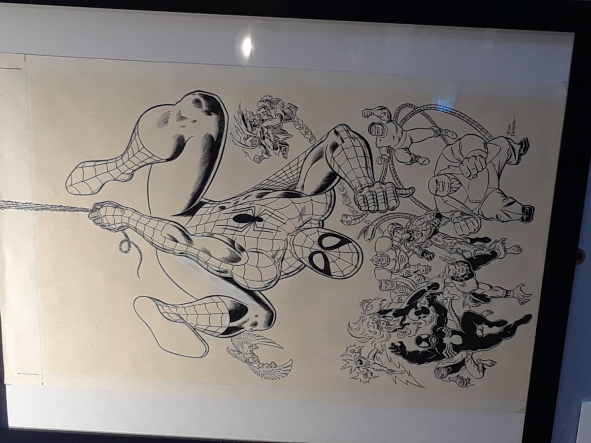
The trip was actually really enjoyable since I kinda thought we were gonna stand in one place all day until the end of time. But it was a rather interesting find looking at all the award-winning Illustrations on display. But what caught my eye specifically was the Stan Lee section on the 3rd floor of the Museum. Sure I may not be a particular fan of Marvel anymore since I feel like it’s been oversaturated. But what really think stands out about it other than the actual artwork is the inking. I myself want to be a Manga Artist, so I would mostly work with ink and sometimes even color in my panels. Which working with color is a lot harder since I don’t have a full enough grasp of color shading with markers, pens, and other materials.
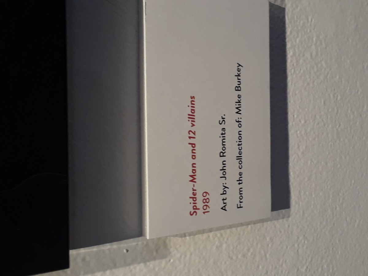
The specific piece I saw with Stan Lee (Writer) and John Romita Sr called “Spider-Man and 12 Villains” created in 1989. I particularly like the line and stroke difference in the cover. After doing some research on it I found out that Romita didn’t really want to draw Spider-Man, according to an excerpt from Comics Alliance.
“The only reason I did Spider-Man was because Stan asked me and I felt that I should help out, like a good soldier. I never really felt comfortable on Spider-Man for years. I had felt at home immediately on Daredevil. On Spider-Man I felt obliged to ghost Ditko because — this may sound naive, but I was convinced, in my own mind, that he was going to come back in two or three issues… The only reason it wasn’t better was that I couldn’t ape him any better.”
So it was a surprise to find out that this cover to that Spider-Man comic really only existed as a sense of a sense of helping a friend like Romita said, which I think is a nice sentiment.
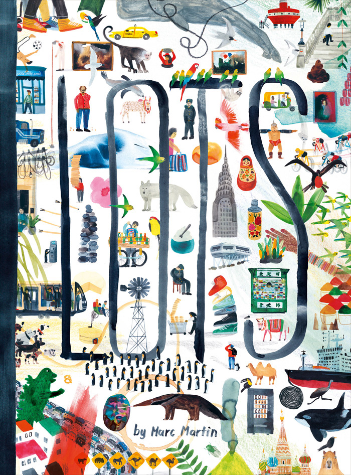
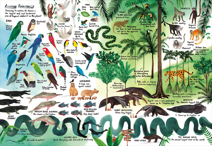
Marc Martin is an award-winning illustrator, artist and book maker based in Melbourne, Australia. Most of Martins work is with watercolor, gouache and pencil. His work is a world of vivid color, rich textures and “occasional scribble.” Martin is also the author/illustrator of A Forest, LOTS and A River. Having trained and worked as a graphic designer, his moonlighting as an illustrator eventually led him to a successful freelance career. I learned that Marc draws/finds inspiration from his surroundings, nature, animals, and the city he lives in.
At the museum Marcs illustration caught my attention. The piece is from the book series called, ‘LOTS’. It’s an incredible picturebook, that takes you on a guided journey around the world. The first moment I looked at it, instantly it reminded me of our first project we did in class with the collage of our illustrations. It reminded me about the use of ink and water color we used to finalize of the process.
As I researched about Marc I found a blog post about his process when creating his book. He first brainstormed which places he was going to draw by making a list. Finally he then narrowed it to 14 places and made sure that he had at least one location from each continent. He then talks about the material he used for his work, which was watercolor, pencil and gouache to add different vibrancy on each other pages as well to “reflect the colors and energy of each location.” He then goes in depth about this project how it was like a travel diary and part fact. He wanted to make a book that captured all the unique things you can find in various places around the world. For this book, he used a combination of watercolor, pencil and gouache to achieve a feeling of immediacy and vibrancy on each page, reflecting the colors and energy of each location.
Altogether, it really made me analyze and reflect about how that’s the same exact process we took in class to achieve our final illustration. It’s not about your first thoughts, it’s about brainstorming with many different thoughts and then narrowing it down to a smaller number. With Project 2 I’ll defeinlty keep this in mind and for all future projects hands down.
LOTS: A Book About Everything, For Everyone
Source: http://blog.picturebookmakers.com/post/157523453476/marc-martin
.

The OpenLab is an open-source, digital platform designed to support teaching and learning at City Tech (New York City College of Technology), and to promote student and faculty engagement in the intellectual and social life of the college community.

