Field Trip Discussion

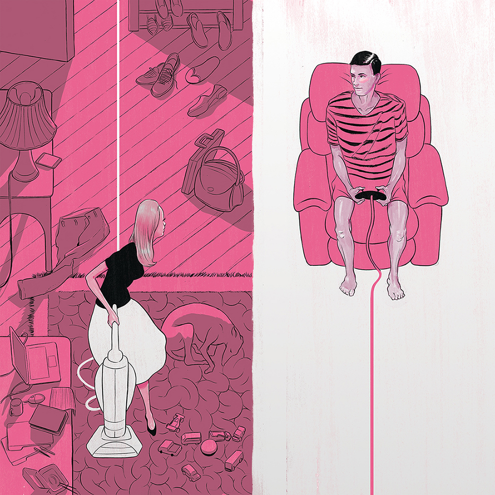
Ryan Garcia’s PRIORITIZING FREE TIME  is 4X4 size editorial single image using Digital, Ink, Gouache. Directed by Bryan Gee. The client is the Globe & Mail. It’s about Editorial illustration to accompany an article about the work/life balance many couples face in the 21st century.

Ryan Garcia is an editorial and commercial illustrator from Toronto, Canada. His work is best known for The New York Times, WIRED, Scientific American, and The Wall Street.

I found particularly interesting in Ryan Garcia’s PRIORITIZING FREE TIME because I think it’s very easy to make the connection with our-self in this drawing. When I see this drawing it makes me think of gender role and gender stereotypes in this society. In the old days, women can’t have a job, and they had no rights,they can only rely on men at home (father and brothers). After marriage, they depended on their husbands for the living. They could only be full-time wives. In nowadays, women have to have the ability to effectively manage a household while juggling a demanding career. It becomes a new problem for a couple or family to face and it’s hard to balance the workload with men at home.

The color of using most pink and white strick me as very interesting.  I’m curious about why did the artist using pink and white in the drawing instead of another color, like blue or purple. And why does the background on the women is pink and it’s not on her, and the mare is wearing pink and the black ground is white. Does it related to gender stereotypes?

Prioritizing Free Time


Henry Chang – Field Trip Discussion


These works by Rebecca Hendin were done for an editorial series under BBC. “Lost In A System’ is about a drug crisis in UK prisons, and how a son of two parents were startled in post cannabis personalities and growing mental health issues. It’s a grim story and the artist of the editorial, Rebecca Hendin, reflects the concepts using the appropriate color schemes and texture.

The monotone color of teal gives just enough personality to imitate specific shadow colors. The usage of color aside from grayscale is what gives a bit more life to the artwork. Grayscale in itself is an uninteresting, and newspaper like colortone. To at least set a hue gives it more ways to take it than just a sad story. Even while there is a teal tone, it’s not impossible to distinguish what colors are what. The Union Jack flag can still be seen to have a red tone, even under a sea of its counterpart color.

Material wise, the granularity and scratches combined cover the flat surfaces of color, giving texture to the work. Line strokes are varied or non existent to determine distance of the object, which gives varied indication of what shade the object is.

Overall, these pieces are accompanied by grittiness and grain by the stroke, but it works to express the tonality of the work, as well as make good non-simplified detail which is very fit for an online posting. The colortone is right for the expression of the story too.

Field Trip Paper

How to Break Up With Your Phone by Miguel Portan


From the moment I saw this piece it caught my eye.  It’s not very much to it and it’s straight to the point but is it so relatable. It is digital art  with sort of a paint based look by Miguel Portan. Which I believe make it into the New York Times. It displays a person trying to disconnect from their phone but some parts of the person’s face is still glued to the phone causing the face to look irregular and elongated. The image doesn’t have much shading or details. It’s very simplistic with very few colors but a certain kind of texture to the coloring making them pop. The movement in this piece is very well constructed as I find my eyes shifting from the person’s face to the phone and then back. The negative space in the piece and the contrasts between the red shirt and green background makes for a very eye pleasing visual, I think it gives the image unity. For me the two focal points is the person’s face and the phone.

I really think this piece works because I automatically connected with it on a personal level.  As the name implies how to break up with your phone is self explanatory towards the image. Even without knowing the title of this piece I believe anybody would have been able put that connection together.  As it is known, we live in a technology based society were phones and computers are everything, so I find myself and people of my generation glued to their phones.  We live on our phones and it’s hard to go days or even hours without it. This piece reminds me of that problem and relays the relatable message very well. Personally I have been finding ways to spend less time on my phone even though it plays a big role in the improvement and evolution of portable technology, that has greatly improved our lives to an extent. Cell phones are very innovative devices constantly improving, but the daily connections and unlimited amount of time the average young adult spends on their phone is unhealthy and it distracts them from reality. There’s but so much you could take from the virtual world or media/internet. At the end of the day, reality and living life is what’s most important, the outside connections, communication and experiences are what’s really going to make an impact and become  memorable. So I have a heavily support this piece and its deeper meaning of breaking the cycle of being glued to your phone.

As far as the other work by this artist go they are all simplistic and unique, and they happened to be digital art as well. Some of them even have similar topics like social media, web browsing, data files and others. From that I could see that this artist is very well interested in the virtual world and technology, whether that’s showing the negative side of it or just shining a light on the subject.

ilustration for project 2 part 2

Concepts:

1. human body parts made of garbage killing, eating, sonicating the turtles and sea animals.

2.Turtles along with other sea animals shape as an object, bottles, car wheel, trash, resources that humans use.

3. Walls made of trash, sea animals water, nature made as a human lifting a piece of the turtle’s shell and finding trash.

4. dissolving with trash while stuck with plastic items serving it as foods in restaurants.

5. sick sea animals looking down at their family, also humans family along with turtles of recycling symbol.