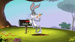
This project is a play on the famous quote “What’s up, doc?” by Bugs Bunny. I chose this very well known line because I watched reruns of this show as a child on CW, CN, and Boomerang. There are variations of three different vector graphics with UP highlighted as the word of importance. When you hear Bugs say “What’s up doc?” you can hear an emphasis or change of tone in his voice when he says up.
Sketches
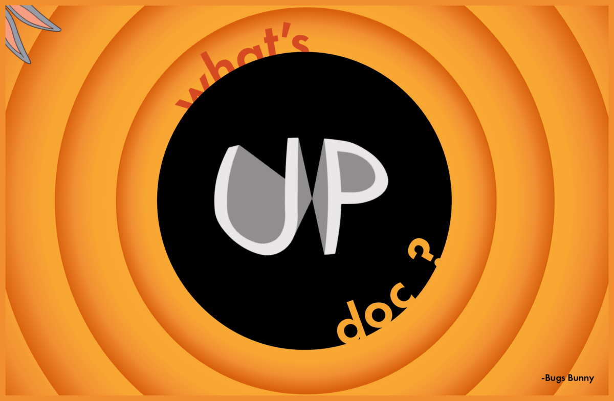
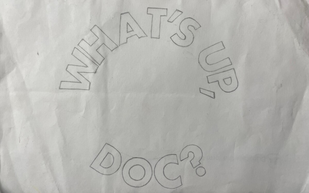
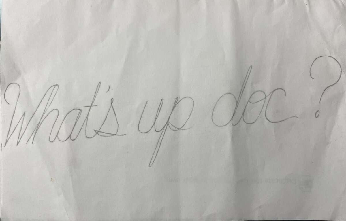
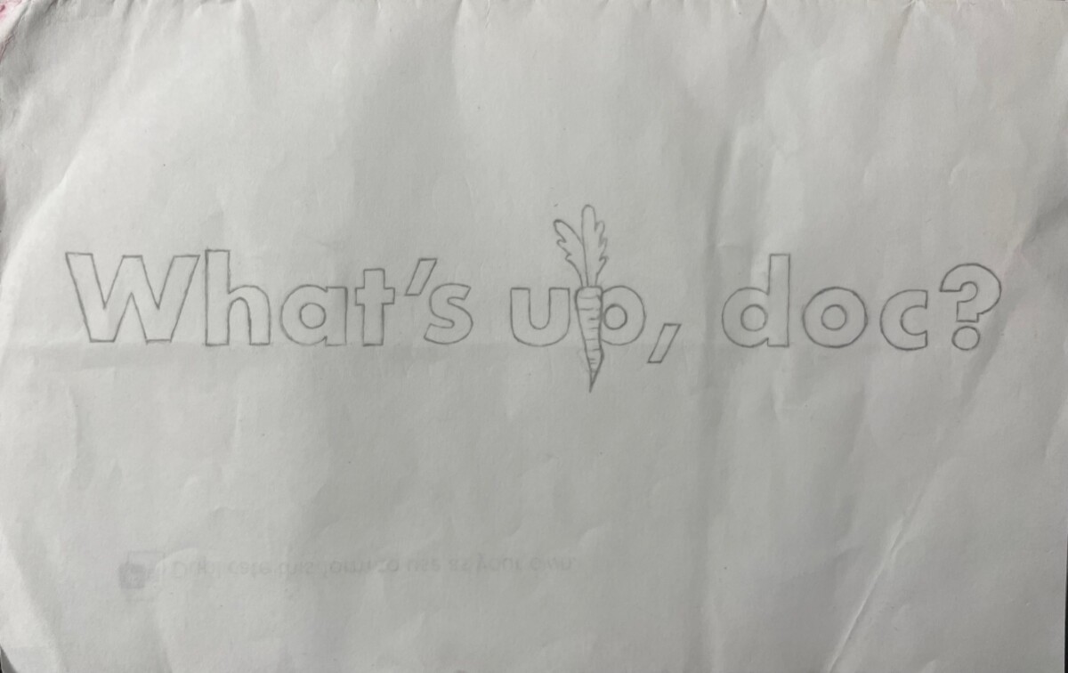
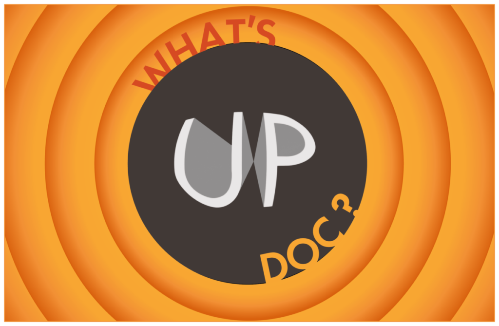
I drew out 3 sketches of the typography that I wanted to use for the project. I did some research on the Looney Tunes typeface and other typefaces used in Bugs Bunny show titles. The typeface I found that matched Looney Tunes was Futura. The other type was written in script, so I decided to create my own handwritten script. The first sketch is in 180 point Futura type. The idea in this sketch was to add a carrot on the p from the word up. The second sketch is the phrase written in a circle to symbolize the ending title that says Looney Tunes with the red and black circles scaling from large to smallest. In the ending title you usually see Porky the pig saying “That’s all folks!”. The third sketch is of the handwritten script. The idea here was to add Bugs’ ears to the w in what.
Draft Phase 1
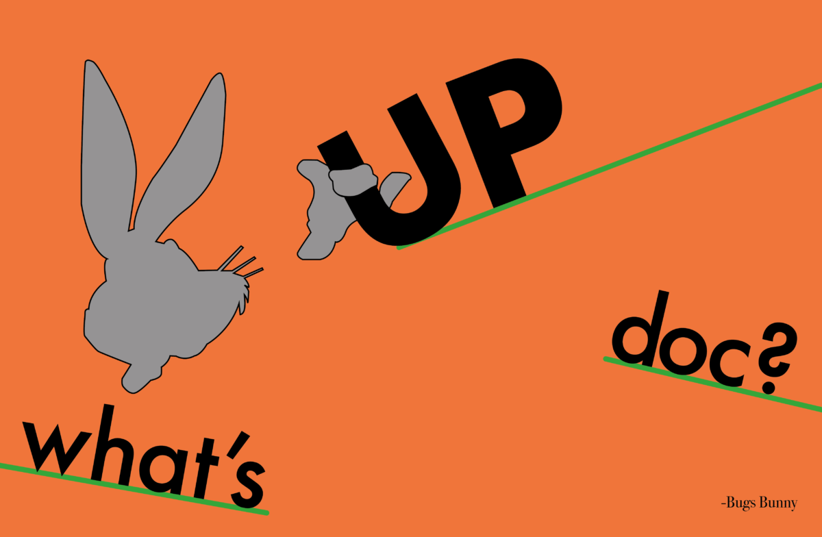
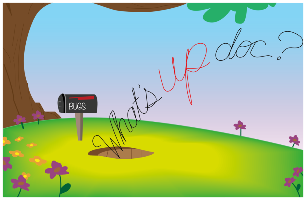
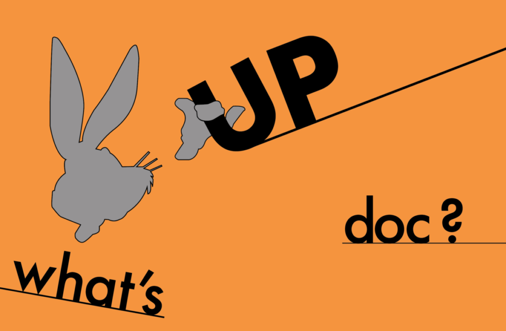
I created this background using the pen tool, blob brush, and the gradient tool on Adobe Illustrator. These first two drafts are for the handwritten script sketch idea. Quote draft number 2 resembles the ending title from Looney Tunes. I played around with the arrangement for the type. I decided to layer the words diagonally (top left to bottom right) with the word up as the main focal element in this postcard. I also made the word up a 3D object that looks as if it is stretching forward from the block hole in the middle of the postcard. Draft number three is the first sketch example. In this postcard I decided to make the U in up represent the carrot that Bugs Bunny usually eats in the cartoon. I chose to put the words in an asymmetrical order that makes the reader’s eye zig zag left, up, and down right. Bugs Bunny’s silhouette is also in the postcard for more symbolism and as a visual starting point on the postcard.
Draft Phase 2

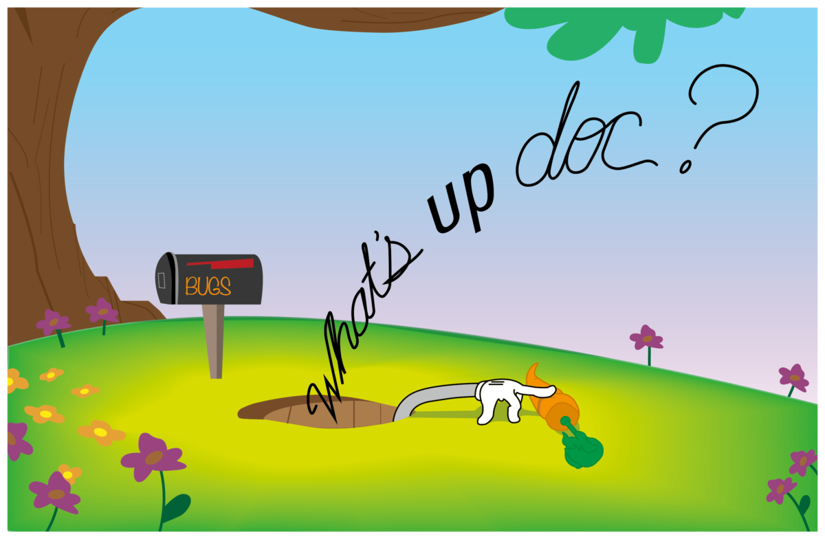
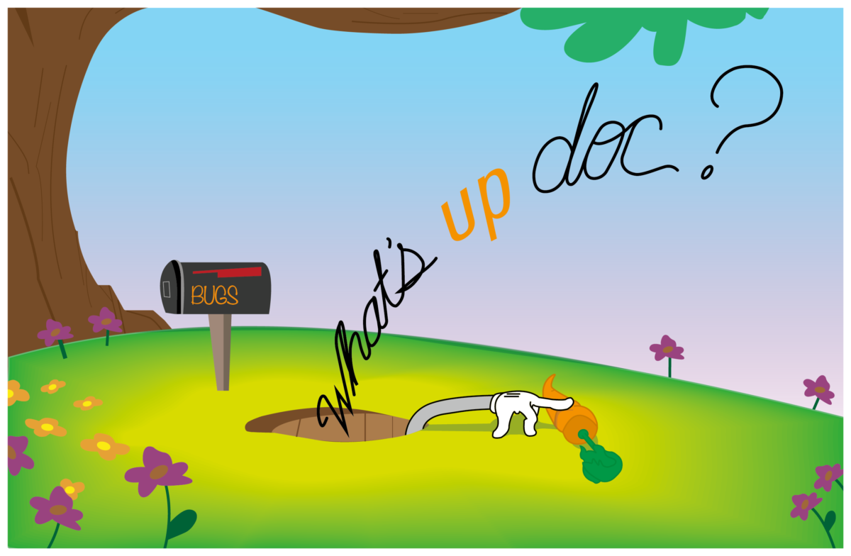
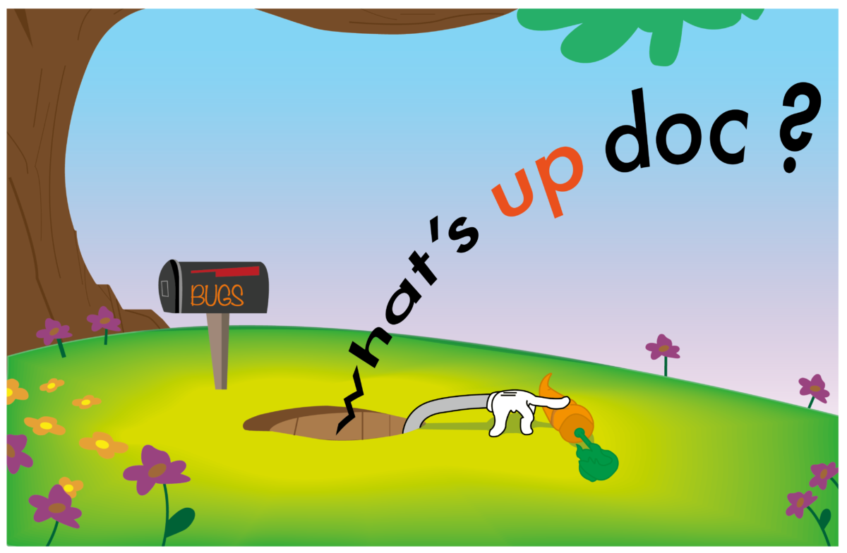
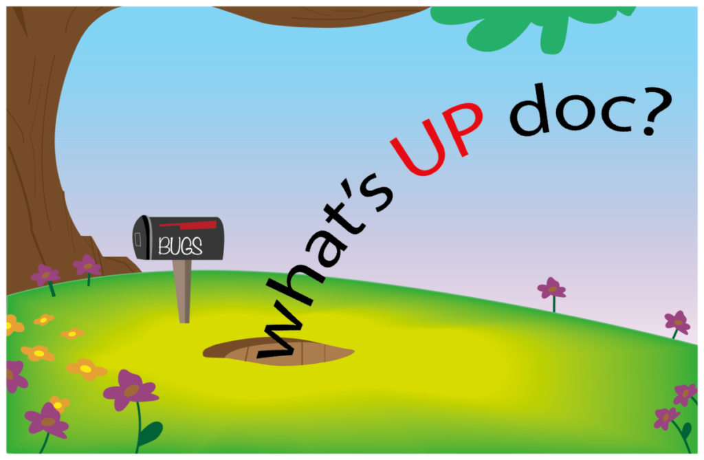
In this phase of the postcard drafts, I decided to add small visual elements that spice up the images. In the first three drafts, I added bugs bunny’s arm grabbing a carrot from inside the rabbit hole on the ground. This was the only post card draft that contained the quote attribution on Bugs’ mailbox. I also made adjustments to the text and made variations of the phrase with all text in black, one word emphasized in orange, and using a San Serif typeface (Futura). In draft number 2, I made the words what and doc lowercase to give more emphasis on the word up. I also added bugs bunny’s ears to the top left corner of the postcard. For draft number 3, I changed the background color and made the lines green to represent the leaves on a carrot. In draft 3b, I turned to word up into an object and placed an image of a carrot to add texture to the postcard. Quote attributions were added to all of the postcard drafts.