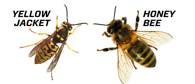
Logos represent and can define an entity. Similarly to various mediums of artwork, to get there one will go through different stages. In most cases, the first step would be to research, research, research. This is something I have been ingrained with to do in all of my courses at City Tech. So, guess what? You’re right! I researched. What is City Tech’s mascot? Do we have a logo for our mascot? What is a Yellow Jacket? What is the difference between a Yellow Jacket and a Bee? These were some of the questions I researched to get started on creating a logo that The Nutrition for Education & Student Achievement‘s (The N.E.S.T) resource center can use.

City Tech’s mascot is a Yellow Jacket. Did you know a yellow jacket is not a bee? They are wasps. Bees are fuzzy whereas a yellow jacket is smooth and shiny on their skin, and although they share similar black and yellow pattern, the yellow jacket tends to be a brighter yellow. This information helped in choosing its color, but the color came later in the process. One thing I learned and worked with was to start with black and white before going into color.

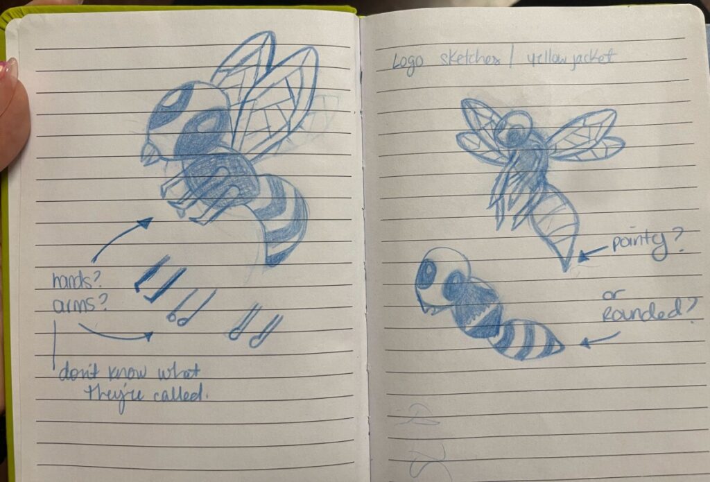
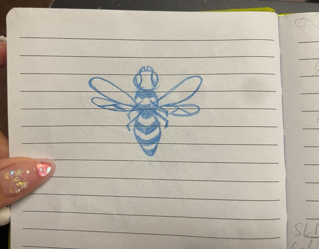
After researching yellow jackets, the sketches started. There wasn’t a clear direction of what kind of illustration style was wanted. So, I tried sketching a couple of styles in between serious and fun. Some factors that we considered for the yellow jacket were if we wanted it to be straightforward or sideways if it served as one logo or will it be customizable for future projects such as wearing a shirt, and how much detail do we want on it, etc.


The process of creating a logo was challenging but I very much enjoyed it. When I got to see the printed results, I felt happy that I got to be part of it. I was proud of the work we did. We made the deadline and got it on The N.E.S.T’s food pantry social assets!


