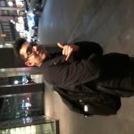
For my marketing event I went to People of Color in Publishing Presents: Diversity in Design Workshop + Portfolio Review, I met a ton of people there, several people that either work for Penguin Random House or for People of Color in Publishing, and got the contacts of eight people overall, five of which were students from Mercy College also attending the event, with the other three being professionals in the field.
I learned a lot from this event, one of which was the very focused portfolio that many people in the industry look for. They want to see nuance, skill, attention to detail, and for that, you could show them five different cover designs with interiors and they’ll be happy, maybe one or two extra things just to show range as another put it. I also learned that there is still a need for employment in the industry, one of the paneli
sts was a woman who had recently graduated Mercy College, and was a Junior Designer at Dutton, a subsidiary of Penguin Random House.
The panelists were very interesting, there were four of them three woman one man. Albert Tang is an art director, Marcie Lawrence is a senior graphic designer at Little Brown, Dominique Jones is a Junior Designer at Penguin, and Maya Battle works at Penguin but with a job she herself admitted is confusing and hard to explain, sin
ce she does a lot of different things, analytics, media buying, and so on.
Battle had many interesting things to say, she admitted that while her job was hard to explain she ended up with a lot of influence and could see a lot of how the company worked in general with its marketing, she lamented the push on advertising towards demographics, such as males 18-24, and herself would rather and tries to market to interest groups, such as coffee drinkers. She said specifically that the former assumes an entire group acts the same, while the latter allows for more targeted ads. This related to their universal opinion on book design, that it should be targeted and nuanced, when making a book for Alice in Wonderland for instance it might be easy to put a large cheshire cat on the cover, but a good designer will look into the interest groups and demographics to know how they relate to and enjoy the book so that the book cover can end up speaking directly to them, as if it was made for them.
This is something Battle attested to, she had found t
hat although she didn’t expect it her degree in Psychology greatly benefitted her because it enabled her to more easily understand people, and by doing this, she was able to create more successful projects. It is an often overlooked fact that with the myriad of projects a designer may get, each one must be detailed and precise, there is no time for creating easy or simple covers since the guy above you might hate all of the concepts.
At the bottom though it seemed a lot more relaxed, Jones was a junior
designer and didn’t have any of those more intense speeches, they gave her projects to do handbags with repeating patterns of cat heads, a few book covers here and there. Whether or not it was more intense I don’t know but she largely played it off.
After their panels and discussions there was a second part which had to do with resumes, I didn’t learn much but they mentioned to show range as far as skills go, and if you don’t have work to show, show work that explains your skills with each program.
After that there was the portfolio review, I got to
a man named Christopher Lin, an art director at Penguin, and we got to talking. Oddly, we didn’t discuss much about my resume, he wanted to know how I felt about the event and Penguin Random House more, and he recommended I read Game of Thrones which I later realized was published under a subsidiary of Penguin Random House. I felt a little flustered because the whole thing seemed really important, but I ended up getting his contact information, as well as a few others.
Another person that I met was an Author/Illustrator named Booki Vivat, she’s published three children’s books so far with the most recent having been published February, she was really bubbly and fun. She actually illustrated her own books so it was nice when I dug around and found her website, that the sketchbook illustrations she wa
s showing off, were near identical to the book cover illustrations.
It may sound extreme, but I think the event has solidified my goal of working in publishing and make Penguin Random House a goal as far as employers go, the atmosphere was relaxed but professional, and I never felt like I had to put on a mask so to speak, it matched myself in terms of tone. I choose the event because I knew it was what I wanted to do, but I didn’t feel the level of commitment that I do now, I’ll use the information to possibly keep in touch with the people I met, or at least keep track of them and the organization that organized it, as well as mess with my portfolio so it’s more focused to book design specifically. Shown below, are some of the Queens College students I took photos of after the event.


