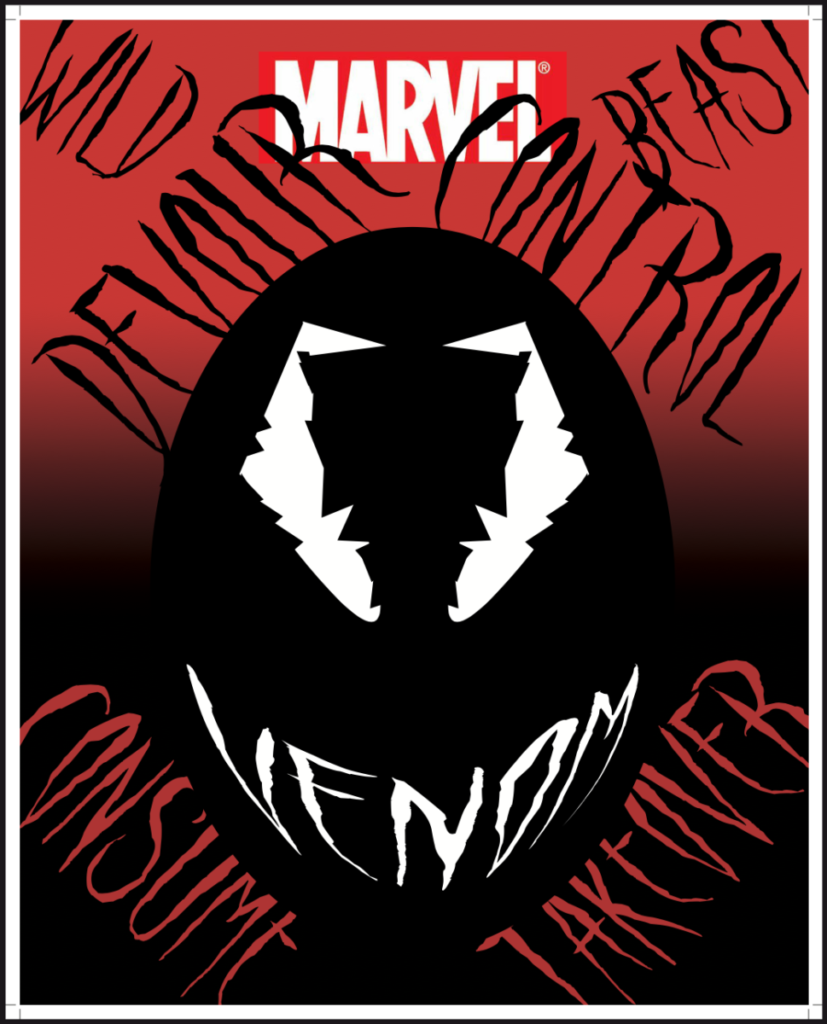
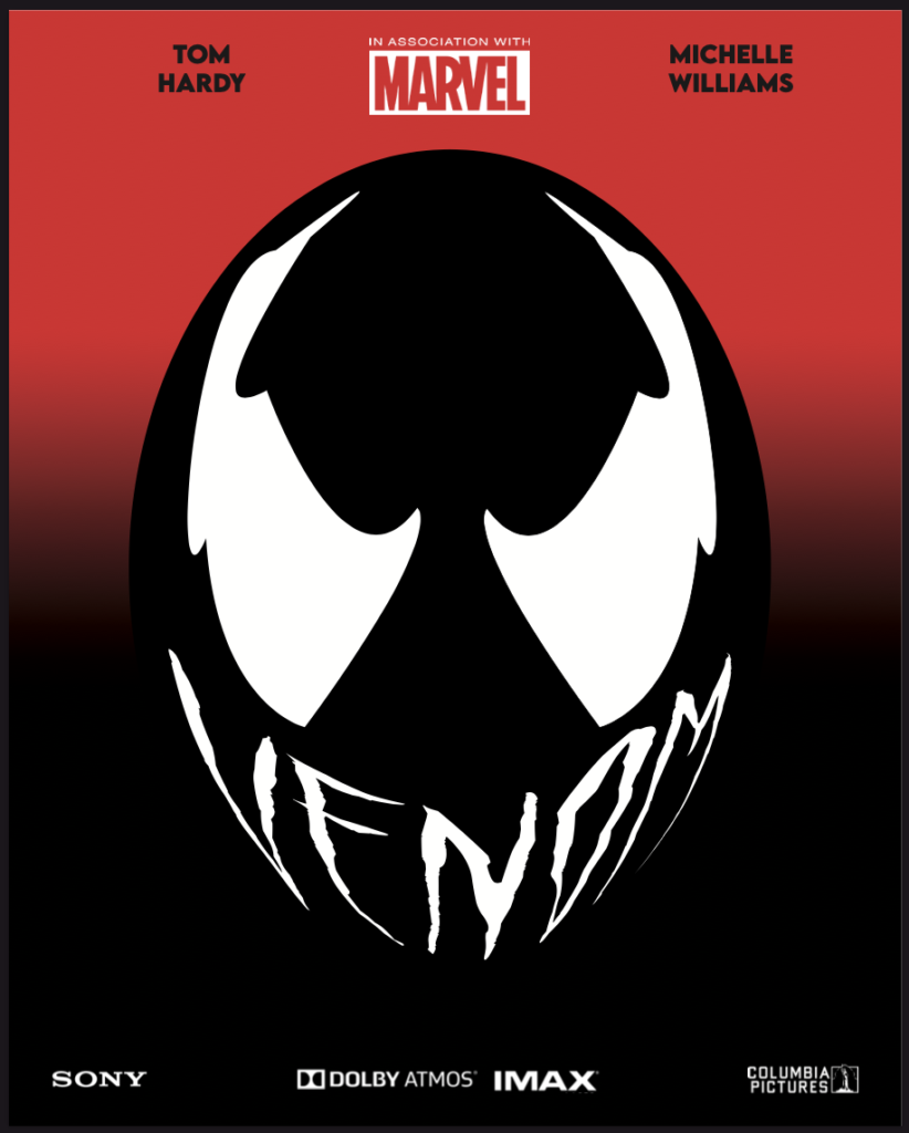
2a. In the past, I would find inspiration for designing from things I enjoy. The first thing that comes to mind was when I designed a poster for the marvel movie, Venom, which came out in 2018. I chose to make this poster because of an assignment I had for typography 2 class, back in the spring 2018 semester. Prof. Garrastegui assigned for us to make movie posters with typography being a focal point. When doing research for this project, I looked at other poster designs involving somewhat of a similar layout to my initial design. A lot designs for this character had usage of typography but none of them featured any playing around with the venom name itself, so I decided to do that. The designed work I submitted for grading wasn’t very strong, in my opinion. I also remember Prof. Garrastegui gave a certain number of type required for the project. I submitted it for grading and that was that. After a few months passed, I was setting up a portfolio website. I wanted to include this poster but felt it needed revising, so that’s what I did. The first design had more typography all around and the eye’s weren’t as organic feeling. The revised version I used for my website shows that making a few tweaks can go along way. I removed the extra type and drew the eyes on Illustrator. I also used the correct logos associated with the venom character, such as using the Marvel logo, and other corresponding logos associated with the film, such as including the Sony logo and Columbia Pictures logo, among others. I strongly feel the revised version is the better of the two. When doing this poster, I didn’t think about giving credit from who I drew inspiration from. I had the idea in mind that, since this only for classwork, I don’t have to worry about giving credit and I should be fine. I never had the idea of putting this particular design for sale or thought about making a profit from it. It was simply for classwork. However, upon reading the various readings assigned to us for this ethics assignment, I learn the importance of taking inspiration from other works of art and doing your own spin on it, but also giving credit where credit is due. I decided to remove my poster from my portfolio site. When I get the proper rights, then and only then, will I post it again on my site.
Here is where I drew inspiration from when making my posters. The link is below.
https://creativesfeed.com/venom-poster-designs/
2b. Upon reading the article of the Fairey Copyright case, I’ve come the conclusion Fairey should have been more cautious of his artistic endeavors. I see that he was inspired by Obama’s win and wanted to commemorate his legacy in this way, but he should’ve went through the proper channels first. Getting the licensing for usage of the image was the first step he needed to take. If he did that in the initials stages of his HOPE poster design, then he wouldn’t have gotten in trouble. He made it out alive in the long run, since after this incident he went on to work with the Associated Press in any future design work. Everyone won in the long run, it just seemed super unnecessary for him not to get the proper licensing from the beginning. However, since he went this route, he wouldn’t have gotten the opportunity at working with the AP had he chose a different image for his HOPE poster.


