UFT Field Trip
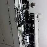
 This picture from UFT, it was amazing because this machine can folds mailing paper that are being shipped out. This machine can help many people out because it will take a long time just fold couple of papers. The folding machine takes the time out of people hands and can fold over 100 papers per min. Humans cant fold that many paper in an hours or so. But it helps out the community.
 My second favorite machine was the mailing room where it put the paper in the envelope and put a stamp on it as well. This machine also helps out the world and company because it can put mailing information in the mailing with an stamp and its ready to get shipped out. Also this machine can put information paper in the envelope really fast and it also takes the time out of people hands by doing it by hand.
Visual Quote
This have a lot going on because I’m using multiple fonts such as Rosewood Std, Minion Pro, and Brush Script. I also used Line Tool to spell out Lives and Life and also used it to write out some letters of gamer. I also picked out of couple of images to corresponds with The quote I used make the image pop out more.
My second visual quote is that I put the letters going to the side to show that’s its moving away. To put the background as I did I used InDesign and went to effects and use the overlay effects to make the images come together as one picture. And the gamer picture in the middle, I took the picture opened it in Photoshop and use the easer tool to easer the background. Fonts I used was Minion Pro, Savoye Let.

Research Paper
Sony Corporation commonly referred to as Sony, is a Japanese multinational conglomerate corporation headquartered in Kōnan Minato, Tokyo, Japan. Its diversified business includes consumer and professional electronics, gaming, entertainment and financial services. The company is one of the leading manufacturers of electronic products for the consumer and professional markets. Sony is ranked 116th on the 2015 list of Fortune Global 500(https://en.wikipedia.org/wiki/Sony).

I learn that Sony was founded in Tokyo in 1946 by engineer Masaru Ibuka and Akio Morita. The name Sony was chosen from the Latin word sonus, which is the root of sonic and sound, and the English word “sunny. The first logo was used until 1957 in different models. The first logo dominates in color of red letters and a box on a white background. Later on in the years Tokio Tsushin Kogyo Limited changed their name to Sony Corporation. In 1959 Sony established the third logo, that looks like the second one that has silver lettering on white background. But the letters use to be in silver or in black on a metallic background.
In Sony logo’s history there are many exceptions as the logo printed on receiver’s background color, but Yasuo Kuroki master lines set in 1960 have been kept. There have been many specific logos of SONY products: Triniton, Betamas, Wallkman, Vaio, psp, etc. but SONY logo has been consolidated been studied as the most influential Corporate Image together with Coca-Cola and Mercedes-Benz ones(http://www.radiomuseum.org/forum/sony_the_history_of_the_sony_logos.html).
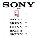
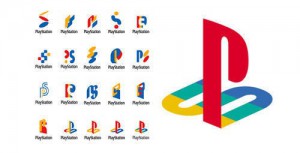
Sony has tow different logo for Sony Corporations and Sony logo for gaming. Those two logo have evolved throughout the years. One of Sony logo was created back in 1955 – thought current day. And Sony gaming logo have 20 different logo which the last one they used for the PlayStation 2. The PlayStation logo is certainly one of the most popular and instantly design logo in the gaming area. The PlayStation logo symbolizes an incorporate PS using four colors red,yellow, green and blue. The colors embody the brilliant, passion,joy,charm and elegance(http://famouslogos.net/playstation-logo/). Also the the typeface for PlayStation logo is Zrnic font.
The Sony origin company logo is derivative of the Latin word “sonus”, which means sound, and the words sunny and sonny, which served as in inspiration(http://www.famouslogos.us/sony-logo/ ). Sony logo was an trademark in 1955. The color of the Sony logo was just black representing elegance, excellence. The Sony logo uses the modified version of Clarendon typeface. And today the Sony company is currently still using the same font and logo until they change it.
Thought out the years, Sony have many competition with there rivals. Each of there rivals are trying to out sell one another with there games and consoles. And each of the rivals and Sony makes millions of dollar each year. Sony’s products are expanding over the years and as long as they keep coming, this company will remain on top. Sony company will never go out of business no matter what.
As you can see Sony company has been around for many years showing off their new ideas and new development. Sony will continue to sell the product with better and bigger enhancement. Sony will still dominate the competition and sell more product with high expectations making their fans wanting more.
http://www.famouslogos.us/sony-logo/
http://www.radiomuseum.org/forum/sony_the_history_of_the_sony_logos.html
http://famouslogos.net/playstation-logo/
http://www.sony.net/SonyInfo/CorporateInfo/History/SonyHistory/2-23.html
Video Project
https://youtu.be/uw4VHilVCVU


