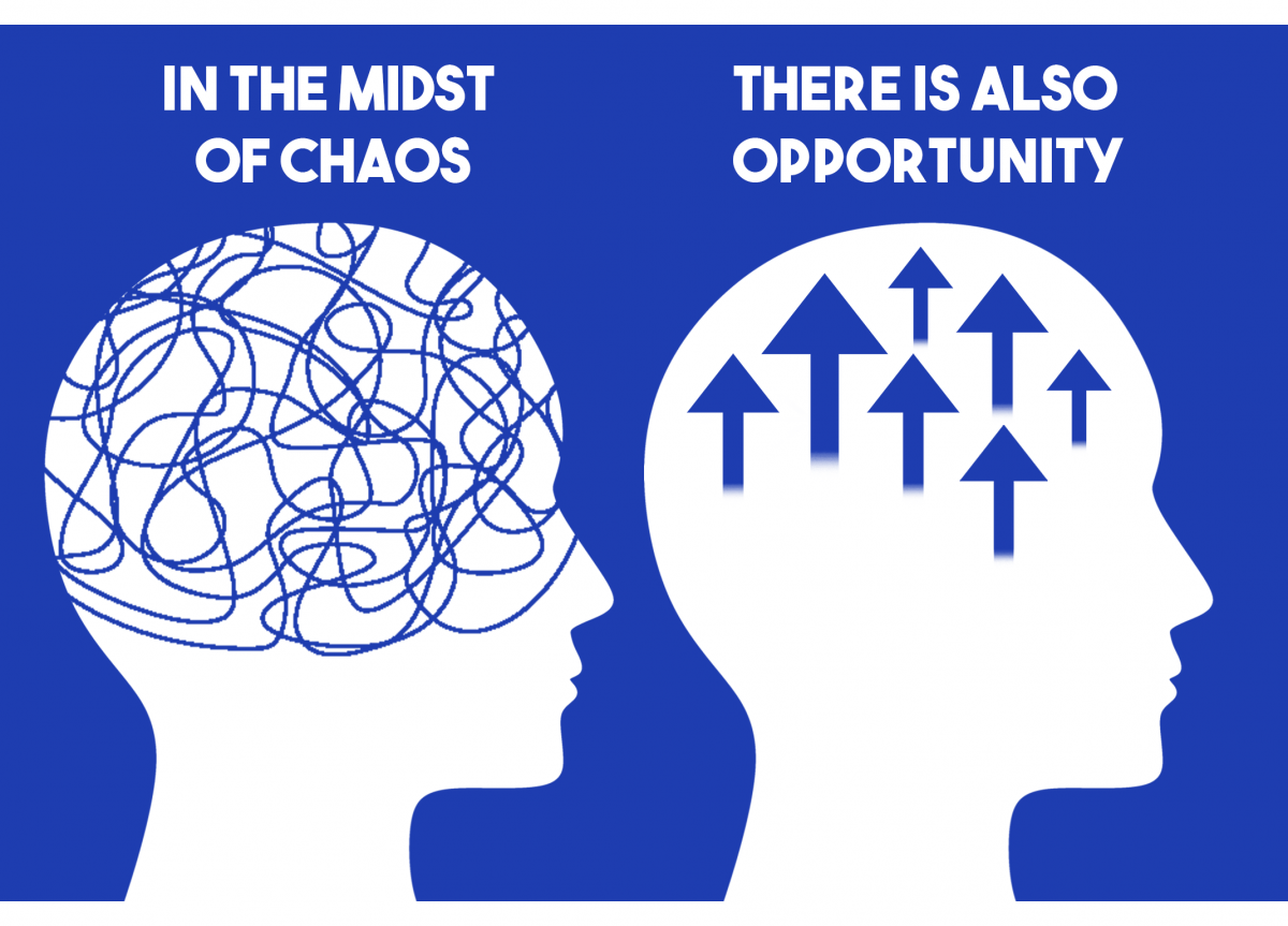
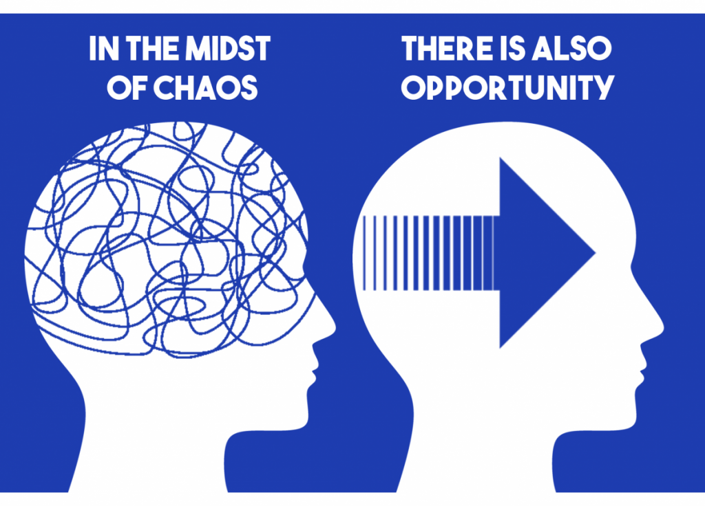
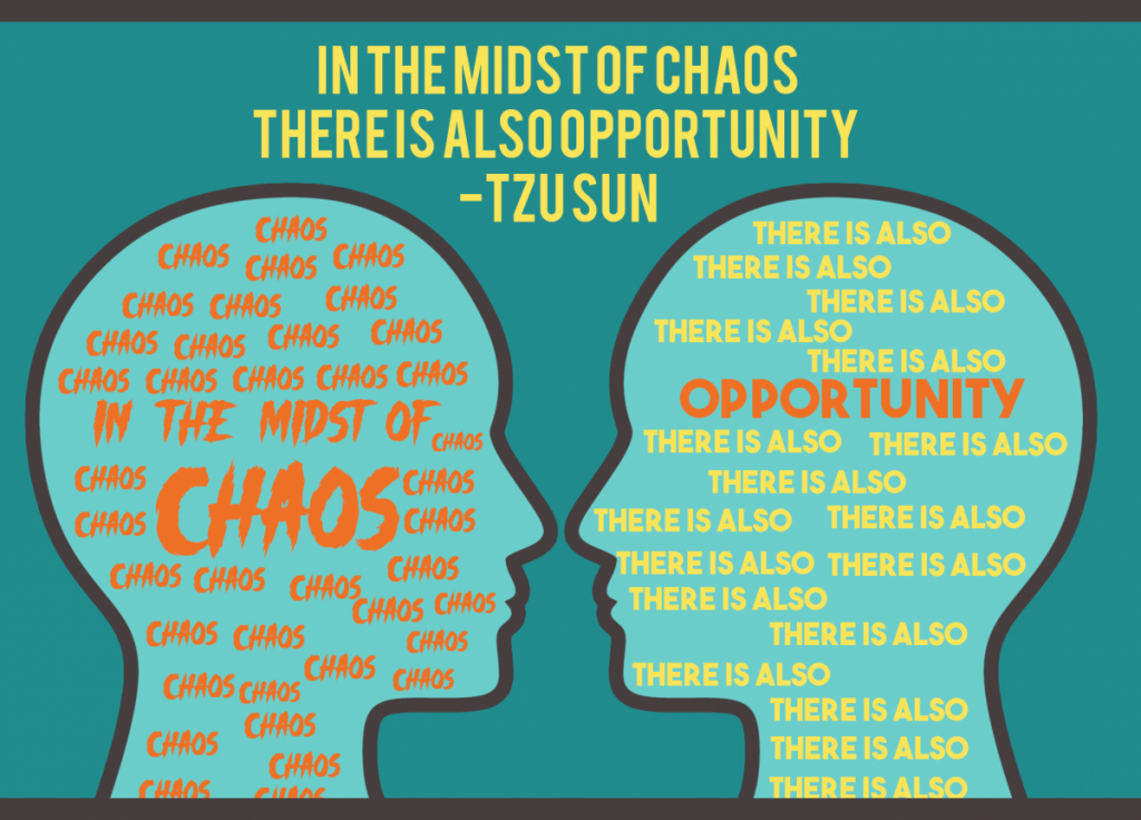
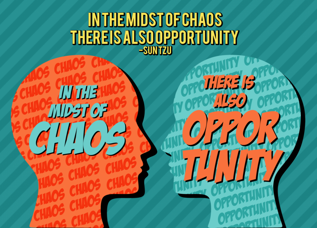
Here is my first attempt of the postcard ver. 1 project. My quote was “In the midst of chaos, there is also opportunity” – Tzu Sun I wanted something to show that the left side is chaotic and the right side means opportunity. So I got 2 heads with both of them facing the same direction while the left one has scribbles in it to represent chaos and the right one has arrows going upwards to represent the word opportunity. I picked the color blue and white as the main colors of my first attempt but I was not sure if I liked the arrowsI wasn’t sure if I liked the arrows going upward representing opportunity so I changed the arrow to show that it means the mind is moving forward to represent an opportunity.I overhauled the entire original design while trying to keep the same idea with the heads. I attempted to use more contrasting colors such as blue orange and yellow. I also focused on using gray outlines and borders. I put the quote “In the midst of chaos” while surround it with the word chaos. I tried to do the same with the word opportunity and surrounded it with “there is also” but it did not work as well.
Here is my final result of the postcard ver.1 project. I put the word opportunity and chaos within the background of the heads so they look less bland. I added a stripe pattern to the background and removed the borders outlines but left a drop-shadow instead. I also made the text bigger with contrasting colors so they stand out more. I’m really happy with the result.
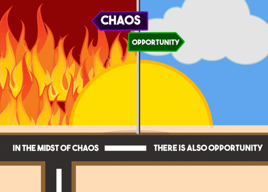
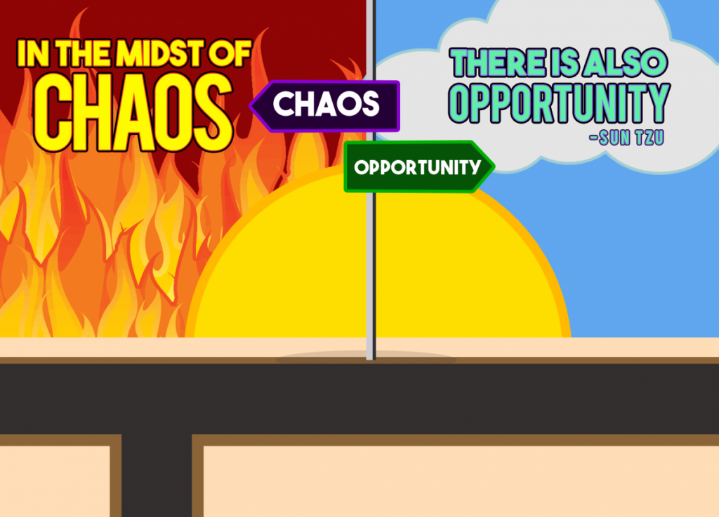
Here is my first attempt of the postcard ver. 2 project. So for this one, I’m using the same quote which is “In the midst of chaos, there is also opportunity by Tzu Sun. I wanted to focus on the concept of people choosing which road to take. So I drew a chaotic path with flames and an opportunity path which is a clear sky. The sun is in the middle of both of these paths. I put the quote on the street have signs pointing at which direction to take. On the left side I also added more streets to make it look more chaotic while the right side has 1 street.For this one I made the the design look more simpler and less complicated. I removed the hill on the left side but I left the 2 streets.
For the final design, I removed the lines and the quote on the street. I decided to put the quote within the fire and the clear sky. I also made the text size bigger and added some color so it would be a lot more eye catching.