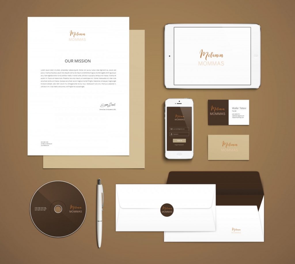
I’m pretty sure when designing, mockups are always something we’re used to doing. After the logo was created, placing it on mockup stationary was an idea that came to mind. I wanted to make sure the logo was legible on items as small as an envelope and as clean on a business card or letterhead. Since companies are utilizing technology now, we even attempted to create designs in the event they ever decided to create an app. Of course, we stood with the nude color palette. I’ve even decided to play around on the business card, using a background behind the logo to see if it would pop more than it would on a white background. Using the mockup to portray the logo helped my supervisor have a visual of how the logo would look on everyday items that would be used. 
The OpenLab at City Tech:A place to learn, work, and share
Support
Help | Contact Us | Privacy Policy | Terms of Use | CreditsAccessibility
Our goal is to make the OpenLab accessible for all users.
top


