
For this project, the end goal was to create a ligature that consisted of our initials.
Idea 1. Shared Stroke
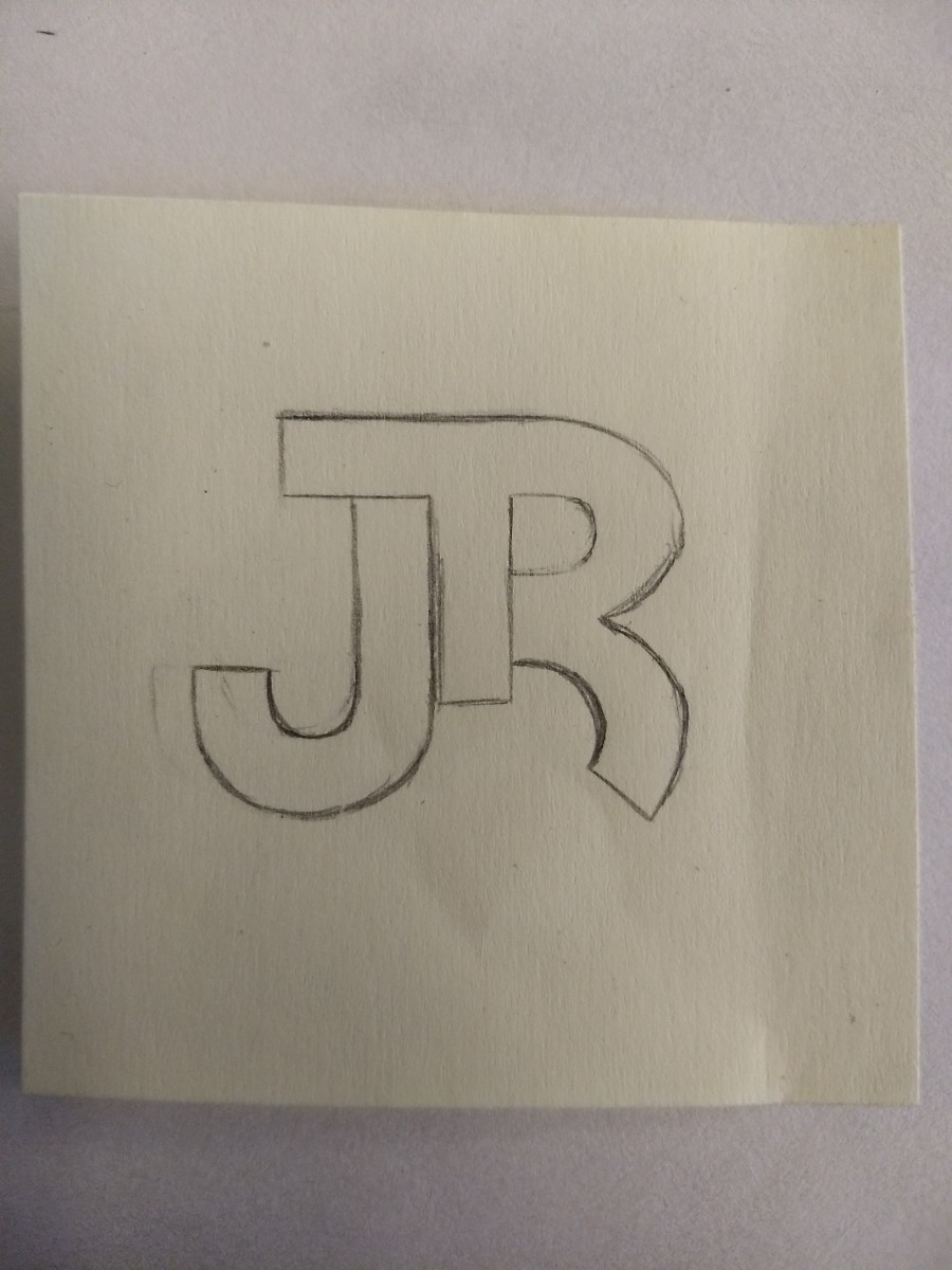
For this first design i wanted to make something that consisted of sans serif. The way it came out didn’t really connect with me mostly because of where J was located which didn’t really sit well with my taste. The only thing i did like about the design was the way the right arm of the T curves downward and flows into the shape of the R.
Idea 2. Removed part of a stroke
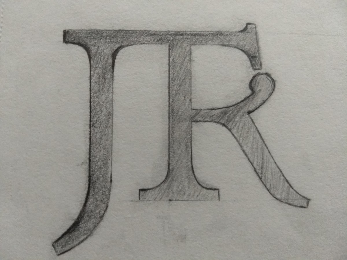
For the second design wanted to try out a serif styled ligature which I thought came out ok. Instead of the R connecting at the top i decided to try to to at from the stem of the T and then the T’s arm would finish complete the R and the other side the left arm connect with the top of the J. I honestly liked the design but as I kept looking at it, I felt that I deviated from the original design that I wanted to go with so i decided to not go with it.
Idea 3. Removed a stroke
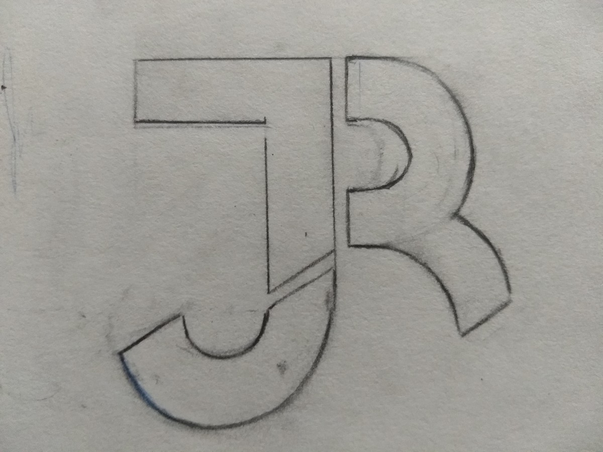
In the last design I went and looked back at the first design which was closest to what I originally wanted and the idea hit me. I decided to take parts from the letters and piece them together like puzzle pieces. This design is the one that I really admired the most out’ve all the other ones that I made. I favor mostly how each piece connects together nicely even though they don’t physically connect.


At the end of it all, the design I went with is the one i loved the most which was the removed stroke idea. After messing around with the design I ended up with two different versions of the ligature. The colored one contains 2 of my favorite colors being red and blue with grey in between to put it all together. The black and white version was purely made just for the sake of making it in black and white. I truly believe that this ligature really represents me and my passion for art. With the way the design looks I think that it is modern logo but i know i can make something much more that this.

