

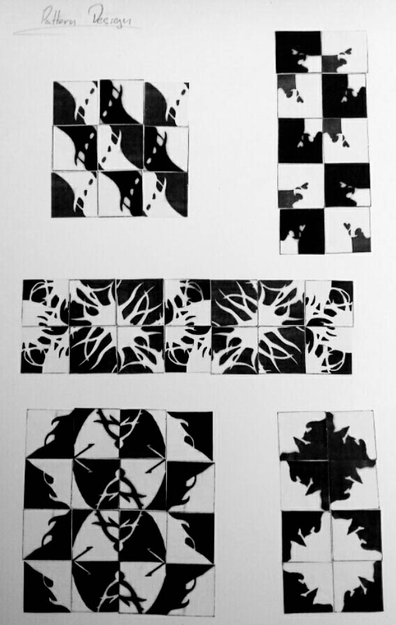
For this project we had to draw a negative/positive of a flower which we later used to make pattern designs. The flower I had chosen for this project was the fringed campion, reason mostly being the unique, elaborate look that is has. The flower was quite difficult to work with, mostly due to the petals sporadic edges but i was still up for the challenge. The most difficult part of it had to be was making the negative space around. It took some days to complete but i was quite satisfied with the result.
In for the pattern design portion of the project we had to select certain areas of the flower, draw the selected spots into small squares, then finally make them into patterns. i went a bit overboard and made lots of different designs but i was able to make some interesting designs. Figuring out where each piece should was somewhat frustrating since there was endless possibilities with these patterns. At the end of it i was able to make a few patterns and it wasn’t as bad as i thought it be.
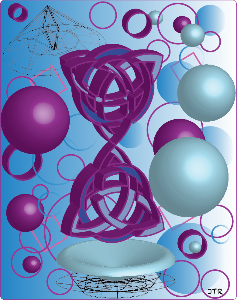
The project we worked on here was 3D design and we had to make use of 3D shapes and objects. What used to make this was Adobe Illustrator and it was hard to do at first but thanks to a fellow classmate i was able to understand how work with the 3D effects. I wanted to try making a 3D Celtic design and make it come out as a whole shape but it didn’t come out the i way i imagined. I still ended up working with it because its had so many things happening inside the shape that it looked interesting. Around that i made use of spheres, circles, and some squares to fill in the empty space that surrounded it. i also made use of some irregular shapes to show 3D wire frame designs.
For the color of the design i went with something that made it seem like it would flow and such. I end up going with some analogous colors which consisted some shades of blue and purple. This project was quite enjoyable, making the shapes and objects was fun because some of the shapes that you make come out in ways you don’t really expect.

For our final project we were to pair up with a partner and make them a flag of sorts as if we were making a logo for a client. I listened to the best of my ability to my partner and did my best to make a flag accustomed to her liking. The things i focused on was an ankh, Guyana, and an event called Carnevale. I traced the Ankh from an image from the internet then i sliced it and slightly spread it out for an effect. The corners i made triangles and gave them the color of the flag of Guyana just as i did with ankh. The background consisted of black along with some art deco designs but i gave them the colors that can be seen in Carnevale.
When i showed the finished product to my partner she found it amazing. She enjoyed that the colors popped out in the black background. It was quite something to hear that something i made for someone looked great. I feel that i should keep working on my art so i can hear again that someone loved the way looked.

