The previous journal talks about my feedback regarding the resume I first used to get my internship. This entire is now gonna talk about my portfolio website. I’ll be honest the first time around was a bit of a rush job because I had an early internship opportunity so I kicked it into high gear. I don’t believe it was a bad website but there was no main foundation or real way to express who I am. It was really throwing my work on these pages. Ok, it wasn’t pretty more like an unruly gallery. So guess what didn’t get that internship but I wasn’t surprised. During the summer I retweaked everything.
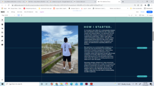
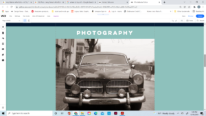
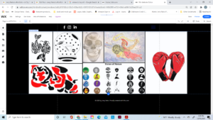
Just to showcase of the previous horror:
Regarding my feedback, it was given to me by my portfolio professor Shanton Wintson and my internship supervisor Max I gave this website a whole redesign. I removed old photos and replace them with more commercial-based photography. I categorized all my work on every page to give a better structure. I worked on all my copy write and made major changes. During my portfolio class this semester I re-amp my projects and made them better than they were before. I also removed my illustration page to stick to the theme of beginning a design and branding-type website. Such big changes were made which again makes me feel like I’ve made it to the next level.


