
Explanation and Breakdown of Design Elements Version 2
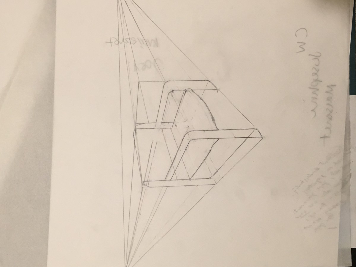
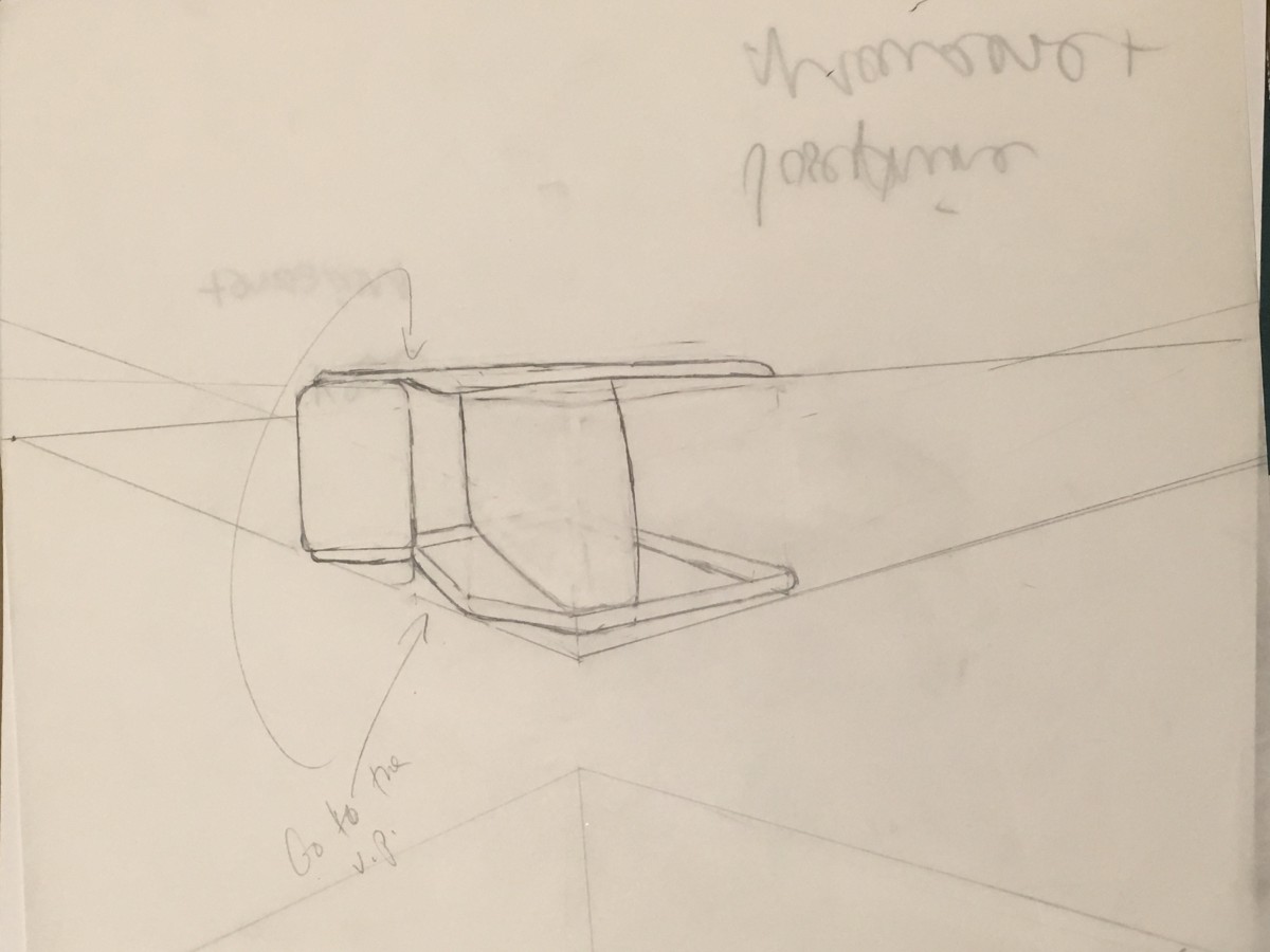
Based on the critiques i recieved in class about my three interpertations here is what ive changed since then. My first interpertation Im going to label “porthole” because of its design where a person is entrapped and can only view the outside through a porthole. what i’ve since change was made the music note more noticabley further into space. Fixing the depth and perspective.
My second interpertation of the quote im going to label “ child’s view” was a illustrative perception to convey obliviousness. Significant of present day battles with racism. Based on my earlier critiques ive since then fixed the bird house to be more apparent that it was falling . Not on the bird. But without the bird noticing.
For my third interpertation with the image i will label “picture frame” following my critiques i will enhance my design with more detail to display to the consumer or viewer that this is infact a picture on a wall by adding a nail and string and details to the backround to convey texture.
Explanation and Breakdown for Design Elements Version 1
For my visual quote project i chose to use a quote by Maya Angelou “ i know why the caged bird sings”. Initially my interpretations of this quote was about freedom of enslaved. The people whom Maya Angelou and myself are expressing are black people. The concept behind my design was to send a message of historically how these people were treated. How in the present day the topic is treated and what I believe the people whose family generations ago would handle a message as powerful as this one.
For my designs my inspiration behind my representations stemmed from the quotes metaphoric use of a bird in place of a black person or black people as a whole. So when creating my design sketches I wanted to play off the imagery, both metaphoric and literal. That way the art could be expressed both with critical thinking and visual regard. which is why some designs are convey more subliminal then others , while others correlated to the quote without any further cognitive explanation. For my color choices I chose to use realistic colors for my realistic art; black for darkness , light blue for sky, and green for grass. My choice for my third interpretation was to include colors that are similar to african fabrics. My idea was to convey a picture on a wall hanging in a house of an african american family.
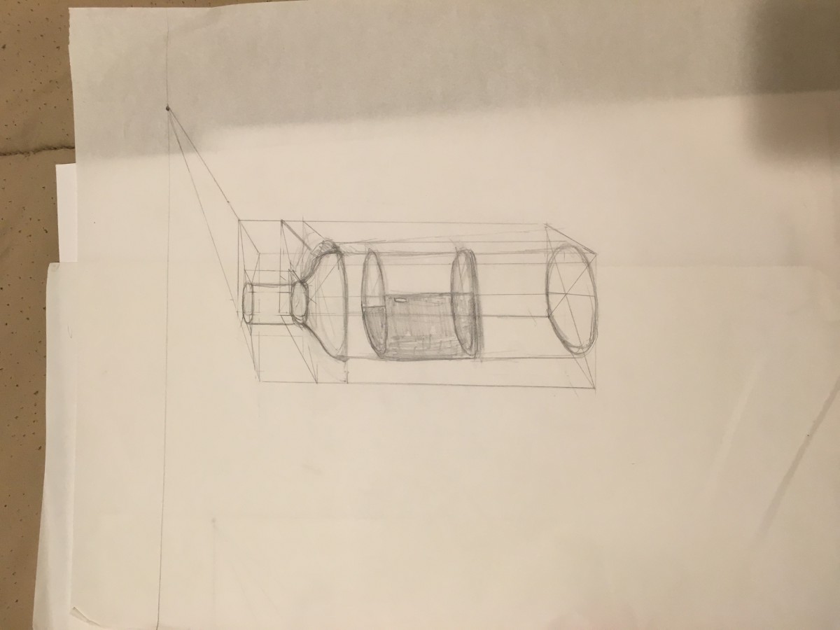
COMD1300 Foundation drawing

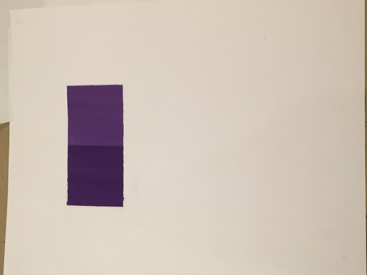
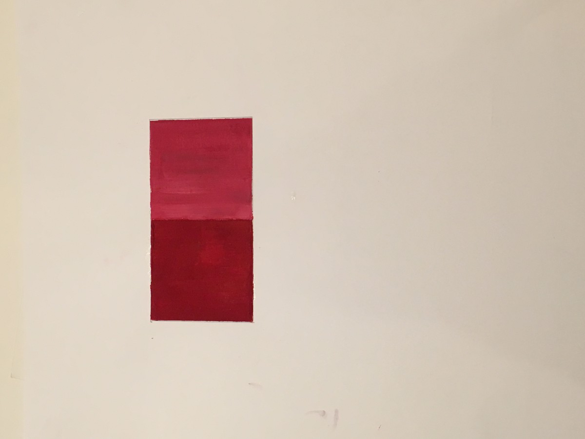
COMD 1100 Graphic Design principles Color Theory
Two tones of a monochramatic pictioral with two shapes
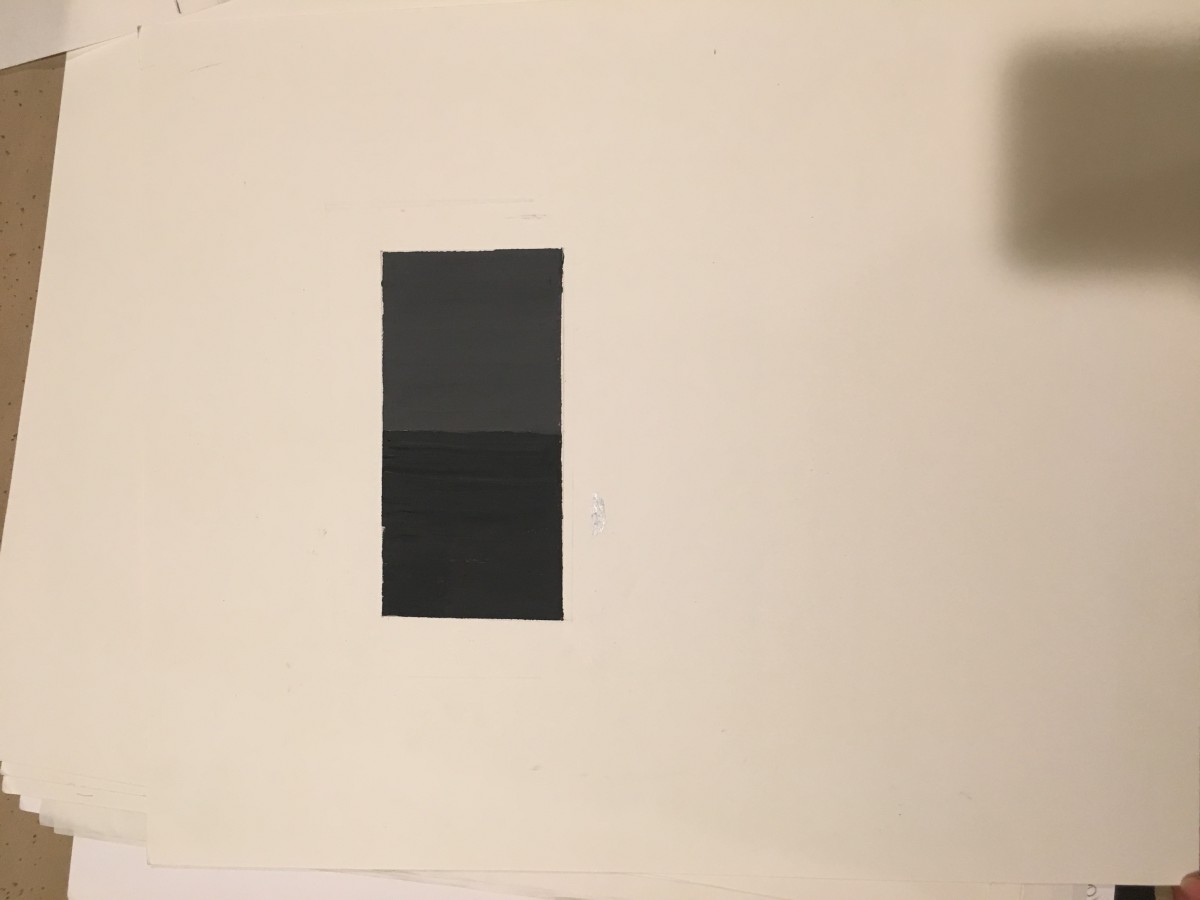
Two tones of achromatic pictorial balance of two shapes
Monochromatic pictorial balance with two shapes

