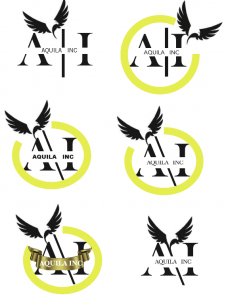
as i sat down to tackle my assignment i played around with the logo to see what would be a good fit for the rebranding. so i thought of using type logos as they always looks supper clean.. below i added a few examples of type logos…
I created a few by just using different font faces and then with additional elements.


