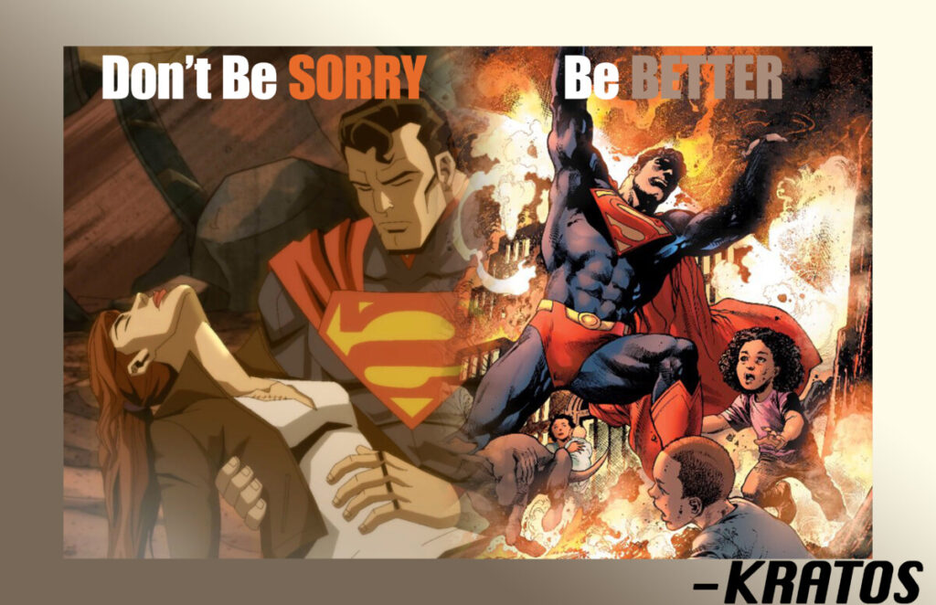
So for this poster and more specifically the quote, I wanted to use a typeface that had a sort of impact with the weight of the words. Given that the quote in itself is short and straight to the point, it would make sense to have a font that matched it in all of its entirety, which happened to be Impact, that gives it the boldness and power that it requires. For the name of the quoter, I chose a somewhat similar quote given that he is respectfully the god of war in his respected media, and being a god is not something to scuff at. Used something that was also heavy and bold, but that was lesser than the quote itself since that was the main point of the poster. I also chose Superman to represent this quote, simply for the fact that being who he is as a symbol of hope and holds himself to a high standard, he fits it perfectly. Even when he fails, he tells himself that “there won’t be a next time” and does everything in his power to make sure that there isn’t.


Leave a Reply