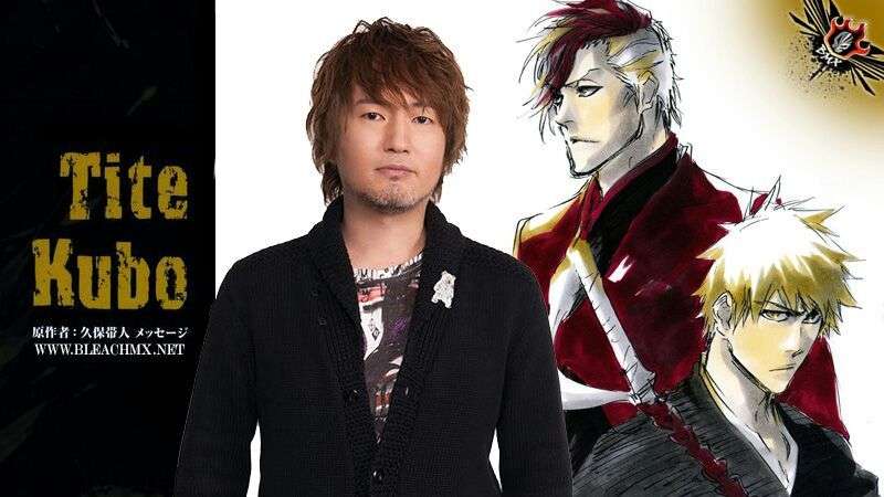
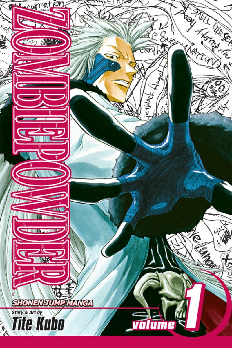
Since a young age, Tite Kubo (born 1977) always wanted to be a manga artist. He used to read mangas such as Saint Seiya and Gegege no Kitaro while in elementary school and dreamed of making a story as captivating. At the age of 19, Kubo wrote his first one-shot for Weekly Shōnen Jump, one of the top magazine publishers in Japan for manga, called Ultra Unholy Hearted Machine and then went on to publishing his first serialization called Zombiepowder, Which run for about a year before being cancelled for health reasons, but he didn’t give up there.


A year later after Zombiepowder ended, Kubo came up with and started creating the Manga Bleach, his most popular series to date, but it also hit a bump upon start. When he first brought it to his publisher, it was rejected; however Akira Toriyama, creator of Dragonball, heard of it and wrote a letter of encouragement to Kubo telling him not to give up and keep trying. Eventually Bleach was able to make its Weekly Shonen Jump debut, and some grew in popularity. The manga originally got its name because Kubo wanted to name it Black, but thought it was too generic so he picked the opposite, but thought white was too bland and decided on Bleach. The manga is about Shinigamis (Grim Reapers) who are invisible to the average human, that fight creatures called Hollows, who terrorize humans and other spirits, with a variety of weapons and spells. Kubo pulled his inspirations for his manga from others that he read as a child, such as the idea for hollows from Gegege no Kitaro and the idea for the weapons from Saint Seiya. He was also inspired by Akira Toriyama’s Dragonball Z when it came to villains, as he liked how they were portrayed to be “strong, scary and cool” without exception. Bleach went on to become one of the top 3 selling mangas of the 2010s and became known as one of “The Big 3” alongside its fellow Weekly Jump titles Naruto and One Piece, and no other manga have been able to top this accomplishment since then.
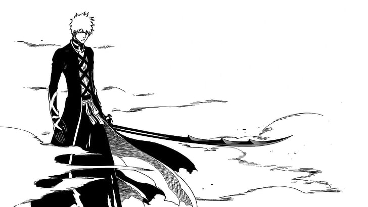
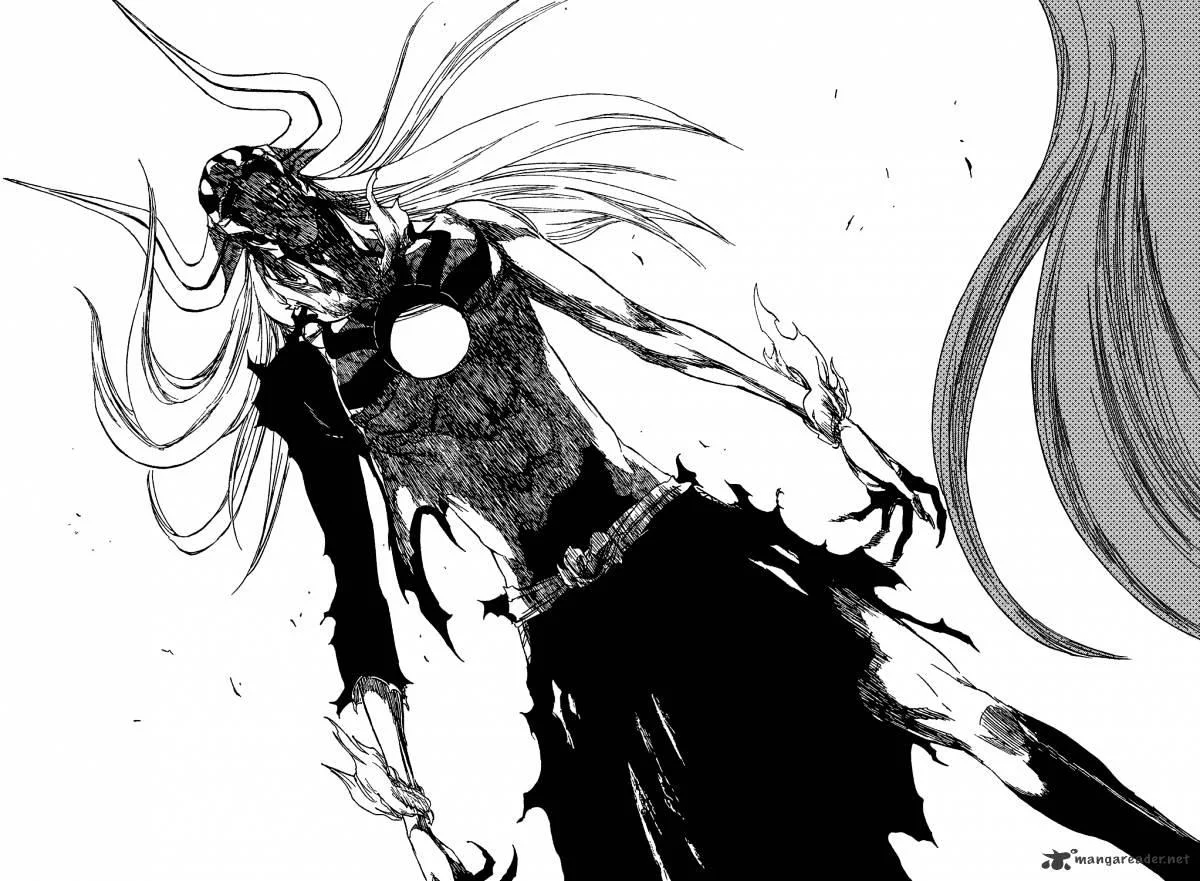
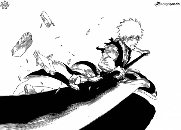
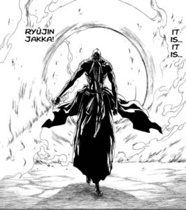
As for his art style, Tite Kubo shows a heavy focus on the action scenes. His fight scenes are noted for swift cuts and dramatic angle changes between panels, as well as minimal inclusion of background art or splash pages. He likes to emphasize the fights and impactful moments by not having much going on in the back so you can fully grasp what’s happening without being distracted. As for his character designs, he used to make them somewhat angular and lanky as can be seen in his earliest work, but eventually he started to fill them out more as Bleach progressed over the years. He also likes to incorporate body horror into his work, due to the fact that “he tries to make the injuries look very realistic in order to make the readers feel the character’s pain.” I personally enjoy his art style and Bleach immensely and it has also inspired me to keep going through with making my own art and stories, as it has done with many others such as Jujutsu Kaisen by Gege Akutami.

