https://openlab.citytech.cuny.edu/woolley-comd2313fa16/2016/10/16/my-process-sweet-talk/
Page 2 of 3
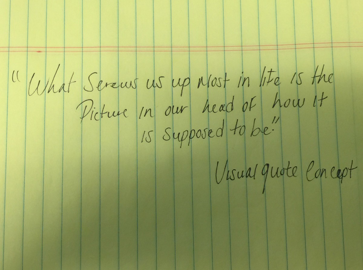
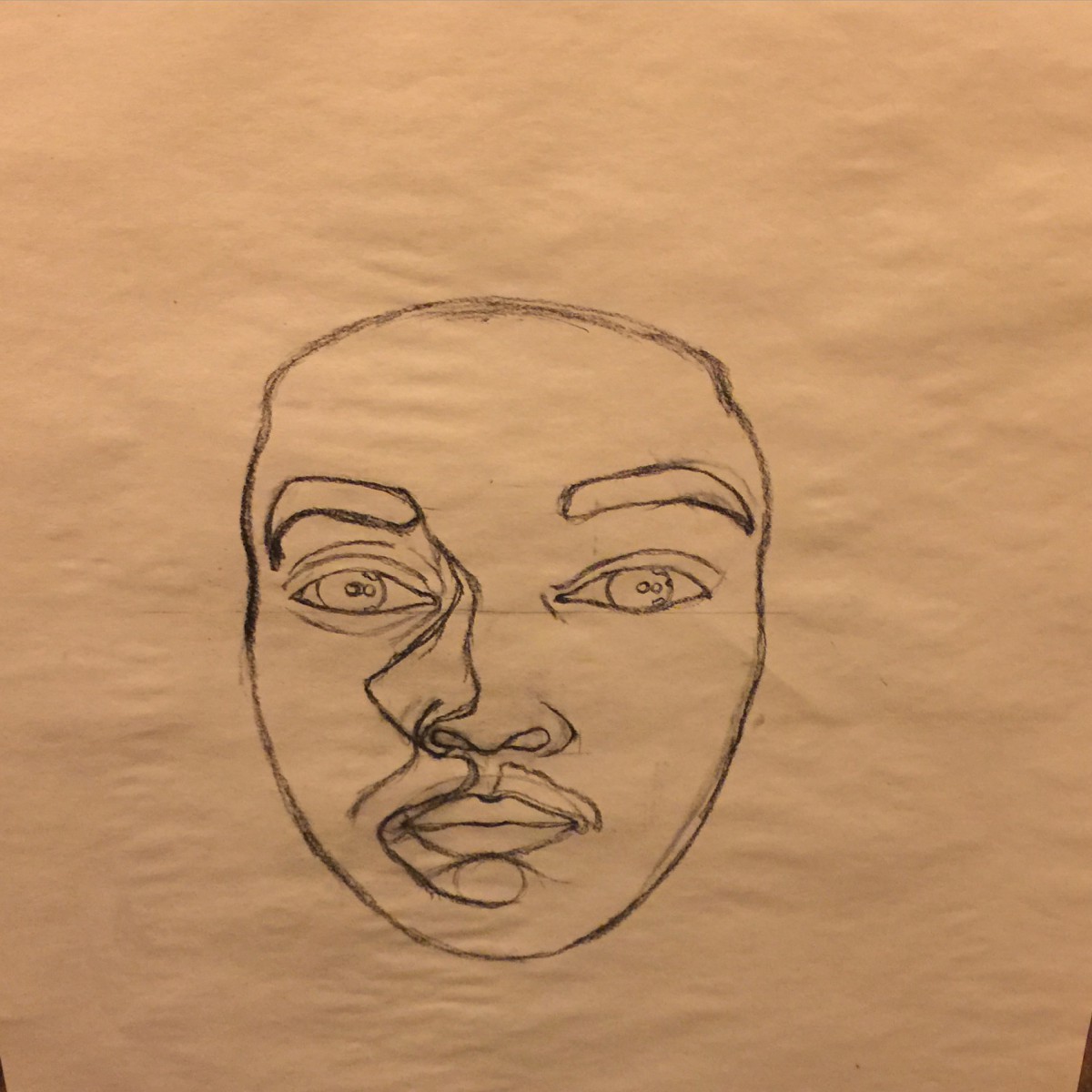
My quotes says ” What screws us up most in life is the picture in our head of how its suppose to be.”My first concept took more of an icon type of visual quote, I kept it very simple so it would be easy to understand. My second concept I was trying to play around and see how my quote could relate to a flight of stairs It did by the way. Because no matter how much steps you take to force the idea of what is meant to be never really was meant to be and that is what screws us up the most which is false hope. Lastly, my third visual concept is still more playing around I just happened to place a face there to make it seem more relatable to a person rather just to say it.
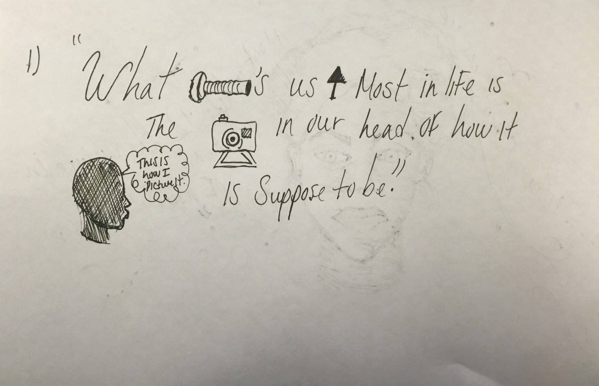
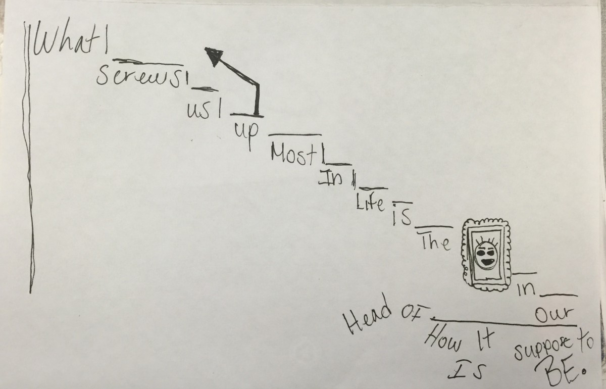
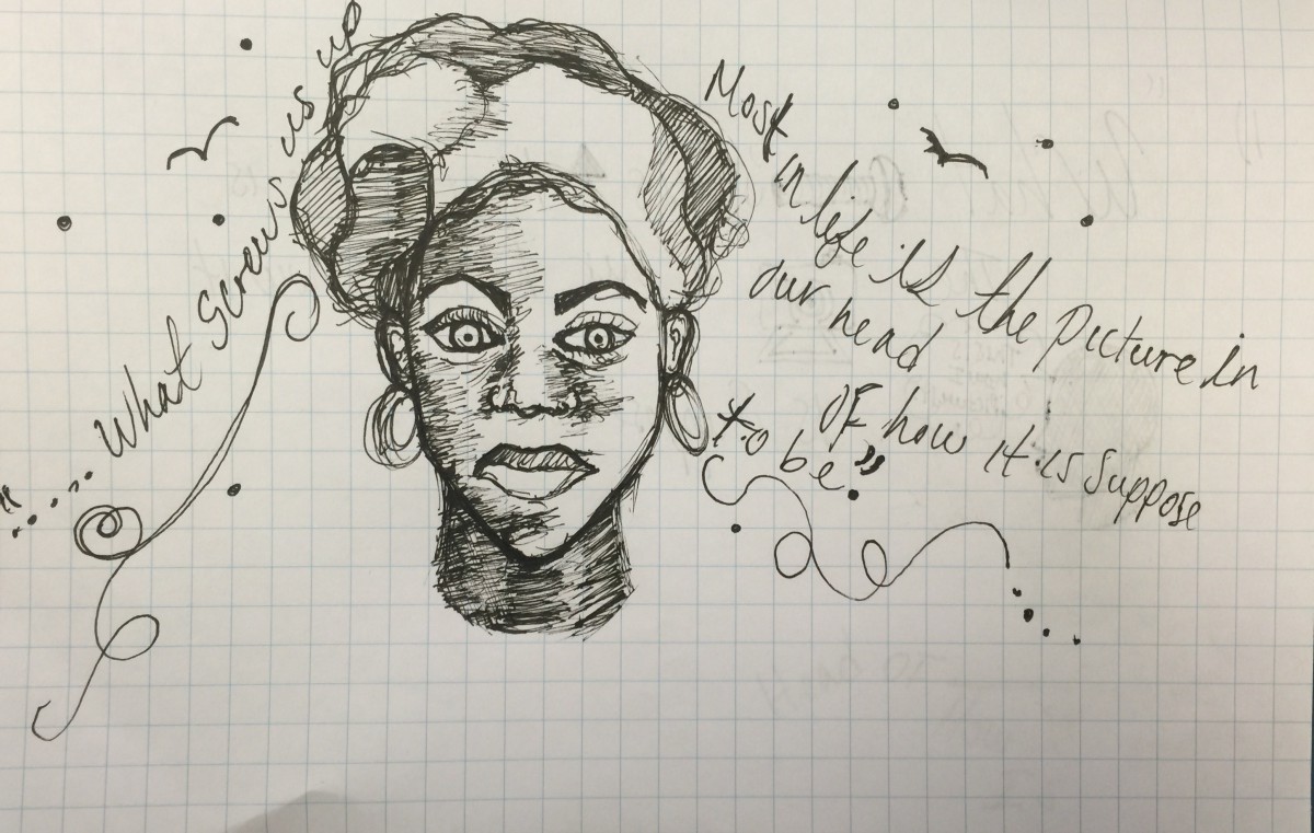
These are my 3 sketches for my visual enhanced quote from what I posted last week.
My quotes says ” What screws us up most in life is the picture in our head of how its suppose to be.”My first concept took more of an icon type of visual quote, I kept it very simple so it would be easy to understand. My second concept I was trying to play around and see how my quote could relate to a flight of stairs It did by the way. Because no matter how much steps you take to force the idea of what is meant to be never really was meant to be and that is what screws us up the most which is false hope. Lastly, my third visual concept is still more playing around I just happened to place a face there to make it seem more relatable to a person rather just to say it.
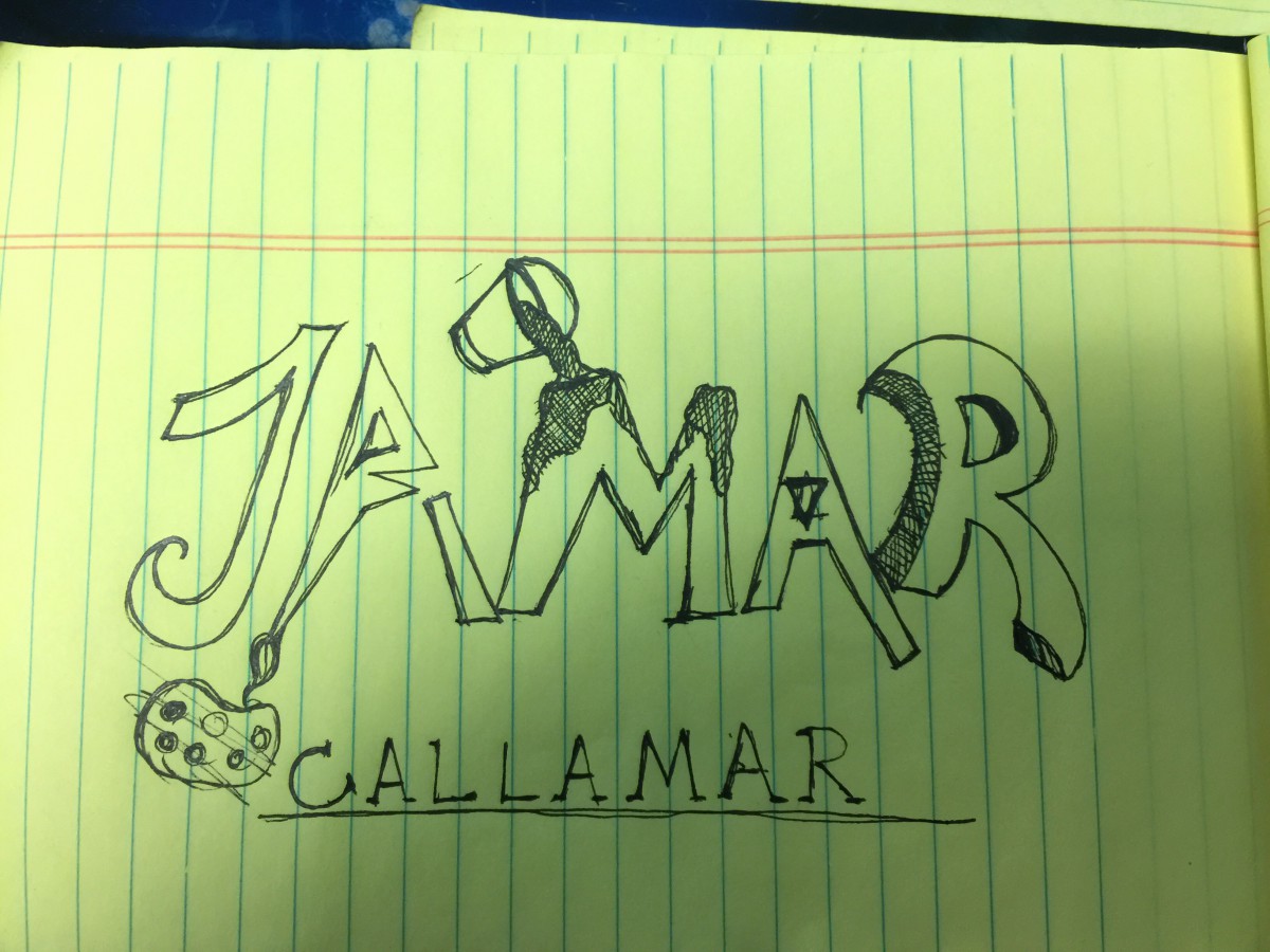
My inspiration for making this specific style for my logo is my intrest in art. As you can see there’s a paint bucket thrown on top of the “M” in my name which is Jamar.like to draw so this logo gives a clear idea that I like art. Also bellow my logo is a tracked out letter format of my first and last name combined together “Callamar” which stands for Jamar Callender. It sounded pretty cool and unique so I stuck with it.
The reason why I picked this quote because it happens to be pretty true in most cases. People want to believe what little fantasy goes on in there head will come true and we can’t always make it happen.
The American Air line has been around for a very long time.The logo it’s self has been around for a long time about 40+ years. Now the recent logo changes AA has went through has totally changed the views of customers who grew up with the logo. Some may not like it and some believed that it was time to start a new chapter and scrape the old paint off the wall. I personally think that it was time and I’ve already adjusted to the new logo as it was designed to be timeless.
Read article to see the influences and views of AA changes
“American Airlines Rebrands Itself” at http://www.fastcodesign.com/1671677/american-airlines-rebrands-itself-and-america-along-with-it and “American Airlines Makeover Design Pros Weight In” at http://www.forbes.com/sites/andrewbender/2013/01/21/american-airlines-makeover-design-pros-weigh-in/
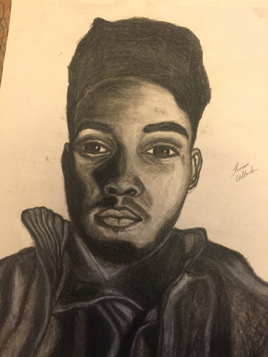
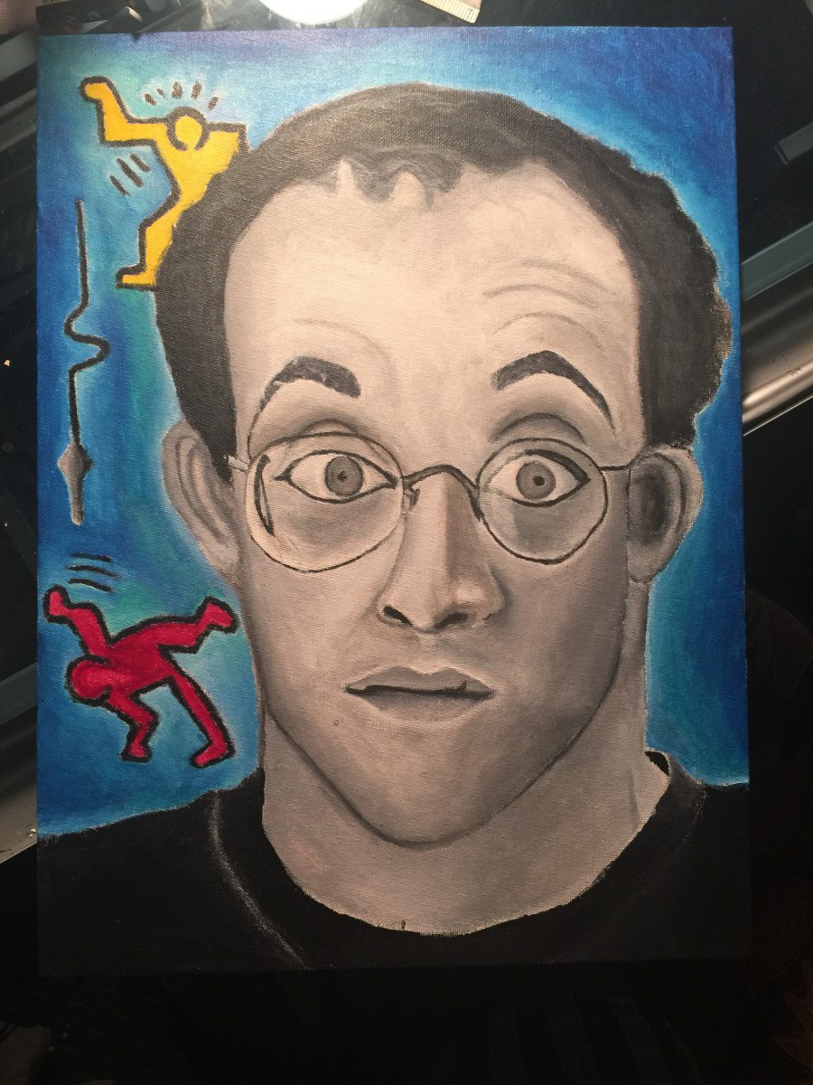
Not my favorite my but, here’s my progress of drawing myself

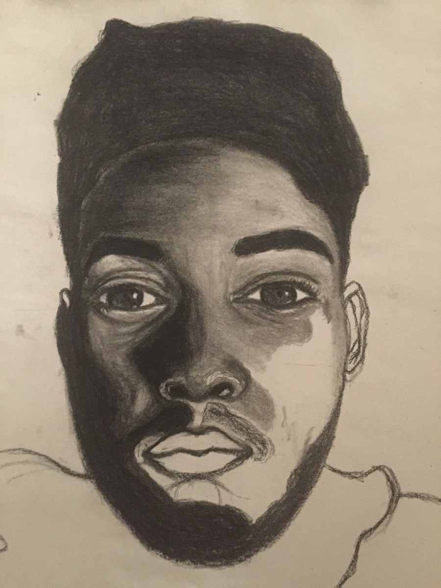
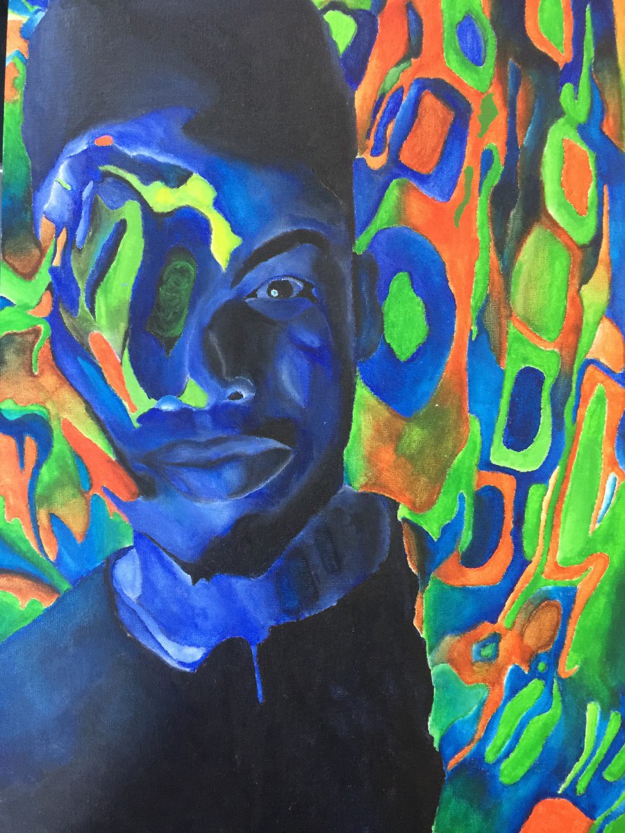
I know I haven’t posted in a while especially with this painting but, I finally got it done 🙂
Self protrait
An old piece of mines..it was a bit challenging.

