https://openlab.citytech.cuny.edu/woolley-comd2313fa16/2016/10/16/my-process-sweet-talk/
Category: Coursework
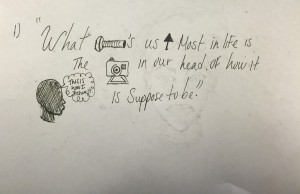
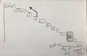
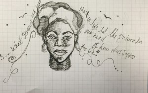
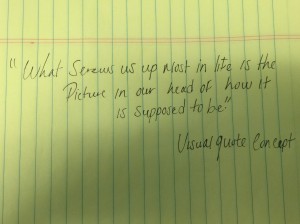
My quotes says ” What screws us up most in life is the picture in our head of how its suppose to be.”My first concept took more of an icon type of visual quote, I kept it very simple so it would be easy to understand. My second concept I was trying to play around and see how my quote could relate to a flight of stairs It did by the way. Because no matter how much steps you take to force the idea of what is meant to be never really was meant to be and that is what screws us up the most which is false hope. Lastly, my third visual concept is still more playing around I just happened to place a face there to make it seem more relatable to a person rather just to say it.
These are my 3 sketches for my visual enhanced quote from what I posted last week.
My quotes says ” What screws us up most in life is the picture in our head of how its suppose to be.”My first concept took more of an icon type of visual quote, I kept it very simple so it would be easy to understand. My second concept I was trying to play around and see how my quote could relate to a flight of stairs It did by the way. Because no matter how much steps you take to force the idea of what is meant to be never really was meant to be and that is what screws us up the most which is false hope. Lastly, my third visual concept is still more playing around I just happened to place a face there to make it seem more relatable to a person rather just to say it.
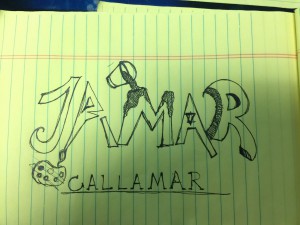
My inspiration for making this specific style for my logo is my intrest in art. As you can see there’s a paint bucket thrown on top of the “M” in my name which is Jamar.like to draw so this logo gives a clear idea that I like art. Also bellow my logo is a tracked out letter format of my first and last name combined together “Callamar” which stands for Jamar Callender. It sounded pretty cool and unique so I stuck with it.
The American Air line has been around for a very long time.The logo it’s self has been around for a long time about 40+ years. Now the recent logo changes AA has went through has totally changed the views of customers who grew up with the logo. Some may not like it and some believed that it was time to start a new chapter and scrape the old paint off the wall. I personally think that it was time and I’ve already adjusted to the new logo as it was designed to be timeless.
Read article to see the influences and views of AA changes
“American Airlines Rebrands Itself” at http://www.fastcodesign.com/1671677/american-airlines-rebrands-itself-and-america-along-with-it and “American Airlines Makeover Design Pros Weight In” at http://www.forbes.com/sites/andrewbender/2013/01/21/american-airlines-makeover-design-pros-weigh-in/
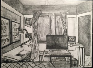
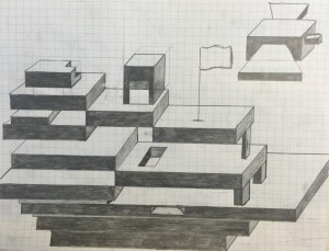
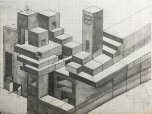
During the process of making these 3 pieces was an enjoyable and fun process. Seeing things through perspective and putting it on paper is amazing of what the outcome will be.Especially when you tap into Your creative side of interesting 3D Shapes to Make and mold into what every your creative mind lets you to create something mesmerizing to the artist and the viewer. These three works do have potential but,in time will progress into something greater.It is in my best interest to do so because there is always room for improvements.
The first, piece involves me to draw my room the best way I know how in the form of perspective so I decided to draw from my bed since I was comfortable and didn’t feel like moving. There was a good sense of light and dark and trying to proportion the room on a 9″x12″ paper. The second piece is a 3D drawing of vertical and diagonal lines in the form of squares and rectangle.It was a challenge to be consistent because of how i wanted to make thing a little complex. The outcome was good. Lastly, the third and final piece was also a 3D drawing that consist of horizontal,vertical and diagonal lines. I was trying to make a ship but, that didn’t work out as I wanted it to. Was a bit disappointed that it didn’t sit very well.but, you live and you learn,right?
This is the first post on your Learning Blog. Edit or delete it, then start blogging!
The ePortfolio is both a Learning Blog and an Academic Career Portfolio. Use the Learning Blog to document your learning experiences and class assignments each semester. As time goes by, add content to the Academics and Career sections to show your department, graduate institutions, or future employers how well prepared you are for your chosen career.
NOTE: Remember to add appropriate Categories and Tags to your posts. This will help your professors and other visitors find the content they are looking for. The Categories “Coursework” and “Field Trips” and the Tags “OpenLab” and “City Tech” have already been applied to this post. Feel free to make changes!
