FEATURED POSTS

Short Video
Logo Evolution: Penguin Books

Visual Quote
LATEST POSTS
- Short Video
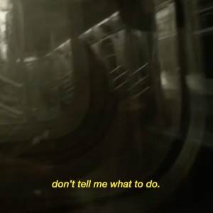
I wanted to do something a little different with my video project because I have worked with video in the past. Usually, when I work with video the footage is the main focus, which is to be expected with the medium, but for my project I wanted to try something different and focus on the audio.
I went for a concept of train announcements and used stock footage of someone on the L train so that the video felt like being on the subway while an announcement came on. I used the editing software Adobe Premiere to create a special effect on my audio recording and make it sound like an announcement. At a certain point in the video the actual train announcement can be heard which is, admittedly, odd. Unfortunately, if I wanted to keep the sound of the train I would also have to keep the announcement since this video was the only footage I had. The video is from the Creative Commons library [link] I couldn’t go out to shoot footage out of concern for my health, as I have preexisting conditions that put me in the at-risk group for severe illness from Covid-19.
Lately, there is a lot of talk about what is essential. I felt that many people were making misguided judgments and doing things that would put people like me at risk. Thinking about the difficulties I would face were I to contract the virus naturally stresses me out, so I aimed to do something a little humorous. I considered situations I had heard about online and on the news and thought about what was truly necessary and about who was being hurt the most; Tenants, minimum wage workers, “low skill” labor workers, basically, most people in the lower class. I included ridiculous parts of the current state of the world (“Franchise Mascots: Unnecessary”) as well as some personal information. I did actually ask my friends to rank rice, bread, potatoes, and pasta, and while it was entertaining at first… two of them ended up upset with each other and the rest of us were left in awkward positions… the WWE wishes it could ensue as much chaos in five minutes as four 20-year-olds left to their devices in a group chat.
Making this video was an interesting experience, it isn’t something I would do of my own accord and I’m glad that despite being a medium I don’t typically use to express myself (my work with video is usually just that, work) I could still make something that felt representative of my design identity. I was surprised to learn that my video was interpreted as spoken word poetry, as that wasn’t my intent, and poetry is a medium that I never really considered for myself. I was just trying to make something entertaining, and in that sense I think I succeeded. Really I made something for myself, that I wanted to see. I’m tired of the news; everything around me has become exhausting, it seems only natural that other people would feel that way too.
- Logo Evolution: Penguin Books

Penguin publishing company is one that is dedicated to good and innovative design. This is exemplified through their logo evolution starting from the very beginning of the company’s inception.
Penguin logo through the years The penguin logo was originally illustrated by Edward Young, an office junior at the up and coming paperback publishing house back in 1935. The penguin is based on and meant to echo the sentiment “flippant, but dignified.” Since paperback publishing in the 1930s was largely associated with pulp novels Penguin strived to provide more affordable and highbrow literature to the masses.
Penguin used design to create a visually appealing and informative line of covers, these covers would go on to become instantly recognizable as part of the Penguin brand. The covers, initially designed under the instruction of Penguin founder Allen Lane, are known for their attractive colors, particularly the bright orange. The colors served as a way to distinguish between genres. This practice of color-coding would continue to current Penguin design as a way to distinguish books by source language instead of by genre.
This isn’t the only way Penguin categorized its books. Between 1937 and 2007 Penguin used spinoff logos, Pelican Books and Puffin Books to promote books aimed to educate and for young children respectively. Though the pelican name and logo are no longer used, Puffin Books is still in operation and going strong. The covers for both Penguin and Puffin Books no longer have to use a similar and easy to print cover format given advances in the printing technology, however, this doesn’t mean that the brand recognition tied to them was gone. On the contrary, the visual language that was built up upon for 85 years has been applied to their brand identity at large.
Penguin Books was a company founded by good design and good intentions. The fact that they were so design forward in the early stages of development served them well. The classic design from the 1930s has survived and endured until the present. Very few brands can relate to this, and even fewer can credit a well-designed logo and visual identity to their success.
Works Cited
1000 Logos. “Biography of the Alan Fletcher.” 1000 Logos The Famous Brands and Company Logos in the World, 1000 Logos, 2016, 1000logos.net/biography-of-the-alan-fletcher/.
Kohlstedt, Kurt. “Classic Penguins: How Minimalist Book Covers Sold the Masses on Paperbacks.” 99% Invisible, 99% Invisible, 3 Aug. 2019, 99percentinvisible.org/article/classic-penguins-how-minimalist-book-covers-sold-paperbacks-to-the-masses/.
Minchin, Adele. “Puffin Children’s Books Changes Its Logo for the First Time in 40 Years.” Penguin.co.uk, Penguin Books, 20 Mar. 2009, web.archive.org/web/20090320145745/www.penguin.co.uk/static/packages/uk/pressoffice/releases1/090403_puffinlogo.pdf.
Penguin Books UK. “’Be My Cover’ Design Exhibit Featuring 100 Penguin Random House Book Covers Launches in Turin.” Penguin Books UK, Penguin Books UK, 19 May 2017, www.penguin.co.uk/articles/company/news/2017/may/be-my-cover-design-exhibit-featuring-100-penguin-random-house-bo.html.
Pulp Librarian. “The Story of the Art of the Book Cover.” Twitter, Pulp Librarian, 7 June 2018, twitter.com/PulpLibrarian/status/1004761355323367424.Sagar, Julia. “The Tale behind the Penguin Logo.” Creative Bloq, Creative Bloq, 21 Nov. 2013, www.creativebloq.com/logo-design/tale-behind-penguin-logo-11135355.
- Visual Quote
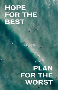
For this project, we were tasked with creating visuals to go along with a quote of our choice for two postcards, one with an image and the other only using type. I based mine off the song Surf boy by HYUKOH as it contains the line “hope for the best, plan for the worst” which I’m fond of.
Surf boy by HYUKOH I started by thinking about layout ideas; I had happened to go to the NYPL at 42nd street and came across an ad from the ’50s whose layout I thought was very well designed and decided to base my type postcard after it. I sketched in Procreate and arranged the text at the same time. Here I focused on highlighting the quote “hope for the best, plan for the worst”. I used the whole song because I thought it would be more interesting visually and also because it was intended to be a postcard; the text could be read up close and would give the audience something more to take in since generally postcards are for shorter lengths of writing. I also planned the fonts and general look of the type while sketching. I brought this into Adobe Illustrator and researched fonts that were designed in the ’50s that matched the aesthetic I was aiming for. After getting feedback in class I cleaned up the layout for the type postcard and added finishing touches.

final image postcard 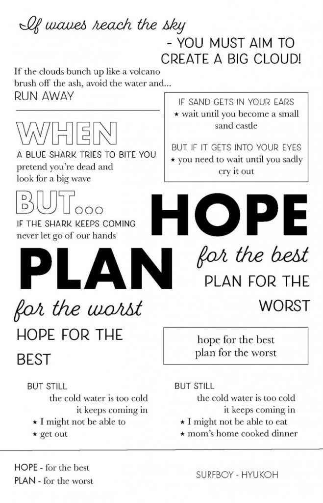
final type postcard 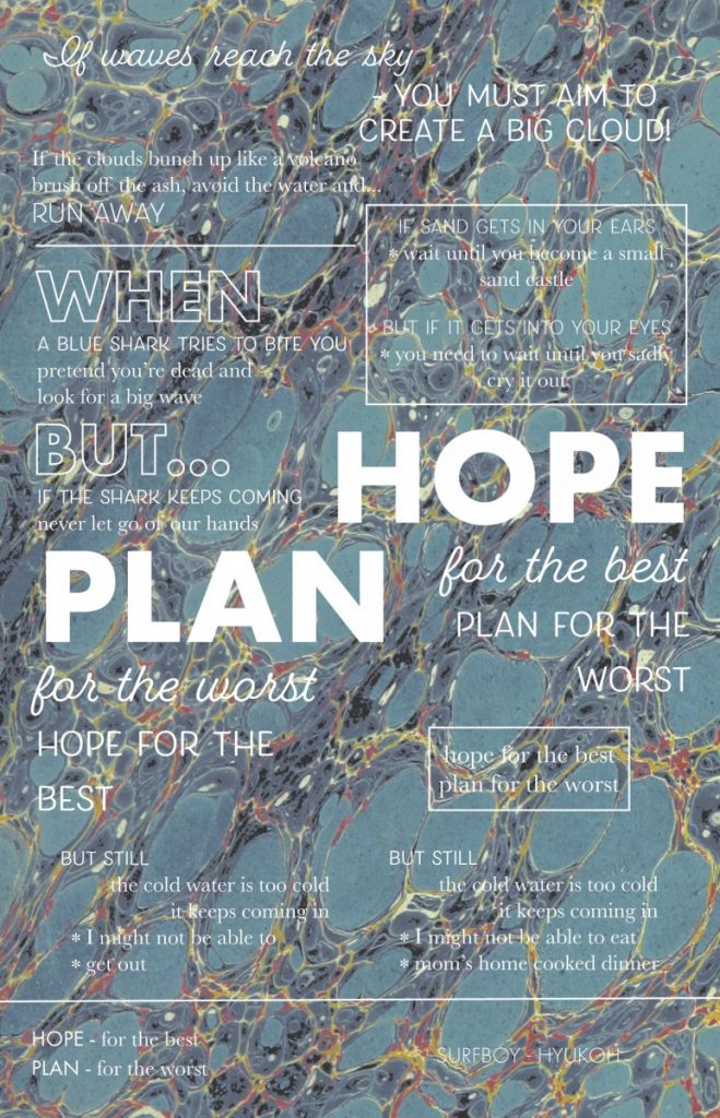
image postcard draft 
type postcard draft 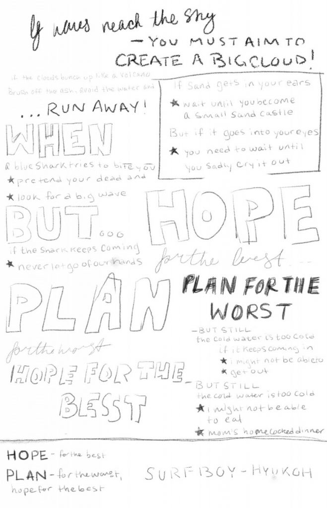
type postcard sketch 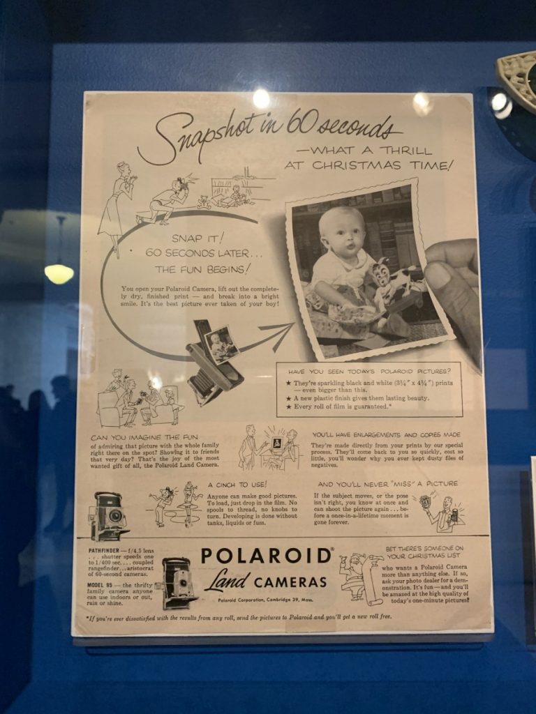
layout inspiration
my design process I had originally intended to use a water marbled decorative paper as the background for the image postcard but it didn’t really read as water and after playing around in Photoshop to up the contrast, I decided that the image didn’t fit. I used a different image that I thought better conveyed the message of the song; since this was a photograph of surfers on the ocean it felt too literal to place all the lyrics of a song called Surf boy over it, so I settled for the text “hope for the best, plan for the worst”. Since there would be less text on this postcard I switched to a font that had more impact, and while it doesn’t exactly read ’50s it does lend itself to a more “surf” aesthetic which is in line with the theme of the song. I kept a similar diagonal placement of the main quote in both postcards, with the photograph it highlights the ocean, and with the type it provides structure.
Overall, I wanted to create a graphic that matched the band HYUKOH’s aesthetic as well as something I would genuinely enjoy to receive. I intend to print these and gift them to the band the next time they come to NYC.


