
For this project, we were tasked with creating visuals to go along with a quote of our choice for two postcards, one with an image and the other only using type. I based mine off the song Surf boy by HYUKOH as it contains the line “hope for the best, plan for the worst” which I’m fond of.
I started by thinking about layout ideas; I had happened to go to the NYPL at 42nd street and came across an ad from the ’50s whose layout I thought was very well designed and decided to base my type postcard after it. I sketched in Procreate and arranged the text at the same time. Here I focused on highlighting the quote “hope for the best, plan for the worst”. I used the whole song because I thought it would be more interesting visually and also because it was intended to be a postcard; the text could be read up close and would give the audience something more to take in since generally postcards are for shorter lengths of writing. I also planned the fonts and general look of the type while sketching. I brought this into Adobe Illustrator and researched fonts that were designed in the ’50s that matched the aesthetic I was aiming for. After getting feedback in class I cleaned up the layout for the type postcard and added finishing touches.

final image postcard 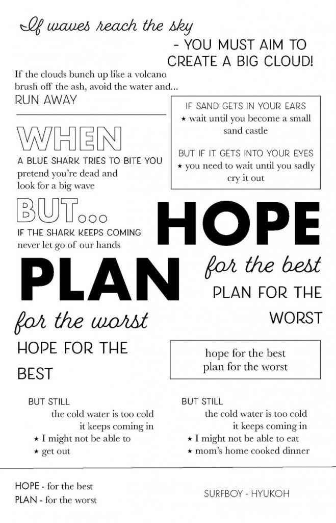
final type postcard 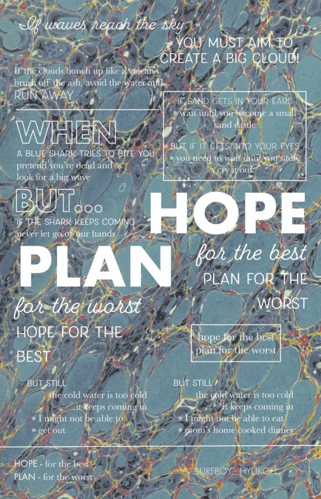
image postcard draft 
type postcard draft 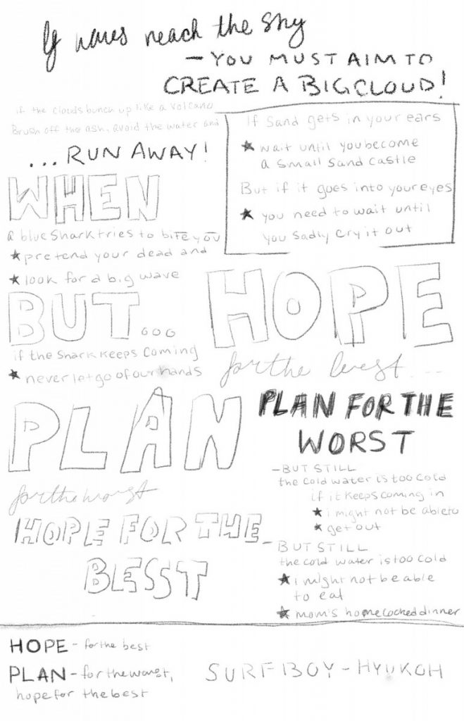
type postcard sketch 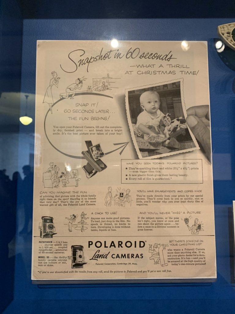
layout inspiration
I had originally intended to use a water marbled decorative paper as the background for the image postcard but it didn’t really read as water and after playing around in Photoshop to up the contrast, I decided that the image didn’t fit. I used a different image that I thought better conveyed the message of the song; since this was a photograph of surfers on the ocean it felt too literal to place all the lyrics of a song called Surf boy over it, so I settled for the text “hope for the best, plan for the worst”. Since there would be less text on this postcard I switched to a font that had more impact, and while it doesn’t exactly read ’50s it does lend itself to a more “surf” aesthetic which is in line with the theme of the song. I kept a similar diagonal placement of the main quote in both postcards, with the photograph it highlights the ocean, and with the type it provides structure.
Overall, I wanted to create a graphic that matched the band HYUKOH’s aesthetic as well as something I would genuinely enjoy to receive. I intend to print these and gift them to the band the next time they come to NYC.

