Proportion | source
Proportion is the relationship between elements with respect to a comparative magnitude. It tells us whether or not our scale is in harmony, whether or not the different sizes of our elements are in agreement and balance. When one element of your design changes size, the others should also change size similarly if you want to keep them in the same proportion.
Informal: Proportion is a balance scale of work and everything inch has to be symmetric to have elements that create consistency.
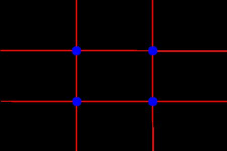
Rule of thirds | source
The Rule of Thirds is another way to look at the layout of a design (be it a web page, a painting or a photograph). The idea is straightforward; you place a simple grid overlay (divided equally into thirds, both horizontally and vertically) on the space to be used for the design.
informal: to be able to divide a design into thirds to mathematically organize and arrange the work to add balance to an composition to guide your viewers eye to makes it easier to position the type and design
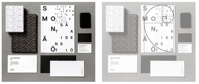
Golden rule (Source)
The Golden Ratio is a mathematical ratio. It is commonly found in nature, and when used in design, it fosters organic and natural looking compositions that are aesthetically pleasing to the eye.
Composition is important for any image, whether it’s to convey important information or to create an aesthetically pleasing photograph. The Golden Ratio can help create a composition that will draw the eyes to the important elements of the photo. Using the Golden Ratio, you split the picture into three unequal sections then use the lines and intersections to compose the picture.
informal: Golden rule creates a consistent format or blueprint to follow to shape a systematically design that will always create a consistency in design work


