Field Trip Report
October 20th 2015 we attended an exhibit at the Society of illustrators, I personally observed 3 separate floors from the lower level to the batman floor. The lower level was set up in a systematic way. Some of the frames were positioned in a size-descending manner on one side and on the other they were more strategically placed. Large, Medium, Large, Two smaller portraits in that order, the lighting had more of a home feel compared to the main floor and batman room which I think had fluorescent lighting. The third floor was the same eggshell walls with frames carefully positioned on them until you enter the batman room which was brilliantly painted red which I think was good because if it was white it wouldn’t make the fact that majority of the art piece were black and white be as significant. It would obviously still be noticed that the art is black and white but the red screams come in and look at what I have to offer, in my opinion. I feel like the purpose of the exhibit was to display American life throughout the years and give American artist a chance to show their talents.
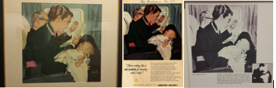
The first piece that caught my eye was “There’s nothing like it on earth for traveling with a baby” an Advertisement for American Airlines, Ruthrauf and Ryan Agency, Published in A Magazine in 1949 The Art Director is Bill Smith and The Actual Artist is Alfred “AL” Charles Parker. This piece of work was Oil on Board. It interested me because I have an unusual baby fetish I just ADORE children and because it was shown in its original form, Print form and black and white. I felt it was a powerful piece because nothing is more important to a mother than the safety and happiness of their child. I know that people generally don’t like children on planes they feel that they are nosey, and rude, and a pure distraction from sleep especially if it’s a long flight. I personally have traveled on plains quite often and have experienced peaceful flights that have small children on them now I’m not sure if that’s because they were just peaceful children or because of the accommodations the airline offered but just the thought that the airline could help is comforting. The overall bluish tone unifies, while pink accents bring harmony throughout the piece of work. Emphasis results in the value of the colors from the blue binky contrasting with the blue and greenish walls and curtains as well as the mothers clothing.
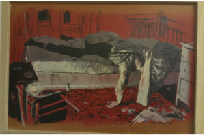
The second piece was “A Matter of Life and Death” which was published in The Cosmopolitan Magazine in 1950. It is an Oil Painting, India ink and casein tempera on plasterboard Museum of American Illustration Purchase Fund Purchased at Auction from Illustration House. The artist is Austin Briggs recruited by the art director of the cosmopolitan magazine. It interested me because of the difference used in color and the line work that had been done. The lines on the radiator and wall, the chair flipped over and the messy rug all convey hardship and mess in its own way. When first just viewing the piece I’d thought it was a man who’d come home from a long hard day at work and was to tired to even get his “uniform” off. Then I sort of thought it was a dead guy, then I proceeded to read the little description and came to realize that it wasn’t either of what I thought well in some ways it was I was a man to tired to take his clothes off and there actually was someone who had been killed but it just so happened that he was the murderer and woke up with blood on his hands to drunk to remember the crime he’d committed. And I find that interesting because I’m into forensic things at least on television and it’s powerful to me because things like this do happen in real life. It makes me wonder if he’s going to get caught and if he does will he be fully prosecuted, would he never be caught and live a regular life, what’s next.
“The hypocrites: The Catholic Church and Sex” is an alternate cover illustration for an article about pedophile priests. Influenced by Der Spiegel who was a man who conducted surveys that brought up investigations that found over 94 priest and church employees that had been suspected of sexual abuse on minors since 1995. The Oil painting was created on Gessoed board Donated by the artist. “ Tim O’Brien” in 2010. I find this piece to be particularly powerful because of the theory behind church as being a safe haven from all evil and that when you enter church you will be forgiven for your sins. Its makes me wonder if these people feel like their justified in their actions because they are “holy men” or because they are already in the safe haven so as they are committing their crimes they are automatically being forgiven I don’t know, it’s just interesting I guess being non religious raised by a very religious family learning about morals and values it makes me wonder where these individuals heads are. Also what you see as far as the priests’ hand going for his private area just says it all. The color red makes me think of evil in this instance and even the position of the bible in his left hand in my opinion symbolizes his wrongs since as we know you associate the bible with your right hand when professing honesty and all things right.


