
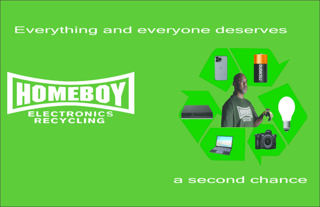
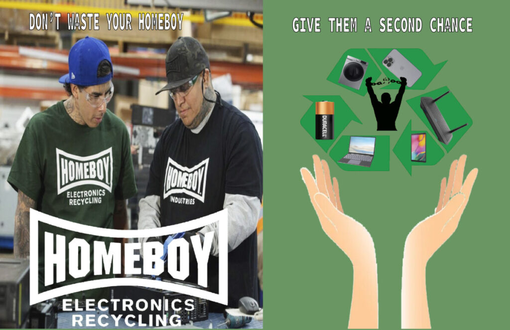

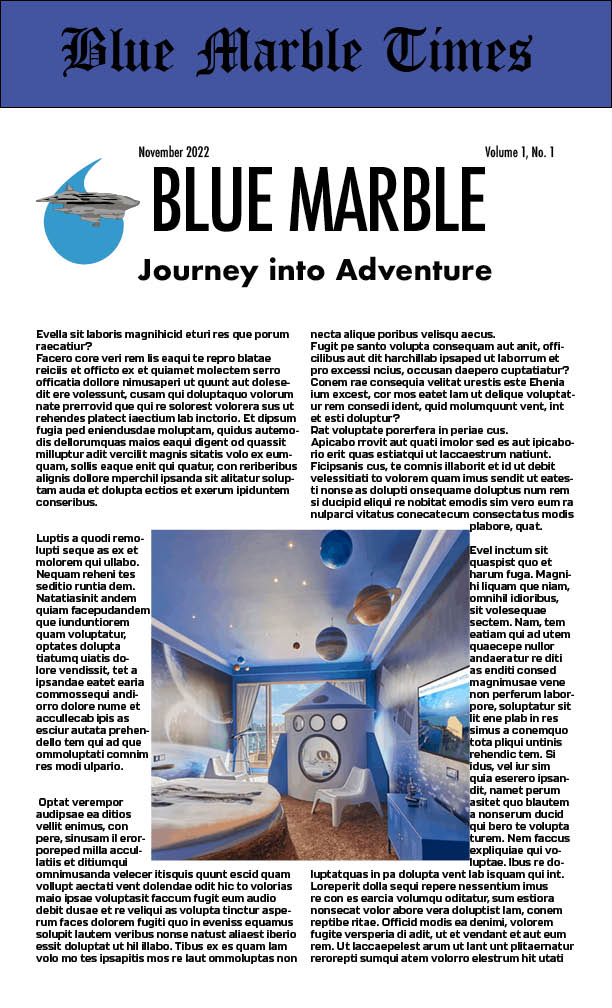
A Communication Design Portfolio


We had the opportunity to be part of the poster house virtual tour of Blaxploitation movies. It was very interesting to see these posters.

This one is one of my favorites. “Coffy. The white background makes everything stand out with the warm tone colors. This poster looks mostly violent and the first things i recognized was the woman with the gun and the man who assume is pimp. Everyone looks innocent too me.
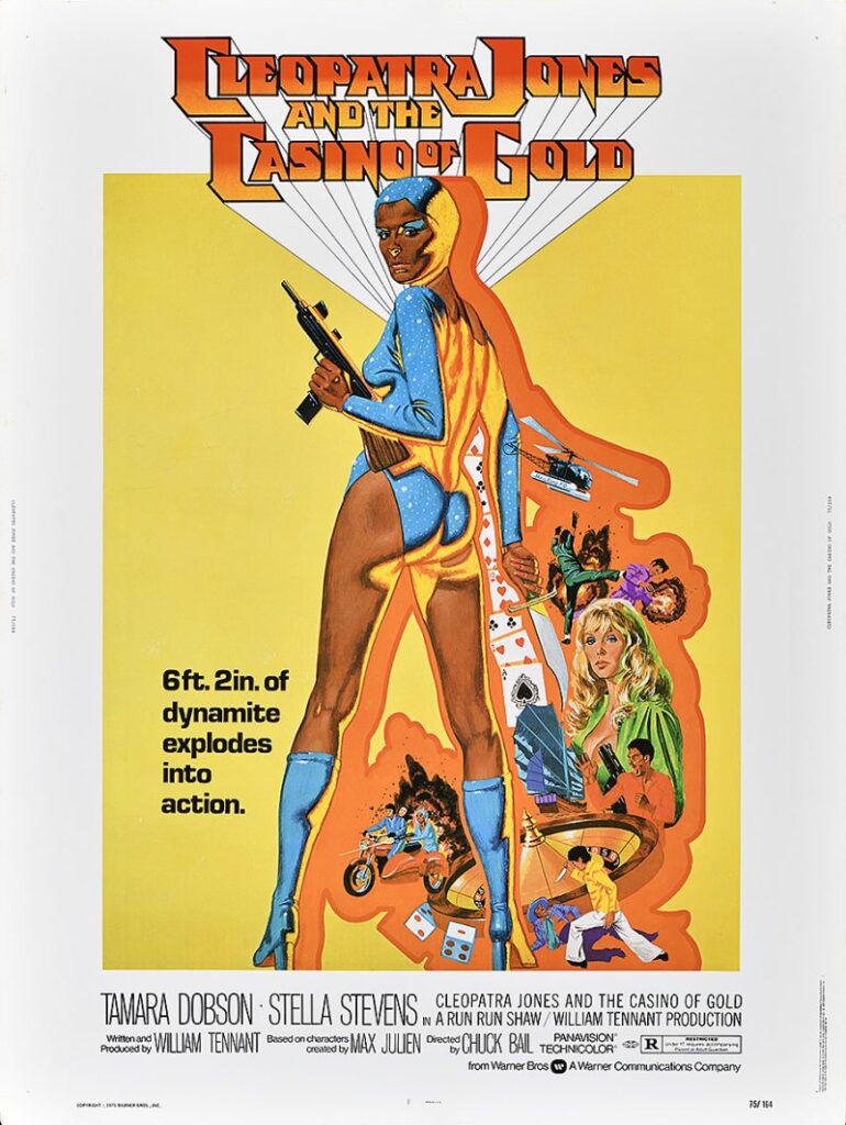
Cleopatra Jones and the casino of gold. I love how abstract and vibrant this poster, i like the orange outline around the characters it makes it pop. It shows that beautiful Women can be very dangerous.
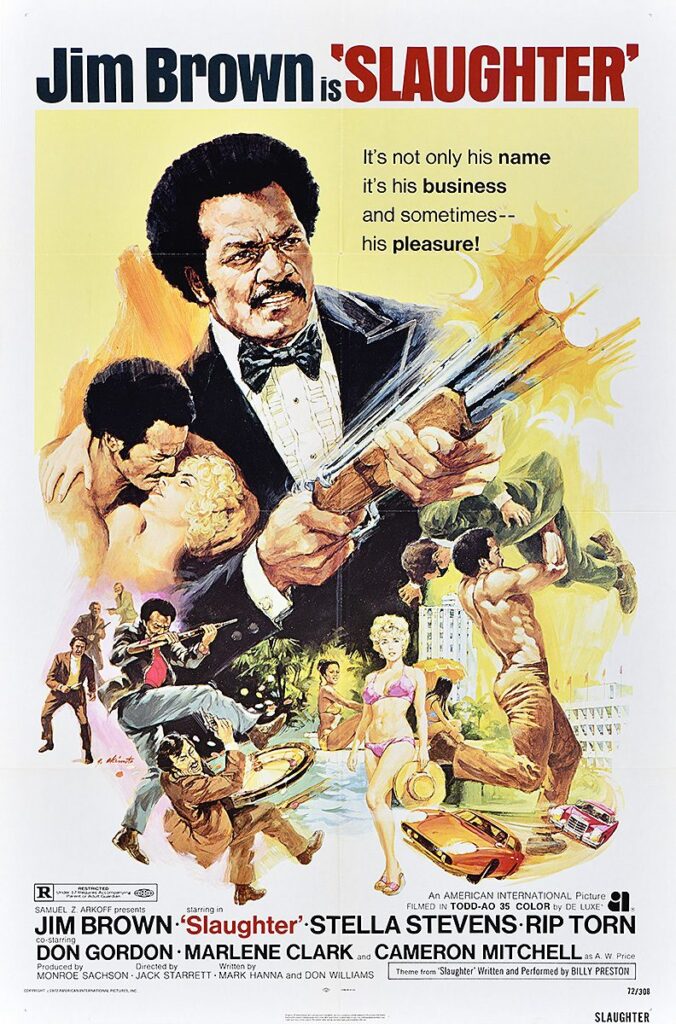
This one really stands out to me. There’s a lot of action in this poster. The obvious thing you see first is the man with the shotgun. I love how the yellow background blends in with the gun blast. This movie looks to have more action. Feel like this poster and the one before this, there was more work put in to it
Hi, my name is Issiah Smith and I am a student at New York City College of Technology and my major is Communication Design. What led to me choosing this major is that I was very curious about how these certain designs were made. I was in a two-year graphic design course in high school which further led to my interest. In my free time, I like to design random stuff in illustrator or Mess around in Photoshop. I like to hang out with my friends and family, go on long walks, and play video games.
While watching both films you can obviously tell that films have a lot in common. At first you can tell that apple was inspired by the dr no credits, they both use different amount of colors, i could possibly see that apple used the colors on their original logo back in 1984. They also have dancing silhouettes and the colors switch from warm to cool colors. They both have shapes that transform into different shapes and colors.

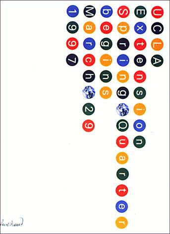
The designer I’ve chosen is Massimo Vignelli . He is an Italian designer who worked in a number of areas such as packaging, houseware, furniture, public signage, and showroom design. But he’s most famous for his of the Map of the New York City Subway. He based his work off of modernism and simplicity. In 1965 he and his wife, Lella moved to Chicago where they founded Unimar International that focused on graphic design for larger compaines.
In 1966, Vignelli expanded the company and launched another second Unimar headquarters in New York. Then it became the largest company in the world. The Work that Vignelli is known for is the map of the New York City Subway System. During his career, he taught at the Institute of Design in Chicago, Umanitaria School in Milan, the University of Venice’s School of Design, Columbia University’s School of Architecture, Philadelphia College of Art, the Parsons School of Design. He even gave lectures in the USA, Europe, and China. He also designed the logos of The Ford Motor Company, Washington DC Metro, American Airlines, and Bloomingdales.
Not only Vignelli was in the graphic design field, he designed dinnerware. His iconic dinnerware, “Heller” was released in 1964. He even won that years Compasso d’Oro award for it’s good design. It became the touchstone of modern design and has been called the “icon of the sixties utilitarian chic”. It was introduced in the U.S. in 1971 and has never been out of production with it still in its original molds.
In 2008, the MTA invited Vignelli to design a digital map which was released in 2011 and is still used to this day. The last map Vignelli work on was for Super Bowl XLVIII.
The MTA stated “The diagram shows all interconnections between the regional transit services, and highlights with a football icon those areas where Super Bowl-related events will occur on both sides of the Hudson River. The diagram will appear on all transit provider websites, as well as in Super Bowl websites, guides, publications, mobile apps, and folding pocket maps to be distributed by the Host Committee.” This would be his last piece of work as he Vignelli would pass away on May 27, 2014 at the age of 83.
https://drive.google.com/file/d/1bqwRF4Tdj8P50MhLZCJtWs1vTDvQuy1S/view?usp=sharing
for this project, I showed off the work I’ve done during my time at City Tech
Over 70 years, the pinnacle of motorsports Formula One has changed drastically. From the cars, the tracks and even the logo. The roots of Formula One traces back to the European Championship of the 20’s and 30’s. The Foundation of modern Formula One began in 1946 when the FIA (Fédération Internationale de l’Automobile) standardize the rules for the World Championship in 1950. The First Logo for F1 didn’t appear until 1985, which is something I didn’t find until researching, When I was searching for the logo font, I found out that it was to me a mixture of Milwaukee and Chamferwood with picture of the globe to the left. This logo was only used from 1985 to 1986.
In 1987, The F1 logo was changed drastically with word ‘FIA Formula One World Championship’ in Bolded Futura text with a silhouette of a race car, this logo is identical to the Sportscar and Rally World Championship Logo.

Ahead of the “fateful” 1994 season, Formula 1 reveal its new negative space logo designed by Carter Wong (who also helped design the FIA logo) This logo is what most formula one fans are more fimila with. Also, the previous logo used before was also still used for the first couple of races of 1994. Between the word F and the Red Swoosh, there’s the number 1. The red represents Passion and Energy and the black represents power and determination.
This logo was used until the end of 2017 when at the End of the Abu Dhabi Grand Prix, the sport unveiled it’s new logo along with typefaces for the 2018 season onwards. Designed by London-based advertisement agency Wieden + Kennedy, this comes after one year of its acquisition by Liberty Media, Liberty wanted the sport to reach new audiences and to engage with the fans in many different ways. The redesign research took about six months which the agency reached out to thousands of fans across the globe and found out that fans wanted to connect to the human side of F1, through the drivers, competition, and the adrenaline of racing. Richard Turley who led the redesign of the logo said , “The new mark aims to embody the core forces of Formula 1 racing: speed, attack, and control; while its sleek, sharp interlocking components celebrate the technical prowess of Formula 1 engineering teams.
The Reaction to the new logo was mixed, some people thought the design work was to “amateur” Drivers like Lewis Hamilton and Sebastian Vettel said they’d prefer the old logo, Then people started to realize that the logo look like the 3M Futuro logo. 3M alleged that the F1 logo infringed their copyright, both logos use a slanted F with two rectangular curved panels.
Formula One has changed not only cars or tracks, but the logos itself. For years the sport has tried to rebrand itself for a global audience. Formula One is not just about the cars, the teams or drivers, it’s about speed, passion and identity. I’m sure the current logo will be around for a very long time for the next generations of F1 fans in the future.
https://www.fastcompany.com/40499523/exclusive-inside-formula-ones-rebranding-strategy
https://us.motorsport.com/f1/news/hamilton-vettel-old-f1-logo-better-new-983410/1380967/
https://thefutur.com/video/f1-formula-1-logo-review-critique
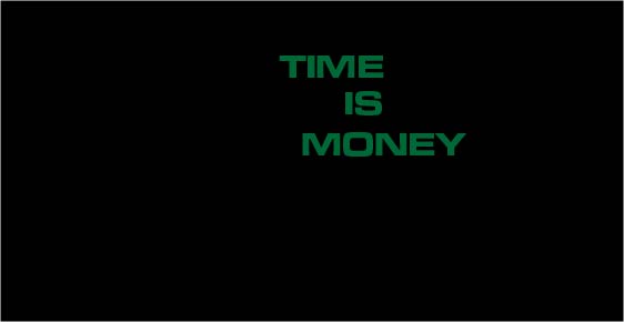

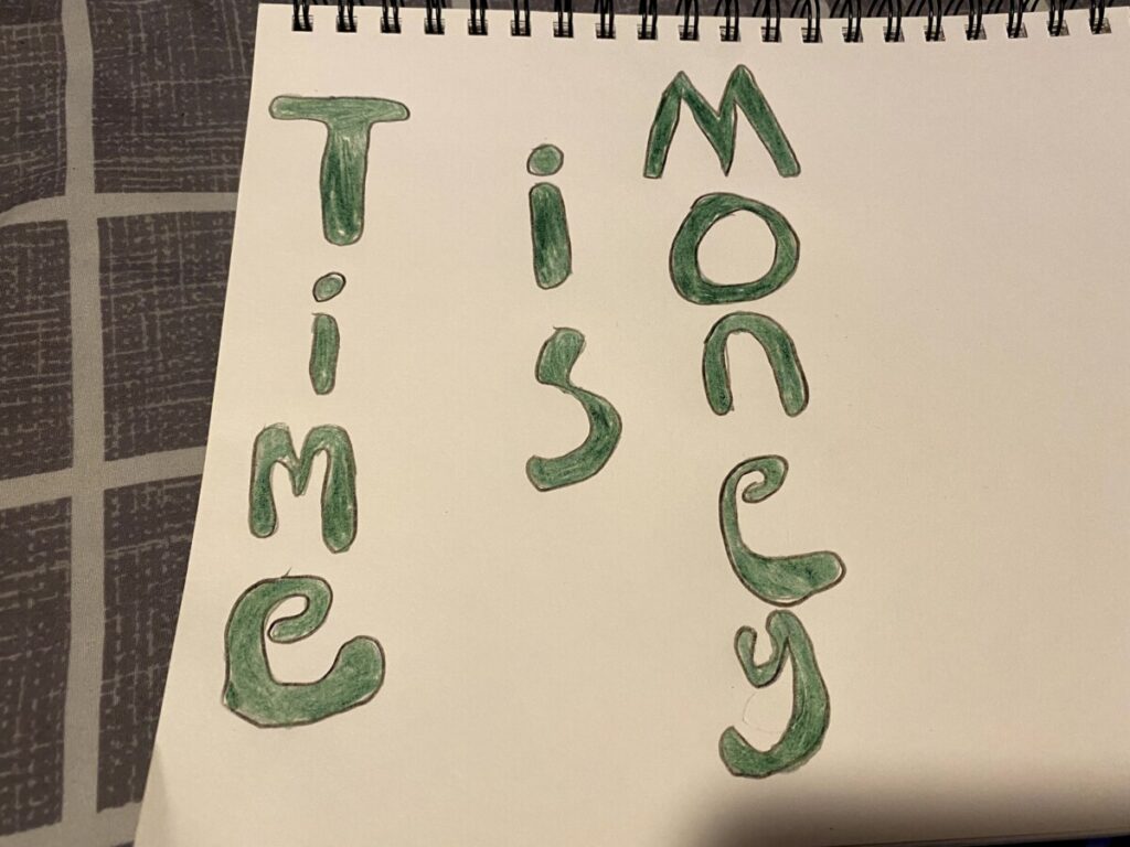


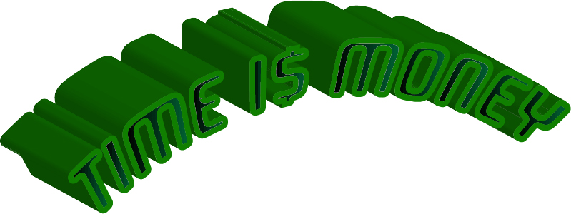
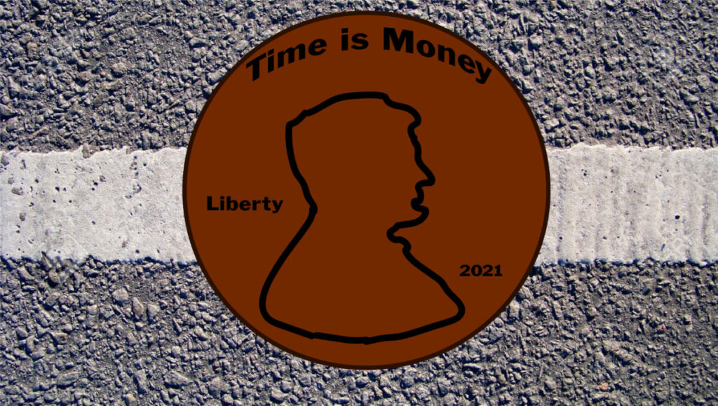
The quote i choose was “Time is Money”. I actually had a hard time trying to find a quote for this project, but when i found this, the visual part of the project was kinda easy.
The OpenLab is an open-source, digital platform designed to support teaching and learning at City Tech (New York City College of Technology), and to promote student and faculty engagement in the intellectual and social life of the college community.

