A City Tech OpenLab Project Site

Category: Portfolio

Type Hero Poster

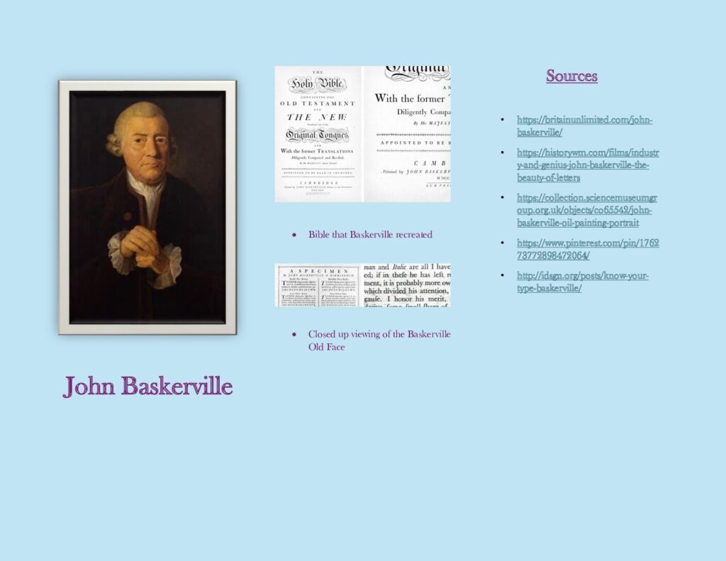
In this first poster I used column grid to make everything stand out. I used a background as a watermark. I used Baskerville Old Face as the typeface.

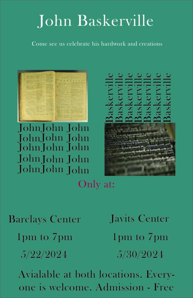
In this poster I used a soft background. I put the headline as a flag. I then entered examples of Baskerville work to help people understand more about this. I used Javits Center as a venue.

In this poster I used a green background. I used the hierarchy guide to make everything look more detailed. I followed the suit of the last three posters.

In this poster I used Diagonal lines. I placed the words ‘John Baskerville’ in a slated position to include the diagonal position of the phrase. I then put in the other information.

Motion Type

In the video above I did a curious style acting video with words. I wanted the make the ‘c’ like eyes and I wanted to curious feel like shy. I then put the word across the screen fast because the word is scared of been caught.

In the video above I used bounce. I did one bounce up and down then I did another bounce across the screen. This one is easier, and I think I managed to split the time evenly to match the speed it bounced across the screen.

I used levitate in the video because I wanted to make it stay in the air but in reality, gravity exists. So instead, I pushed it up back in the air to make it look better and used proper realism.

Typography Hero

In this presentation we will be discussing about John Baskerville. This is what mainly I started to think before even trying to write something about this person. In the first slide I did the cover page where I introduced my name and included the purpose of this presentation. In the second slide I included a picture of Mr. John Baskerville and a templated example of his typeface called Baskerville Old Face. In the third slide I added the table of contents where I am happy to include where everything of my presentation would be viewed. In the fourth slide I talked about the history of Baskerville and went more Indepth about him. In the fifth slide I added his birthplace. In the sixth slide I stated some important facts about Baskerville that I know would be useful. In the slides seven, eight and nine this was a timeline of history of Baskerville’s life and his accomplishments. In slide ten I included what he invented that we all use today. In slide eleven I stated some pictures of example of what he created. In slide twelve and the last slide I added the sources where I got all my information.

In the brochure I included more words than anything because my timeline had a lot of useful information. This is why I put this I information inside the brochure. And the outside included the appeasing stuff. I believe a brochure should not have pictures inside but on the outside. The body belongs in the inside. I also did a trifold brochure to separate the timeline to make it easier to read.

Found Letterforms

In this artwork I went to take out pictures of things around me that had the same shape and form as different letters from a well-known quote. This quote states “YOU ARE GOOD ENOUGH”. It was recited by Laura Moncur. I like this lovely quote because it is nice and simple. This took me a long time to gather the pictures and I think I did a good job. I took out most these pictures in my yard and some around my surroundings because I thought I wanted to keep this project simple and what’s simpler than a place like home. That’s what I did.

Type Expression

In page one of this work, I had to get a lyric on one of my favorite songs and I choose August Diaries by Dharia. I choose this song because it is one of my most favorite songs and I think it is best for this solution. On page two I have to introduce font sizes and leading. On page three I have to create a new layout using different type of Boldings. On page four I continued with the instructions from the past pages but introduced more kerning and tracking. On page five I continued, and I added an extra color and an additional typeface. On page six I used text as an image. I used a flag like design and an arc. On page seven I had to eliminate some work to make this paper stand out. On page eight I had to make anything that I would think that when I present this it will achieve the worth.

In the video link above I attached by expression of the song I choose and personally I think I had some hard time with this because I had to match the letters or words with the time of the correct beat, and I did my best. I loved when all the letters dropped in placed as soon as the beat dropped.

Type Primer

In this creation I created a 12-page typographic primer about typography, text variations and text anatomy. The word I choose to start with is World Peace. On the first page I included my topic, subtitle and my name. On the second page I included the anatomy of letters by simply labeling the different parts of a letter. On the third page I included type variations by focusing on fonts weight. On the fourth page I included type variations by focusing on variations on different sizes. On the fifth page I focused on type variations by using different treatments. On the sixth page I used word spacing by using different word tracking. On page seven I used line spacing by using leading some words. On page eight I used alignment to align three paragraphs differently. On page 9 I used alignment by using justify alignment to experiment. On page ten I used type on path by using images and then write on them to showcase a line. On page eleven I used Hierarchy to make my information in a very pleasing way. On page twelve I used credits page to list where I got all my information from.