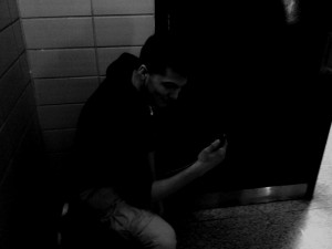
In this picture, the overall tones are low key. The shadows seem to try to overtake the light (seen at the top) and envelop the subject hidden in the darkness. The darker areas are clear because of this.
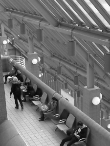
Due to the back being very bright, the mullions of the curtain wall stand out. This make the focus go to the the mullions (due to the stark and sudden contrast between the darker and lighter tones) against the more high key background. This also is just a great few out onto DUMBO, and Brooklyn Heights


